13 / 16
Aug 2023

Mostly geared towards readers: do you like artsy comics? Not only in story but in the art itself; unconventional and strange coloring to show and/or reveal how the story is going or specific points?

Usually I'd say my opinion, but I love it! It should be obvious from Megamix16. But years ago UBERNATURA had artsy comic pages and people HATED it! Like seriously! I thought it looked OK, it was suppose to look like a manga with a few colors splashes and eventually full color during exciting scenes, which fades back to black &white depending on how mundane it gets... People were saying it looked unfinished because of how color was used and kept pushing grayscale on me..

Meanwhile I was enjoying a friend's pseudo One Punch based comic, and had fun with the art style being similar to the web comic version, but sometimes using Photoshop or CGi(?) for crazier effects​:joy:

But what's your thoughts on experimental and artsy styles?

  • created

    Aug '23
  • last reply

    Aug '23
  • 15

    replies

  • 1.0k

    views

  • 1

    user

  • 24

    likes

  • 2

    links

Can you add a link to the UBERNATURA thing? I couldn't find it, LOL.
I think it depends on the story. I'll read something in any style if the story is good. But I think utilizing colors is a good technique to set the mood and importance of the scene, especially if you're having trouble coloring every single panel.

I'm kind of style-agnostic myself, I read all sorts of comics, because my main criteria are that the art clearly gets across what's going on, and that it feels appropriate to the tone of the story.

If a comic is really beautiful or clever, but hard to follow, I won't read it. I want the beauty or cleverness of the art to enhance the reading experience. I have a lot more admiration personally for comics creators who use simple techniques and clarity of intended meaning to evoke something deep, than for ones who throw a lot of strangeness and symbolism and hope I'll read it as something deep.

Experimentation is great to encourage in developing artists. It's how you find your style and stuff, but I don't want to read "experimental" to relax. I'll buy an experimental zine to encourage and support young creators in their artistic journey, and it's fun to look at sometimes, but at the end of a long day when I just want a nice cup of tea and something to read for fun, something I can relax and get lost in, I want to read the work of somebody who has done their experiments, reached a point where they know what they're doing, and can confidently tell me a story that isn't hard work to read.

As a creator, rather than reader note... if people are all telling you a stylistic choice isn't working, it might not mean they just don't like stylised comics or comics that use visual metaphor, it could mean that the execution of that style or metaphor isn't doing what you wanted it to and it needs tweaking, or that the underlying visual storytelling isn't clear enough for the stylistic choice to look deliberate rather than like a glitch or mistake.

There is no line where "experimental" becomes "incomprehensible" but if an artist isn't competent enough to stay on the right side of that spectrum any audience that might be open to... comics a little less pablum-like... will see it for what it is and turn away from it.

I feel like you can make a simplistic or nonconventional style look charming. I feel like Dog Man masters it. It’s supposed to emulate how a child would draw and I feel it works.

I do really like the art styles of the Little Prince and the Madeline books. As well as Lauren Child who will sometimes use mix media.

I think part if it is having it look like effort was put in and not having it look unfinished.

I went to art school, so I've seen and made all sorts of types of art lol. I definitely have a taste for all different genres :slight_smile:

SAME I can appreciate experimental, huge-focus-on-the-art comics if they were one-shots but not as a long comic.

Too many details, too many colors, too much focus on the art pull me away from not only the dialogue but also the surrounding panels -- at that point it's not a comic, it's just a bunch of illustrations.

Such comics may look great at first glance but I am not sticking around to read the story. :sweat_smile:

(Also there's often a big difference between a comic artist who uses complex art in a way that adds to the story/maintains readability, versus one who uses complex art solely thinking the busy visuals are what makes for a good comic.)

OK here's the novel
https://m.tapas.io/series//info3

But the comic no longer exists; the people on the site it was on had erased my account and most of the comic along with it.

If you really want to see, I could try to find the SDcard that had some of the panels? If you really want to see how it looks (I want to make sure, because it will take some effort to find it/get the pictures on this device)

Or if it's a temporary art shift to emphasize a point in a longer comic that usually has more 'normal'-looking art :smiley: Like, if it's artsy the whole way though for that long, it kind of loses its impact I feel :stuck_out_tongue:

OK, I got extremely curious about reactions to UBERNATURA's comic;
so I thought about it and remembered I technically already had a few pages (and didn't have to tediously search) some of the comic was featured on Newgrounds for a small while, but pulled it down and salvaged some earlier this year. (They don't have a comic section, so...)

Now: none of this is in any order, but it all comes from the same arc

As you can see; covers/first page is in color. Actual panels stay black&white until fighting and/or someone uses their powers. I'll admit some of it looks rough, but it was supposed to be a mix of comics and manga; (the summary was literally calling it "a Sitcom anime") I wish I had the greyscale and full color panels too...

THOSE made it look messy in my opinion; I remember doing one or 2 at the suggestion of other artists... Color ALL THE TIME gave it a sickly kiddie look, and greyscale was far more time consuming (also) and didn't fit the tone, even during fight/serious scenes.

So everybody tell me what YOU think of this? Too artsy? Lol

I don't think it's too artsy!
As long as you have a good story and stick to one style, I think it'd be fine. Whatever is easier, I guess.

Thanks, that's actually the first good comment I heard on this comic! It might look messy, but this still took HOURS to do!:sweat_smile:

The art just looks really young, it's not that it's "artsy" or stylized, the artist doesn't have the experience to convey what they're trying to depict yet so it comes off looking kinda surreal at times.

To answer the main question I personally like experimental, surreal, artsy-fartsy stuff. I got myself a copy of Arkham Asylum: A Serious House on Serious Earth, and I think the messy, surreal style fits well with the messy story being told. There's also The Arrival by Shaun Tan which depicts immigration using a surreal setting and abstract concepts, as well as a book I backed on Kickstarter not too long ago called The Boy with Nails for Eyes by Shaun Gardiner, which is super experimental visually and I kinda like what the artist did with it.

Personally I think it depends on the story, presentation and skill level of the artist. Surrealism imo takes a different skill set than just knowing the basics (Although that would help! But you don't need to be a particularly skilled artist to be skilled at surrealism.), like how comics takes a different skill set than illustration, they both have their own language separate from Just Art. A lot of times experimentation/surrealism/abstraction turns out edgy, superficial and/or convoluted because the artist doesn't know how to use symbolism, emotional colors or how to present metaphors and messages in a way that's understandable yet challenging. It takes a lot of studying to learn the visual language of thiiings and stuuuff. Lmao

Yeah... I wasn't sure how to say this gently, but since @UrMom already said it... I personally wouldn't read these as "artsy", I'd read these as "this is a developing artist still learning how do use their style." There's nothing wrong with that, but I think it's going to hold you back if you use "I'm being artsy" as an excuse in response to people suggesting that a stylistic experiment isn't quite giving you the audience reaction you want, rather than looking for ways you could perhaps improve on it.

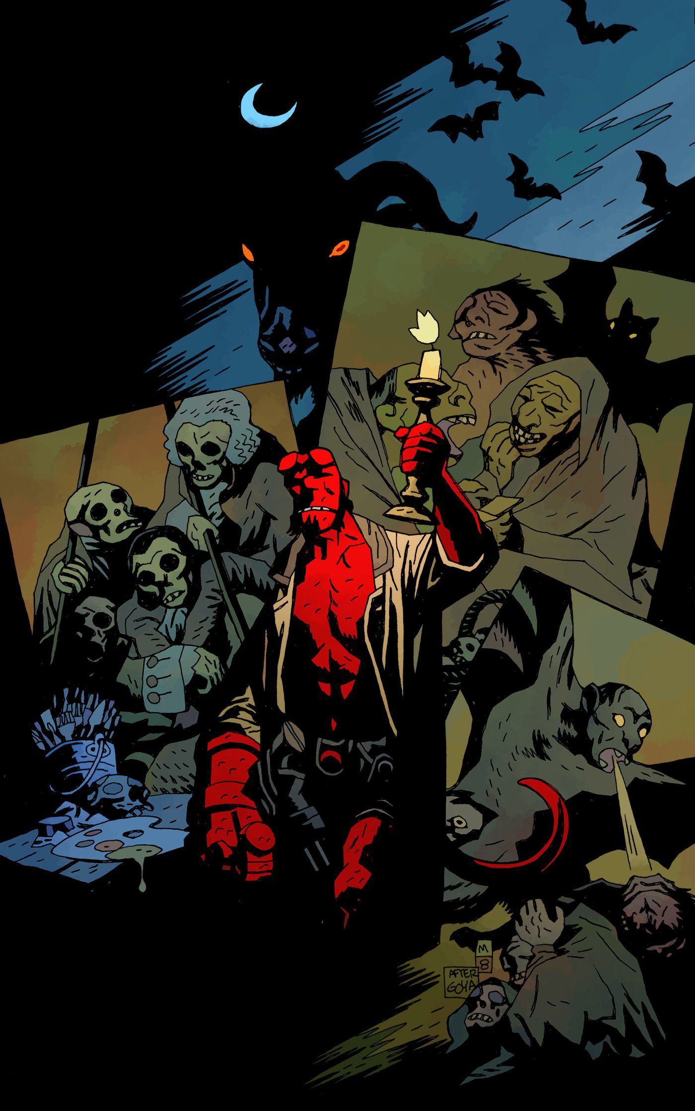
For example, if you think full colour looks "sickly" or "kiddie", you should probably look at colour comics that don't, like... Watchmen:

Or Hellboy:
Or even the colour versions of Scott Pilgrim:
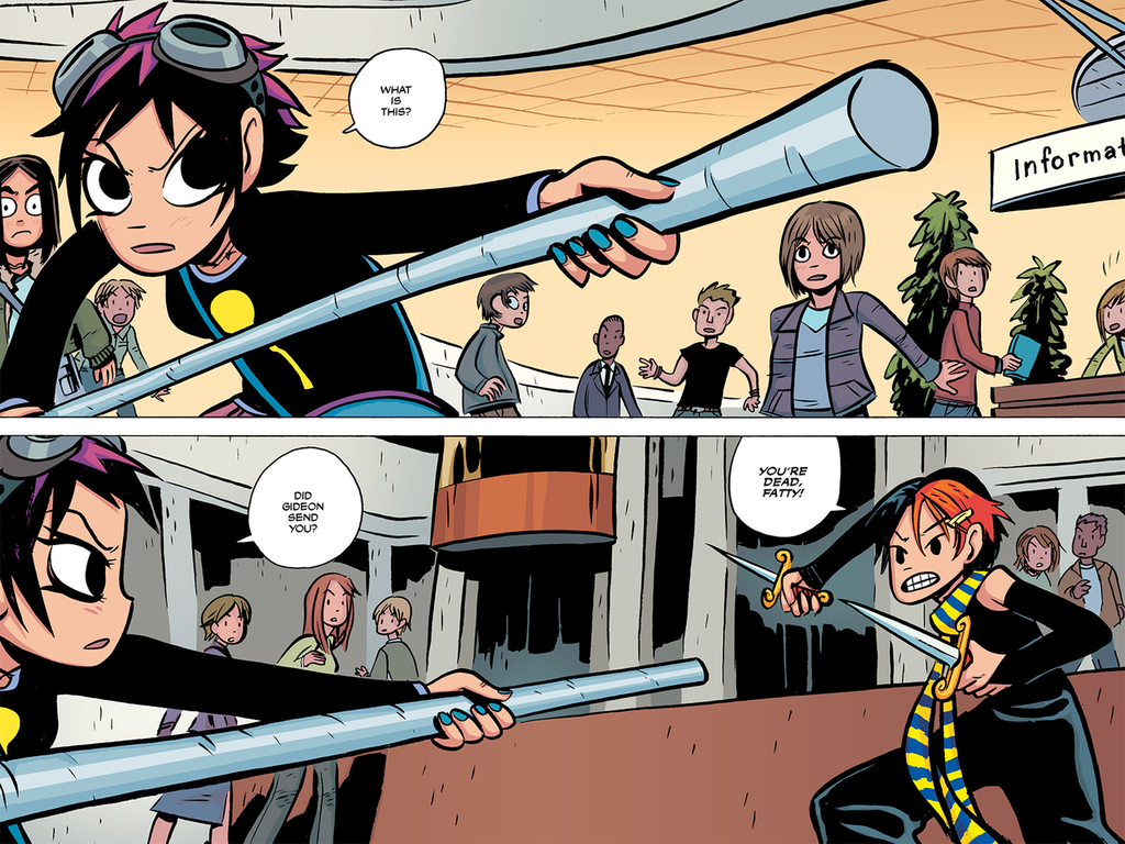
Because it's not the fact that the work is in colour that's making your colour pages look sickly and childish, it's that you're picking colours with a really high saturation, rather than picking some saturated colours, and some less saturated ones to create a harmonious colour palette.

A lot of the places your work deviates from a "normal" or "fashionable" comics style don't feel like deliberate choices from a seasoned artist who knows all the rules, could make a polished looking webtoon in a fashionable style if they wanted, but has decided not to; they look like things you've done because you didn't actually know how to do it the other way, or thought the other way looked difficult or time consuming.

Compare, say, Heartstopper.

This comic breaks a bunch of "rules" of what's popular on the Tapas front page. It uses very minimal colour, the linework is simple and a little wobbly, it's not in a manga style but a sort of simple indie zine vibe, and the text is hand-written. But this looks deliberate, because the colour wash, in a soft watercolour style to match the rough "hand drawn" looking inking, is used to add depth and make the figures pop. Black fills are used on the characters to make them stand out in panels. The hand-written text harmonises with the art style, and the innocent "schoolboy romance" tone. The wobbly panel clearly gets across the transition into a flashback. All of the choices Alice Oseman has made here look like the confident choices of somebody selecting what they believe to be the best balance of a style they could make a good number of panels of per week to a consistent level of polish, that clearly tell the story, and which evoke the intended vibe.

I think having the humility to admit you don't actually know how to do certain things you see in comics, and being able to say, "hey, how do they do that? Does anyone have a tutorial?" instead of saying, "It's my style! It's meant to look like that!" in response to any criticism, Is an important ability for a comic creator. You can get weird later, once you've mastered doing all the basic stuff to a competent level and can make your stylistic choices feel deliberate.

(post withdrawn by author, will be automatically deleted in 24 hours unless flagged)

I was referring to my art style in full color, it looks extra kiddy/childish, as tones wasn't ever really my thing. Yeah, I was aware my style was infantile back then too

But I remember just really wanting people to at least read it despite that, as a lot of work was put into it. At least with the novel now everyone will see the plot and not get deflected by the look of it