Wooow, your art is beautiful~! So pretty that I subscribed .3. Though there's not a lot of story yet, so this'll be focused more on the technical aspect of things.
Pros:
-Did I mentioned the art?? The effort put into the coloring, the backgrounds, and the linework is just amazing. I can really feel the emotion/work put into this comic. The characters are so expressive, and the Prologue especially was very well done. On like my third read through, I noticed that the sky was slowly going from a yellow-ish sunrise lighting to a full, sunny day throughout the panels! That's so cool! Such attention to detail!
-Your speech bubble placement is actually very well done. The words aren't all squished together, and that font you chose meshes well with your style~ That tends to be something people forget about.
- I love your character designs tbh. Your design for death was unique, as well as the design for the (what I believe is) the human/deity she tried to bring back to life. 
Cons:
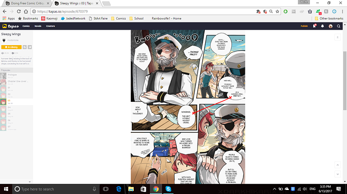
-Your panels are really squished together .3. It makes the scenes feel very fast paced, which is odd in moments that aren't necessarily moving very quickly. And, because things are so close together, it can even stop up the flow. For example, on page 3, after the speech bubble "or a hundred crew, finny boy", the next set of panels is way too close to the previous set. As the reader looks at it, they run into the "nonsense" speech bubble before Finny's suggestion. (i tried to draw it out for you, looky)
The reader would run into the wrong speech bubble first. Technically, the best way to fix it would be to lower that speech bubble, but the page is so tightly packed, you're unable to do that
-Sometimes character positioning is unclear. An example of this pages 2 and 3, where Thomas is hit with a fish. It's clear that the old man threw it at him, but it's unclear from where the fish is thrown. Or even where the old man comes from, since he just kind of ends up in front of Thomas.
This happens again on Page 4 when the girl boards the ship, and goes to look at the things they caught but those things seemingly did not exist before that panel. If it was somewhere "off screen" then it implies she walked rather far after climbing onto the ship, and then walked to an unknown area of said ship.
Other:
-I don't have anything to put here really, but I think you shouldn't be afraid of slowing things down. In some cases this may mean drawing additional panels (which sucks, i know lol) OR you could make wider gutters (the space between panels). Since this website really favors the webtoons format, I would suggest putting wider vertical gutters where you can. And maybe less panels that are within other panels (an example of this would be on Page 6, when the girl grabs Thomas).