I'd say that your detail has sort of lessened but thats alright
comics can be long and taxing and it really is best to keep it simple (personally it helps me work faster)
but i can say that your colors are really nice and softer
I'd say that your detail has sort of lessened but thats alright
comics can be long and taxing and it really is best to keep it simple (personally it helps me work faster)
but i can say that your colors are really nice and softer
Your latest panels seems less detailed but softer..if that is the style you are trying to achieve, then I can say you are going in a right direction.
Though in my own opinion, I like the 1st one with clean line and hard shade. But it is just me. What suits you better and benefit you is the most valid opinion. ^_^
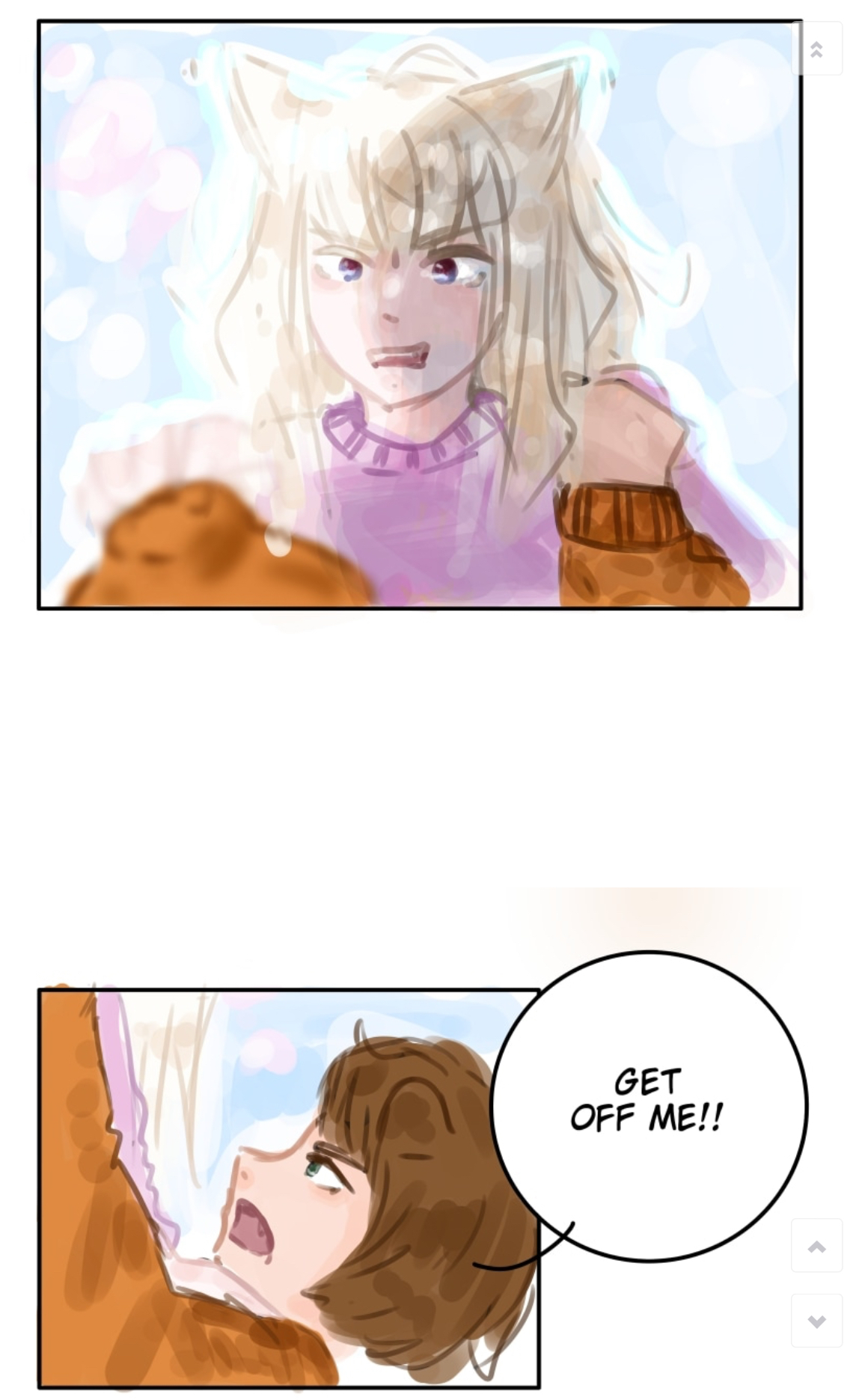
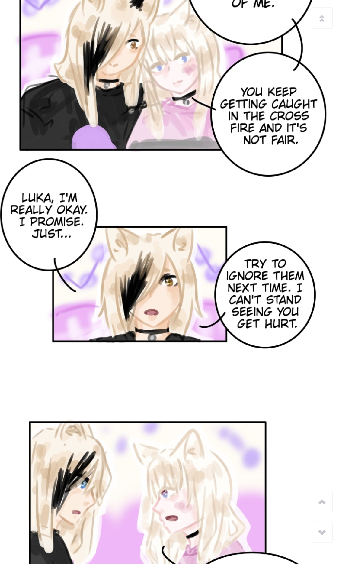
I definitely see what you mean! I actually chose the panels where it’s more just characgers talking so you can see if there’s any improvement in how I draw faces (what I’m modt concerned about). I’ll post some panels where theres more action and variety in what’s happening.
I had to stop drawing quite so detailed because it was taking so long  it took me several months to draw the prologue and that’s my shortest chapter lol.
I want to start adding more detailcback in though, gotta find the balanced between drawing quickly and drawing well!
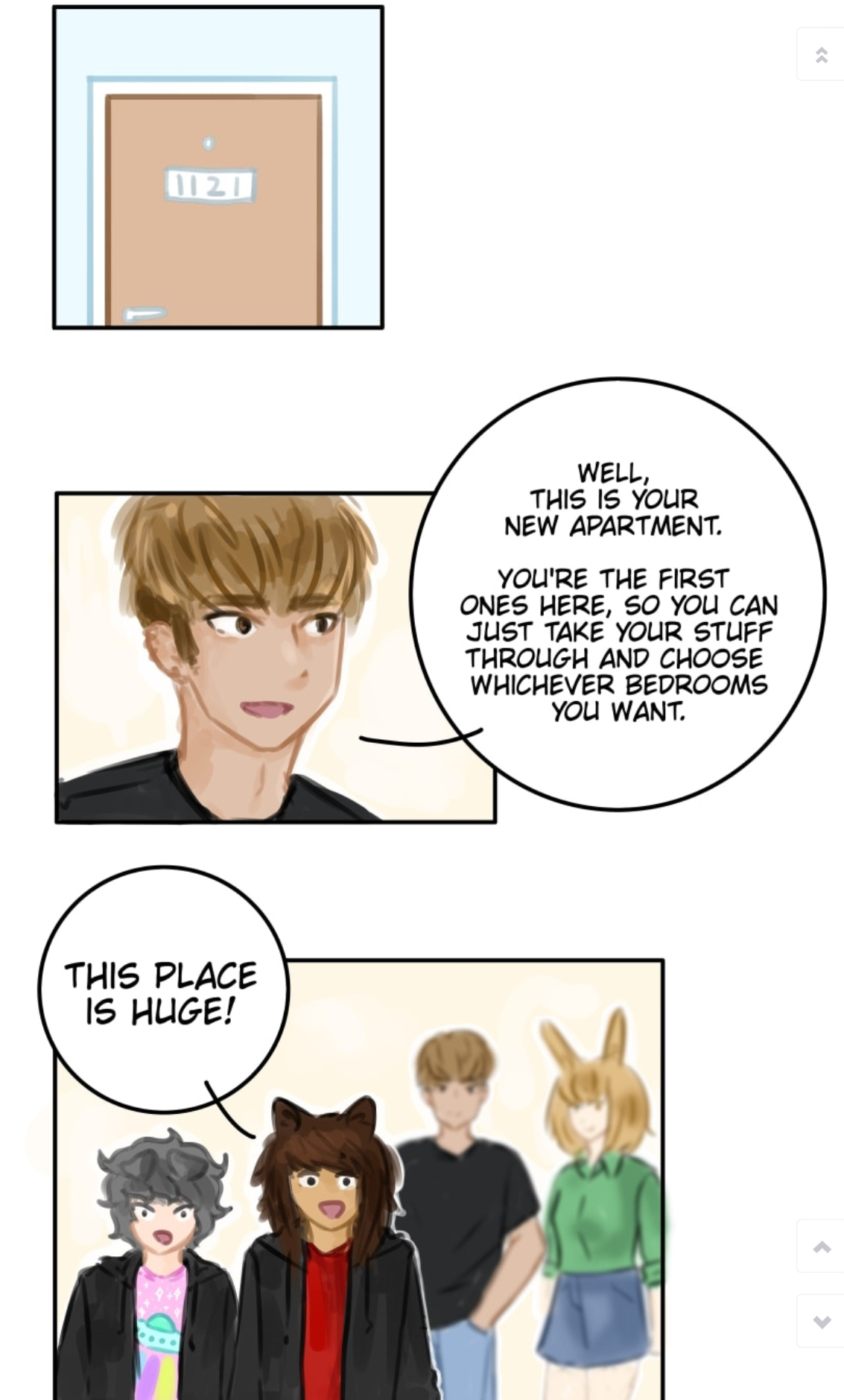
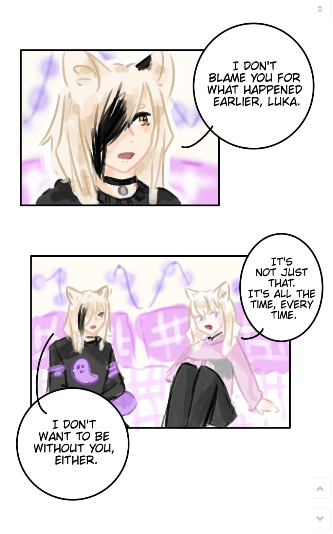
my characters haven’t really been in super detailed environments since prologue  . The adoption centres are pretty plain and undecorated, and George and Dodger haven’t had a chance to decorate their apartment yet. Shinya and Luka’s room at the adoption centre has more decoration so you’ll definitely get to see more decoration in the next chapter!
I’ve been thinking of going back to that style of lineart. I stopped because it was harder to control the lines (shakey hands) but it’s just so coean and shiny
I really did chose bad example pages haha I was only thinking about the improvement in the character’s themselves and not the whole comic I’ll add some more panels from the later chapters that show more variety. Chapter 2 was the last chapter where the writer had storyboarded the pages for me and she’s definitely braver in terms of composition haha. She took several months to get one chapter storyboarded though so it was just really inconvenient tbh
Chapter 3
Chapter 4 honestly there’s a lot in this chapter I’m not happy with
I chose bad example pages but I definitely need to start drawing more of their bodies tho haha
I just posted some better pages you can look at if you want.
I'd say that you haven't "improved" directly. It looks more like you've developed stylistically. I would still recommend that you do figure drawing to practice (as most people need to do, including myself). Improvement is done, usually, through very intentional practicing. Drawing a comic will help you refine what you already know, but without any sort of intentional practice (focusing on improving hands, or feet, or whatever), improvement will be hard to achieve.
Think of it like learning a language. Unless you are actively trying to teach yourself new grammar or vocabulary, all you are doing is repeating the things you already know. You get better at saying them, but they are still the same things you knew already.
Not only that, it fossilizes bad habits, which can happen in art, too.
My best suggestion, watch some youtube videos or something on methods to improve your art. (I recommend an artist called Sycra). They really help teach techniques or forms you may not have thought of yet.
Most of all, have fun and experiment!
no offense, but I feel like your art has gotten progressively harder to look at with each picture. it's because of how you lightened the colors, made the lineart lighter and messier and changed full colors to just dots.. but I do think you've gotten better at making your characters look more expressive.
i'm with @ghostieblu on this one.
I’m not sure what you mean by changing colours to dots?
I agree about the lineart, HS is a side project and I’m trying to get updates out frequently so I’m not putting as much time and effort into it as I’d like and my lineart isn’t as neat as I’d like. I’m going to try and fix that with the next udate though!
It’s interesting that the softer colours make it harder for you to look at because I find lighter colours to be a lot easier on my eyes! I will try to have more variety in the background colours from now on, though it doesn’t help that Luka and Shinya are both pale and blond lol.
well I mean how you went from solid color fills to splotches that look kind of messy, and tend to go out of the lines
Ah i thought you meant actual dots lol.
With the old brush i could fill bucket the flat colour but I can’t bc the transparency of the new brush and I guess I’m too blind to colour neatly  I disn’t realise it was so messy! I’ll try to colour more neatly next time.
You have gone from detailed to emotional, which imo is a very good thing! Since your style is still evolving, I guess the next step will blend the 2 and you'll be amazing!
Kudos for that hard work, and for not giving up despite the issues you've got with your eyes, too!
Also yes, for most people lighter colors are harder to distinguish, so I'd suggest either make your lineart more pronouced or try to have at least a few deeper colors to enhance the rest 
In any case keep going, you're doing a great job!