4 / 12
Jul 2020

I've been taking some coloring courses and am attempting to color my comic. I'd like your thoughts and also what kind of vibe the color scheme gives.

  • created

    Jul '20
  • last reply

    Jul '20
  • 11

    replies

  • 379

    views

  • 5

    users

  • 19

    likes

I think the coloring looks nice! I guess it gives off a warm vibe

Im glad they're working. This took like 4 hrs :sweat_smile: I was worried about tones since there's a lot of cool colors in it. I wanted to make sure they gave off a warm vibe

very warm earthy feel, like a calm mountain
only nitpick would be making it a bit more contrast to make the character pop out from the background but other than that 10/10

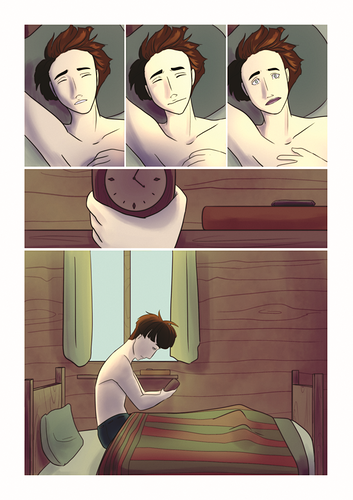
More of a camp trip vibe. Nice lighting on the character. On the pillow though, it feels off (but that's me because I shade differently). The character's mouth in the 3rd panel needs to be titlted a little to the right because it feels slightly off. Also, for the 3 panels, you can just copy the entire panel and paste to the right, with other face to draw, that way proportion can stay the same when you look at it and it's less work to do.

Don't shade to heavy for the left side of the hair because "there is no such thing as black, just dark gray." let it fade to the left rather than just smacking down a black-like color.

(it probably isn't black, it prolly just my screen).

Yep that's all I got to say. Good job nonetheless!

a tip (though I don't know if the coloring course has already told you) is to put your painting in grey scale, this leaves only the values and you can make it so the colors contrast between each other better

:open_mouth: I didn't learn that! I will definitely do that

Grayscale mode is actually not the best way to go about it, it screws up values something fierce. Always better to put a black rectangle over the whole picture and set that layer to Color.

The overall use of color is very nice! If you draw characters and backgrounds separately, I recommend doing softer shadows on the ends of the panel to put all focus on the character, or making the window's light brighter to take away some attention from what's behind them. Another thing that might help out is putting more drop shadow where they're at - like the pillow and where they sit on the mattress, since the body is blocking that area from light by a lot.

That'll definitely help with contrast, thanks :grin: