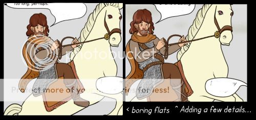
Sorry about your problem @keac but I think the folks here have the right of it. Using separate layers for color, inks and shades, in addition to expanding the selection of your area is going to make the biggest difference.
Like many here, I use Photoshop on the inks for my teams comic, Kamikaze.
I do the ink and paint, so my work is pretty similar to others:
I do the first pass of inks, and then add in the fills.

Then I lay down my guides for shading on a separate layer using a REALLY obnoxious color so I can see where I'm filling in.
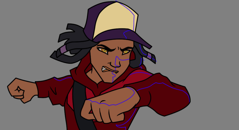
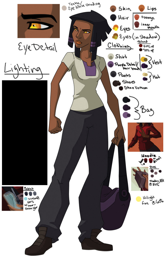
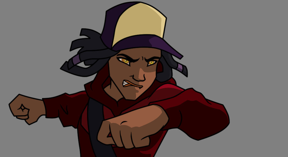
I create a new layer for each element that I'm shading, so for example in this image it would be hat, hair, skin, hoodie, and bag strap. Then I fill in these areas using a magic wand and a handy-dandy color map I created for reference.
Color ref
And then the shades.
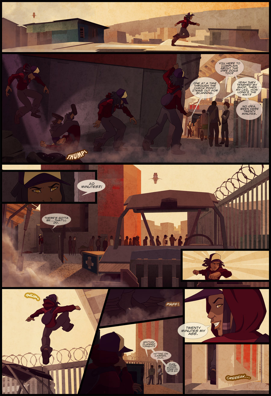
From there compositing begins (as the backgrounds are also colored in photoshop) and additional lighting, texture and gradients are added to make the characters look more in line with the environment. So the end result goes from
This (flat inks and color)

To the shades

To the full page finished and completely composited together with background, effects, and lettering.