5 / 11
Oct 2018

When I try draw in detail, all it does is make it look more horrid. How do I make it look not horrid.

Update:
21

I was think from the head that says "Millions" under it, to the head that says "Thousands" under it.

  • created

    Oct '18
  • last reply

    Oct '18
  • 10

    replies

  • 2.0k

    views

  • 9

    users

  • 25

    likes

  • 1

    link

examples of what you mean would be useful. A general tip is switching to a smaller line weight typically makes it easier to portray details nicely. If you're trying to use a big thick line to draw something finely detailed it can be tough to keep it looking clean.

Yeah if you show us what you mean I might be able to help.

Oh, ok. Some things in this example at least that differentiate the "millions" head from the "thousands":

  • As mentioned in my first comment, line weight is a factor. the millions face uses a uniform line weight throughout it looks like. The thousands face uses a variety. The jawline is defined with a strong line, but some of the inside features like the mouth, eyes, and ear details are put down with thin lines.

  • Where as the millions face is flat black and white, the thousands face starts to depict 3D form through light and shadow.

  • Since this series of drawings is progressing from super cartoony to super realistic, another difference you'll see between each stage is them using more lines/features to try to portray the face in a more realistic way. The mouth on the millions face is a single line, but the thousands face uses two curved lines to try and convey the shape of the lips more realistically, as well as an additional line/shadow below for the lower lip. Similarly instead of the eyes just being two single dots they've drawn a few lines in to suggest the eye lids and eye itself more distinctly. the face shape is more defined with the cheek bones, the hair has a bit more variation to it, etc.

Essentially it's like the difference between drawing in more of a simple newspaper strip style vs what looks to me like a super hero comic style, which uses more detail (typically).

The further away or smaller the objects become I try to simplify the number of lines I put into it. I try to keep a balance that is appealing to me as far as detail goes- when I first started out making comics I used to over render panels to death and when the size was reduced, the page would look cluttered and awful...

It's hard to give concrete advice without seeing examples of your own drawings and in what way it looks horrid to you, but to me a lot of drawing is in how you think about things and not just what you're doing mechanically.

Your phrasing implies to me that you're thinking of your drawing in a less detailed way initially and trying to add in details. Perhaps it doesn't look good because those details don't seem to fit right?

If you look at the Scott McCloud example you posted again. He starts on the left with the most detailed face and each drawing after that is being more and more selective about what details are drawn and emphasized. I understand it's difficult but if you try to picture the hypothetical most detailed version of something and then choose which details to draw you may find the end results look better even if you're not doing anything mechanically different.

I can definitely give an example on how I personal go about it. So here's a simple sketch I made.


It looks pretty good with details so far, but I want to add more. Now, I could definitely just add more lines here and there, especially for her hair. But in this case, I'm gonna go with coloring in the strands. I start off by adding some color to the hair.

Then, with a darker color, I begin to add in a bit of shading. I know exactly where my light source will be, so I start from there. You'll begin to see that I didn't decide to color in all of the sketch. Yet, the parts I did color helped to enhance it!

And, for a little bit of somethin', somethin', I add in lighter and darker shades of the same color to make the hair pop!

And there we go!
Sometimes, less is more when it comes to details. You can definitely start out with simple lineart and use other elements to make it pop. In my case, I used one color (in different shades), and the element of a light source to turn my simple doodle into something more :blush:

Oh you mean the ol' "I can draw cartoons fine, but why does my realistic drawings look weird" problem? Yeah I ran into that when I was starting out. Just gotta practice from life, photos, anatomy, etc as much as you can and eventually you can do simplified and detailed both as easy as possible.

you have to be careful with details in a face....more often than not the face ends up looking older or worse...uglier..

here's an idea If you plan using colour, save part of your details for the coloring stage for example.

i did the example in a couple of minutes....hope it get the message across...

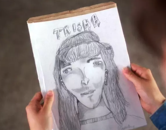
There is a ton of solid advice on this thread. Do some studies of skulls, use references, vary line weight (maybe try using pencil if you've been using ink? It's easier with pencil I've found). Make a bunch of bad stuff without beating yourself up about it, everyone makes bad art constantly except for that one person we're all jealous of. Just no one is broadcasting it.

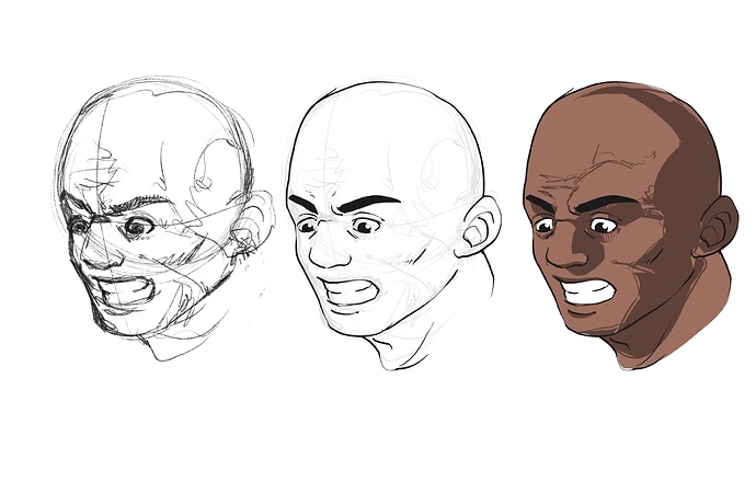
Also when adding details keep your wrist as loose as you can, even drawing more from the elbow, and try and suggest lines instead of connecting them, or construct them with shading instead of lines. @Hodge is really good at this, notice how in the semi-realism and realism around the lips; they aren't drawing every line that defines the lips, they are leaving a gap where they would connect and letting your brain fill in the rest, and instead of lines for the colour to the lips they're using shading. Be very careful about drawing in under eye bags, and that crease coming down from your nose to the corners of your lips, those age people pretty fast if you use to hard of a line. @jay3spin did this in the middle picture by drawing just a hint of cheekbone, anything more would have made them look too gaunt.

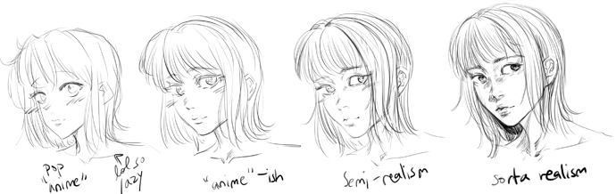
Also like...I have no idea what stage you are at but when you're drawing eyes if you shade the upper third dark connecting into the pupil and do a gradient down the iris so the lightest part is under the pupil in a bit of a kidney bean shape like hodge did here, people go wild for that shit.

Copy work you think is cool. Like don't post it and call it your own, but everyone is copying and learning from everyone else constantly. Keep drawing all the time. When you feel comfortable enough post your work for critique.