
Idk much too but read a bit of color theory. You'll figure which ones work and which don't
I mostly go by environmental lighting and/or the mood I'm trying to convey.
So, like, if the characters are outside in a park and it's a bright sunny day, I'll go with really bright oranges and yellows and yellow-greens. If they're in that same park but it's night-time, I'll use blue-greens and blues and purples. If they're in the same park, but the main character is sad, I'll lean much more into blue and purple.
Even if you decide that a school wall is beige, you don't have to color it beige every time. You can tint it blue or purple or orange or whatever depending on the lighting and the mood of the scene.
I've never had proper color theory classes, I just follow this tutorial:
Basically I choose a main color (usually purple) and desaturate the colors that are on the opposite side of the color wheel (like green and yellow). It's a quite hack-y method, but I like the end results, and some of my readers seem to like my color choices too! =D You can change the main color according to the ambient light or something like that (although I don't, it's always purple).
Also, I do a slight hue shift when I shade. My shadows tend to be more blueish than light parts.
This6 site might help you. It can generate color palettes from images, or even randomly. I use it mainly for characters, but it can be useful for general colors.
A good way to start your color palette process might be to think about the tone/image you want to convey. Instead of going based on individual item, think something like "I want the reader to see the school as a happy palace. To me, "happy place" implies pastel colors, so maybe the school wall is a pastel yellow or white and the posters are pastel blue and pink. Or if the school is meant to be scary, maybe the walls are beige and the posters are black and white. I think of colors more as tone indicators than anything else.
I hope this makes a modicum of sense lol.

If you want cohesive, you could try:
-Monochrome (as in, everything is lighter/darker shades of one color)
-Tinting all the colors towards one main color (so if you have a beige wall, all the other colors in the scene are just a smidge away from neutrals that would match: brownish-red, dull green, deep navy blue, etc.)
-Limited color palette (you have only one shade of green, red, blue, etc; and you use that same shade everywhere throughout the comic. Shading is usually hatched, black/white cel, or nonexistent)
If you want pleasing to the eye...actually, there are a ton of ways to do that, including the above. ^^; But just for the heck of it:
-Temperature Control (use only cool colors, or only warm colors. If you do include colors from the other side of the wheel, make 'em weird (for instance, bright cyan in a sea of warm reds, or pale pink in an ocean of blues))
-Pastels (Using light, baby color schemes is practically a cheat; they tend to look good no matter what. For maximum effect, try to either limit the color palette, or go full impressionist with tons of different shades.)
-Background disparity (limit or monochromize the background, while keeping characters and foreground elements in full color. For extra cohesiveness, tint the characters similarly to the background.)
Uh ... trial and error I guess. I don't really know. I mean, the comic I'm working on right now is in sepia anyway so it doesn't matter, but the one I want to make after that will be in colour and I kinda started out with Krita's default palette and changed out a few colours I didn't need for colours that were missing and ... Idk, somehow I have a colour palette that's mostly warm tones now and I kinda like it. It's not perfect but it works. But it was really just trial and error and figuring out which colours look nice and which colours and colour combinations I like looking at and working with.
I usually pick colours that reflect a character's personality. For calmer and more docile character, I go with blues, whites and silvers. For the more energetic ones, I use the more electric and louder colours. I think you get the idea.
Asides the color theory and the very useful advice others have given (Specially Doki's) I think that you could practice with custom palette of colors. Color sets can be downloaded form Deviant art or Clip Studio materials.
This way you can test using more cohesive colors colors with a similar saturation, brightness etc. Instead of picking random colors that might not look well together.
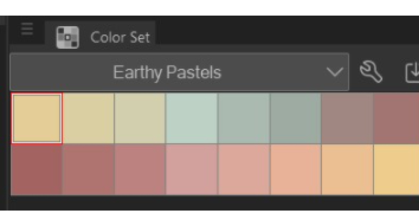
For example in a palette like this we get the idea that the illumination is warm, so objects that would normally be blue in daylight, they get tinted green instead. This shade selection already help you to stay in the mood.
Drawing tests with limited color palettes also helped me to know that I don't always have to use black, shadows and line art can be interesting in other colors too.
A mixture of winging it and intentional design.
I choose colors that mix well and make/use them according to the environment and character. So for a bright character and/or a bright environment, I use bright colors and brighter shades of other colors and the vice versa is true for darker. I have yet to figure out the neutrals though, so that is gonna be a journey.
The winging it part is the experimental stage and part just remembering the official color palettes before looking back at a reference XD.
A little trick I learned is that when you find a painting with colors you love--just steal em. Take that color picker, add em to your library, and after a while you will see what type of colors you gravitate to. You'll also have a library where all the colors that are next to eachother match eachother, since they were from the same paintings. This is incredibly helpful for landscapes, where color needs to be pretty precise to sell it. (Green in particular is a really intense color, and finding the right color for leaves on trees can be a lot of stress.)
When it comes to my comics, I refer back to that library and finesse to make my own limited colors schemes--but knowing what you like and what your own preferences are is a big part of knowing what directions your style will take.

I figured out mine by applying a bit of color psychology into them by picking colors based on that specific character's personality or borrow colors from nature itself.
For example, in my case, for my current characters', I decided to take colour palettes from colours of a specific flower associated with their personalities.
That way I can also generate a specific colour palettes specifically for that character only. The palette assigned to them is to be used throughout the story. In cases like their clothing, the color values may change but it still comes from the same hue that I assigned for that characters -- which will then help them to stand out from the mob characters because that character is the only one who has that palette.
then finally, I adjust the colors to match according to the environment/setting of the story to match the mood.
If you struggle with picking flat colours, I recommend finding a photo with the kind of mood you want, adding a gaussian blur over it to make the colours easier to see, and eyedropping a palette from there! I'll link to a video by an artist called Angry Mikko where he does just that, it's pretty helpful: https://www.youtube.com/watch?v=jCCw9tzrsCw1 (He's brilliant, I highly recommend his videos.) I often blur a reference photo a bit more than he does, as I'll just be picking flat colours, but it's similar!
Beyond that, if you're adding shadows and lighting, a good rule of thumb is to decide whether you want cool or warm shadows. Purple is an easy example. If I were adding a shadow to a purple tone, I'd choose a more blueish purple than my base colour if I wanted a cool shadow, or a more reddish purple than my base colour if I wanted a warm shadow.
Also, adding an overlay layer filled with a flat colour at the end of your workflow can often help consolidate the colours into a more cohesive whole. I find that really helpful!
Amateur/freelance colorist here. For me, it's partially a process of "it's grass and therefore it's green" and deciding what I want to put emphasis on. For example, on a page I was working on today, I had to color an old passenger train. When I went to go look at old trains, I noticed that a lot of them were kind of a dark red, so that's what I colored it as, at first. But then, I realized it was the brightest thing on the page, so your eye immediately went to it - not good, since it was just kind of a background thing. So, I had to change the color so it wasn't the first thing you noticed. What I make sure to do is to have my foreground/most important thing in the panel to stand out color wise, either by using brighter colors or more saturated colors, then have everything else be a little darker, or grayer, if that makes sense. Best thing you can do to practice is to get real familiar with the color wheel - knowing what colors are "opposites", which ones are "warm" vs "cool", will really help with color palettes.
Thank you, I was hoping you'd offer some advice. I've been playing around with this, and I like some of what I'm coming up with!
When I'm working with flat colours the important decisions are:
- What's the darkest possible colour I'm using. I only use pure black for inking, so if a character is wearing black clothing, the "black" fabric is usually a dark greyish blue or purple. Because black clothing rarely looks pure black; the fabric still reflects light, it's just dyed as dark as they can make it.
- What's my approximate level of saturation and value overall? Do I want really bright colours or a subdued, muted feel? And do I want light colours for a soft, floaty feel? Dark colours for a dark and grungy feel? Or something in-between? The main thing is avoiding too much or too little contrast and to have a fairly consistent level of contrast.
So the original palette for Errant, before I made the better organised one looked like this, complete with weird Rekki with her old colourscheme and drawn in the style of the early pages  :
:
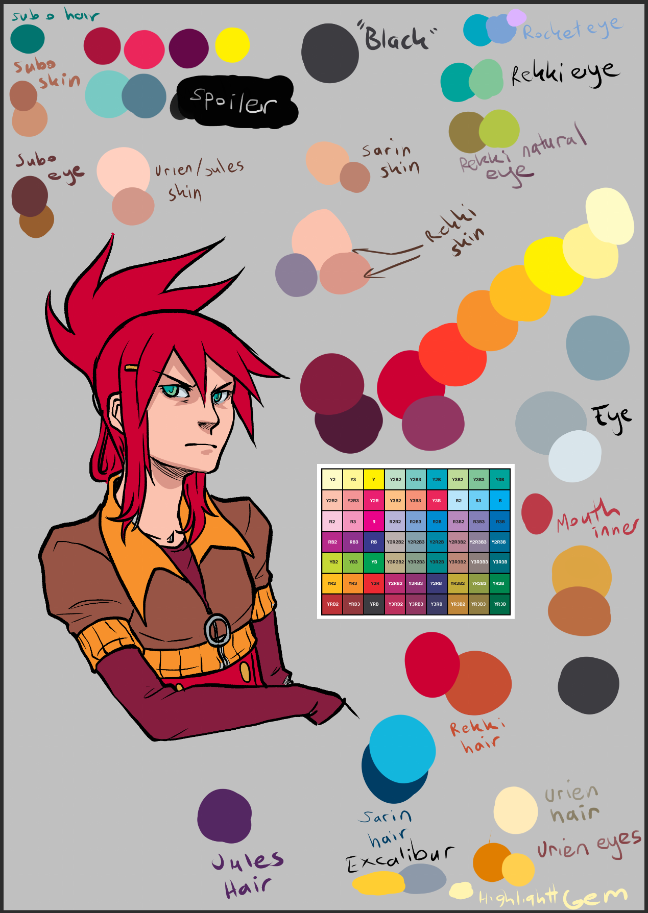
So the basis/inspiration for this palette is that square in the middle, which is a chart I found online of the colours that were available to pre-digital colour comics. I love the bright, lurid colours of 1970s and 80s American comics, and this is a bold action comic with chunky inks. This formed the foundation for the rough level of value and saturation.
That run of red-yellow on the right is me working out how I'll bridge the gaps between the hues on the chart and flesh things out. I tend to use "hue ramping" in my colours, which means that as colours get darker in shadows, they move towards blue or purple, except skintones and yellows, which move towards red. This is a shortcut for approximating the blue scattered light you tend to get in shadows IRL and the translucency of skin which means you get a reddish look in shadows on it (because some light is still going through the skin and blood and visible in the shadowed parts of skin, this is called "sub surface scattering"). Other than that, I have a "white" which is actually a very light grey-blue for eyes and teeth so they don't look weird with the overall palette's brightness level.
Having the test Rekki there was important to just check that my light colours, darker colours and skintones felt cohesive. I definitely recommend testing out the palette you put together on an image with the pipeline you want. Also never be scared to make alterations on the fly. I tested a lot of colours for Sarin's hair before I hit a shade of blue that didn't look horrible, because as soon as I filled the original blue in a panel I went "EUGH!". Blue and Green can be two of the hardest colours to use well, because computers can create incredibly bright blues and indigos that look very unnatural, and green is always hard because humans can perceive more shades of green than any other colour, so I'm always extra careful with those. They usually need to be less saturated than the warm colours, and greens I try to avoid emerald green in favour of spring greens or teals.
I put a LOT of thought into my colours, some people might think I go a bit overboard, but I do get complimented on them pretty often, so I feel like it's worth it! 