1 / 10
Sep 2017

One of the great thing about art techniques, is that once you know how they work they can become easy to spot and easier to employ in your own work. Noticing and then applying stuff like perspective or line of action on a character design can be pretty easy, but there is one technique that's been alluding me recently; "flow". It's kind of hard for me to even explain it myself so I'll post some pictures from other sources.

132 58 78 26

I suppose this could also be called "leading the eye". Out of some of the other techniques I've used this one seems to be the most abstract. I can usually find the horizon line within a perspective piece, and I can even point out where the foreground, midground, and background are in a composition, but if the editors of these pieces hadn't drawn these arrows over the original pictures I probably never would've picked up on this (even with them, it seems a little foggy [I actually own that book in the fourth picture, and I was still confused by what it was saying]).

I'd guess this really is the kind of thing you'd have to develop an eye for after a while, so I thought I'd ask some of you who have more experience than me. Do YOU use composition techniques like this in your comics? Do you think about "flow" and motion in a different way when you create pages and panels? Do you have any tips on how I could think about concepts like this when I draw my pages (Am I supposed to just draw the lines before I put in my characters or ... ). Do you have any examples? Post em! There's just something about composition and flow in comics and art that's coming off as more cryptic than the other things I've studied, so any advice would be appreciated!

  • created

    Sep '17
  • last reply

    Sep '17
  • 9

    replies

  • 9.2k

    views

  • 7

    users

  • 13

    likes

  • 6

    links

this is one of the most dificult techniques in compossition to me I usually just use the bubbles and panel layout to guide the eye (like in the mangas you showed) but using the characters and artwork to guide the eye is a bit more complicated since you must use instinct or composition rules like the golden rule and line of action / point of interest to guide the eyes,
I only started learning this after reading a book called The Art of Composition by Michel Jacobs before I would just use the bubbles to guide the eye, now I try to make the art and bubbles guide it still pretty hard and abstract as you say =/

(GOODNESS I'M SORRY THIS IS SO LONG, It's a bit clumsy but I hope something here provides some tiny amount of insight!! @u@ )

Honestly when I first read about this, my reaction was essentially, "What? no. I'm calling B.S. Comic artists don't really do this." SO YEAH I FEEL YOU, IT, DEFINITELY FEELS LIKE WEIRD MADE UP NONSENSE. But it turned out to be real -- now, I do absolutely think about this in every page!!

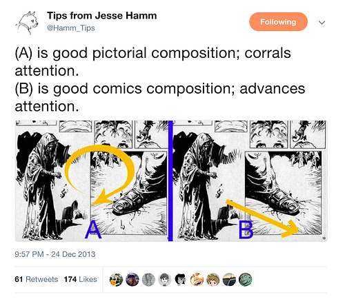
I do draw those arrows on my own work, but it tends to be a really early stage thing, at the point where my thumbnails are illegible to anyone but me, and in later sketches it's drawn very lightly, so it's tough to find Actual Examples without just drawing incomprehensible arrows on my own work. But here's kind of how I like... approach it I guess?


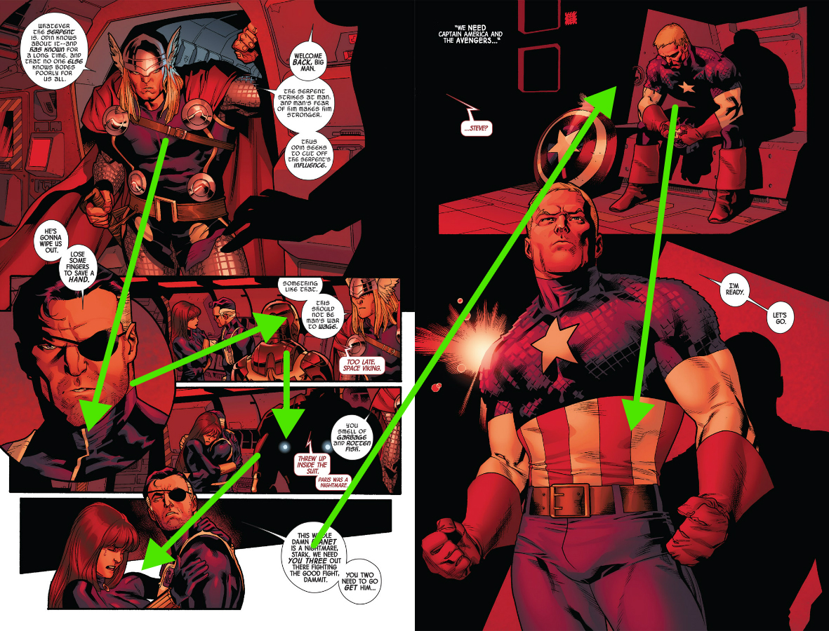
A lot of times I do sort of start sketching those lines, just to give me a sense of "this panel should flow into that panel" when I'm just starting out. This is how the readers eye will naturally scan! These aren't like, the FINAL PATH OF THE EYE, because that gets more complicated when I actually start sketching figures in, but

the important part is kinda how they flow into each other -- this isn't so much a thought of "THERE MUST BE AN ART ELEMENT POINTING AT THE NEXT PANEL" -- tho sometimes that's true -- it's more that I want to make sure I'm pointing things in the "right" direction and not leading away from the place I want a reader to look next.


so for example, in this hypothetical setup, I'd face the character so he's looking in the direction we're next going to be looking, because it's natural to follow his eyes. (You can use stuff like this to INTENTIONALLY disorient readers but in most cases that's something you want to avoid)

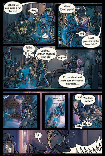
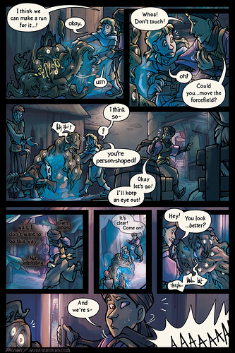
I do have a small example of when this came up in my own comic, in the way word balloons were laid out! This is from my patreon but it's a few months old at this point so I guess, consider it a sneak peek of patreon content. xD

I had dialogue laid out like this initially:

this created flow problems in two places -- we would read the reaction before we actually got to the thing that was being reacted to:

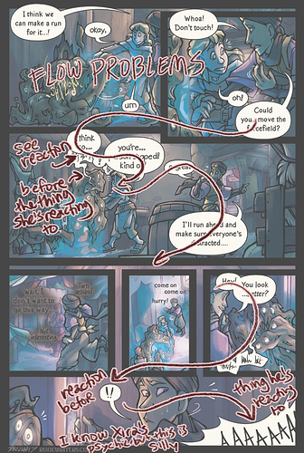
I rearranged the problem balloons to get this:

The break in balloons between "i think so" and "you're person shaped" gives us a chance to stop and see her face, and see what she's reacting to. That's not perfect, but it was an improvement so I went with it!
Note also that this version, the "I think so" balloon is more in line with that flow path from panel 2 to panel 3, whereas the last one required our eyes to do more upwards gymnastics to get there which made it a bit more awkward.

For the last panel, I still needed a word balloon in the same spot as the "!!" balloon (to pull your eye over to that side of the panel, so you'd see Xira's nervous face instead of jumping straight down to the screaming), but instead of having that be the reaction to the screaming, it's him starting to say "we're safe!" Changing it to a cut-off statement means the timing follows the order we're reading it in a lot better. You move to his word balloon, "hear" it cut abruptly, and then see him reacting to a scream -- approximately what would actually happen if you were in the room watching this.

So that's kind of how the idea of "flow" affects my thought process? A lot of it is very loose for me, not so much in the sense of "art elements must create literal path from panel to panel" but more like, the motion of figures and the direction that characters are looking should play into the path our eyes are travelling, so that we kind of follow-through that motion into the next panel -- and word balloons play a HUGE role in this since we're trained to look for the next balloon; this plays into making sure we read the balloons in the right order, that we don't accidentally run into a balloon early (which might not confuse us if we can tell it's not the "next" one, but does feel awkward and break immersion) and can sometimes be used to move the eye around the page by counting on the reader to jump to the next balloon.

Does this hit on any of the things you were wondering about? If I'm kind of missing the actual question or you have questions about anything that I described strangely, by all means feel free to ask or clarify and I'll be happy to see if I can put my thoughts into words more clearly!! ;u;

If you are formatting for smartphones, and are using the scroll format, just focus on getting the reader to look down the page.

And for any format, word balloons are a part of the composition, I use them to direct the reader as well. Use shadows as arrows pointing the reader to areas of emphasis. Practice will help it happen naturally :slight_smile:

this thread by @niah146 has some interesting discussions about flow

personally i think flows smth i need to work on / think about consciously more, so currently my flow is mostly.. bad as hell

I think it's a great way to do things, but I personally tend to focus more on technical indicators of reading direction. Flow is a method that is great when used well, but becomes more confusing or can throw a reader off if a creator gets so far into it that they end up using it in a less than favorable manner.

One example is a page the op posted:

5

What I'm talking about here is the lower part of the page on the right. Since the creator relies too much on flow, they assume that the reader will automatically know to follow the three speech bubbles on the right in succession, and then move on to the one attatched to the next panel to the left. But this would be wrong. Some readers do, yes, but some readers will stop and go "wait, do I move on downwards or leftward first and then back to here and downwards?" Not all readers think the way you do, especially not if you're a comic nerd who thinks in creator methods rather than casual reader experience. I would say that more emotionally leaning individuals are more likely to automatically follow flow, whereas more abstractly thinking individuals will try to apply reader direction rules.

An easy way to avoid it in this case would have been to just not let the speech bubble in the left panel bleed out into the panel before it. It's a fun thing to do, but bleeding a bubble from one panel into the other is preferrably only done when it does not cause any direction confusion.
And yes, I see that the mangaka has tried to avoid direction confusion by the second speech bubble in the problematic panel overlapping the one prior to it, but since the third one hangs loosely, it still causes confusion for some readers.

So yeah, it's a great tool, but I would suggest that people experimenting with it make sure to use it with care!

Nope, this is great! I love seeing other artists process and this did clear things up a bit. It'll give me something to think about the next time I thumbnail.

Also like to add, understanding the fundamentals of drawing will give you a natural sense of how things should flow on a page. Rythm, line, etc.... all those fundamentals will prepare you for this.

Understanding the fundamentals of design will totally make panel flow your bitch :slight_smile:

So practicing good drawing will make your comic pages better, just how it is. I find a lot of comic artists dive right into drawing comics, without learning how to really draw... and I myself was guilty of this at one point... its never to late to figure it out.

After working on comics for 10+ years and more than 1000 pages created i'm lucky I even get page and bubble composition to look somewhat unique.