
The cover has a lot of personality and pops up. The anatomy could be better, but the style is there, just needs a bit of polishing. The characters are recognizable, the dialogue is snappy and the description works. The main issue is the inconsistency of the art, but apart from that, you have an interesting style of narrative. I love you took your time in the first chapter to create an atmosphere.
The art is what it is, I feel like the description sells a more action packed story and the art gives itself more to comedy hijinks.
Panelling feels a bit rough, you could get more mileage by having gutters between each pannel or using a webtoon esque format with the panels split apart, allowing them to have more individual impact and avoid blending them together. Plus the lines around the panels being so rough give the comic a feeling of being unpolished and messy. I checked the later chapters and you improved a bit, but there is a lot of room to improve the panelling.
I'm just doing the first
Is a biographical 4-koma so there aren't many comments about the concept or the description, it's what's on the text.
I find it jarring the use of Japanese words so often, people who aren't in the know won't get it half of the time. Some of your jokes fall flat, not because they're bad, but because they've been really overused. Writers talking about how hard being a writer is almost as old as time.
The art is serviceable for the concept, nothing groundbreaking.
https://tapas.io/series/So-Childish1
I await to hear your critique/opinion
I think the description could be a bit less general and more focused on something. It doesn't give me a hook or a point of interest.
The art is top tier, among everyone on this thread, to my opinion, you have the best art.
I loved the narrative device of the child reading a book, is tried and through, but still works and you make it work perfectly. Kudos to you and your artist.
I feel the description is a bit too vague, you introduce a concept but don't give any explanations about it.
The cover could use some work, there are many really cool free fonts you can find online to improve it for starters. And consider saving to get an artist to do your cover.
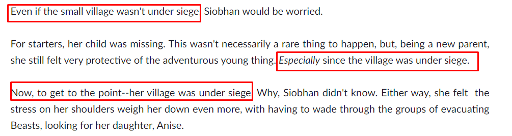
I don't know if the village is under siege.
Joking aside, if this was the first thing I read in a book I opened a bookstore, I wouldn't continue, because it feels like the information would keep being repeated.
First, put your links under the description, not as the first line.
The description has a lot of issues, like sentences that are too long and have to many commas and a couple of grammar mistakes.
The art is good, maybe a bit flat, could use half tones or more shading.
Comic is a visual medium and is better to show, rather than just tell. We learn a lot about Cody on the first pages, but everything is told to us, we don't see it. Talking to himself is the easiest, and dare I say cheapest, way to dunk exposition. You could have used a friend at the very least to make it sound more natural, show him stepping on puddles, visually giving us cues both to his lack of computer and his bad luck.
Thank you for the feedback! The link is there because of the dashboard link, but to be fair, I haven't posted much on deviantArt lately so it's only useless. And thank you for checking it out even if the concept is not your favorite! Hopefully I will get better at storytelling by showing more rather than telling.
I can't? Its automatic from the page. So, yeah.
English is not my first tongue, so also, yeah. I do my best with the little I have.
Absolutely agree! This are the things that I can't learn just by doing. That must be told by an outside eye so I can catch it quicker than I could on my own.
Thank you very much for the honest review @Kuma!
Hello! I've already reviewed Centris a bit, but I have to say that your cover art is gorgeous and definitely drew me in. The summary doesn't draw me in all that much, because I'm not that much of a fantasy nerd, but I like that you introduce the main plot threads quickly. I also found one error, "is, without realizing, drafted to become a paw in the silent war between the factions of the court". I believe it should be "pawn" instead? Aside from that, there's a little bit of wordiness that doesn't work in your favor. For a bit of a catchier blurb, you might want to condense it a bit. For example, you could edit the sentence above into "a young mage ... is unwittingly drafted into the silent war between the factions of the court." or "a young mage unwittingly becomes a pawn in the silent war between the factions." Cutting out words and phrases that mess with the rhythm will help a lot. It's also just a lot of info for a blurb.
I have a few concerns for the hook of this one. First is the cover, though I can't do much about it because I have no money to spare for commissions. It doesn't really strike me as a BL cover, and I also think that on Tapas, characters sell really well, so having a cover without that might drag me down. There's also the fact that my setting is based on the Joseon dynasty, but there's nothing on my cover to represent that, so the reader would have to look into the tags and my blurb to get that part. Beyond that, my blurb might actually be a bit too short. I really try to walk the line of not revealing too much while still showing the core of my story to draw people in. I don't want to misrepresent it. Anywho, let me know what you think!