10 / 16
Mar 2021

I have finished up my new art cover finally. But can't tell which one is better. I like the blue curtains more and the ambience. But the spine. Should I change the color of it? I can change everything but the peoples clothes and the red text. It has to be that way because of my story content. Its a literal scene in my novel so the characters and scene are what they are. And my story is about the red threads of fate so the red color has to stay.
Version A


Version B

  • created

    Mar '21
  • last reply

    Mar '21
  • 15

    replies

  • 559

    views

  • 7

    users

  • 23

    likes

First of all: Your art is gorgeous.

Im kinda blind to red (in the sense red is too strong for my eyes idk why) but I think the problem here is not the color per se but the font when it come to certain colors togheter and competing in strenght. Id rather pick A and add that cyanish shadow in the back of the letters you put in the cover.

There’s not a big difference between them for me, but I prefer A slightly. But I have to say I’m not a super big fan of the red text and purple clothing together. I love the art though, it looks really good!

Ah! Thank you I see what you mean now. That is a fantastic Idea
I will do that right now

Ahh this is a really good cover~ very pretty!

Hmm I suppose the main thing for me is the over all saturation, maybe it could be a bit more balanced. Idk also personal taste thing. I've been tryign to do more novel covers lately so I gave it a shot and played with some ideas, maybe it can help you.

I like the first one better. The second one is too blue. The other one is more balanced and with the dark background and the white/see through curtain, it makes the two characters stand out more.

Aahh I already merged the layers and it won't let me go back far enough. It was something I did quickly in a corner of an already open file. Sorry! If I knew would have kept it for you.

Feel free to ask me what I did if there's anything you want to know.

I ended up being inspired by your image and you guys really helped with the color correction.
This is what the finished product ended up looking like. XD
Thanks for everyones help

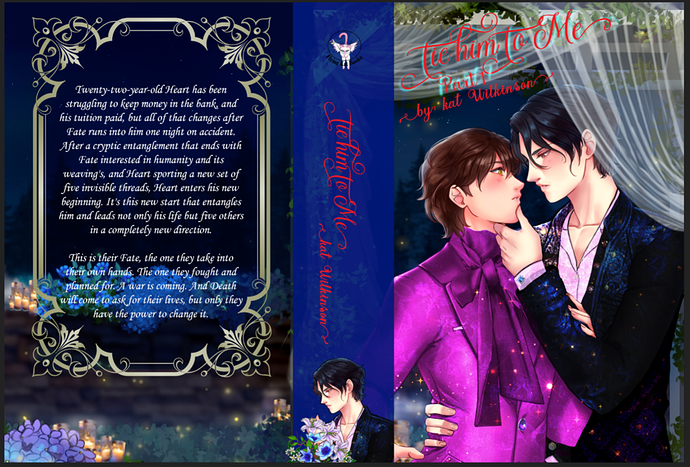
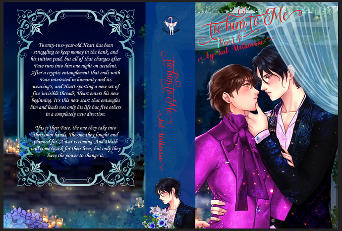
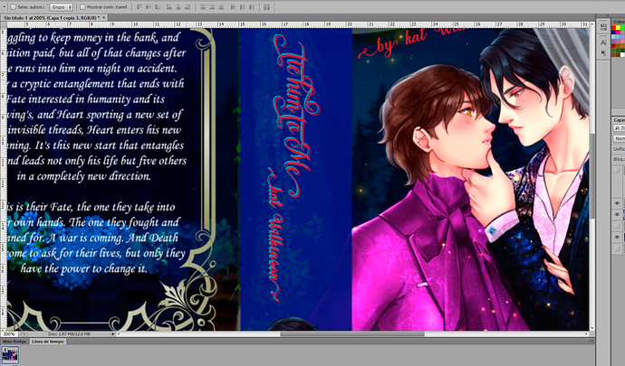
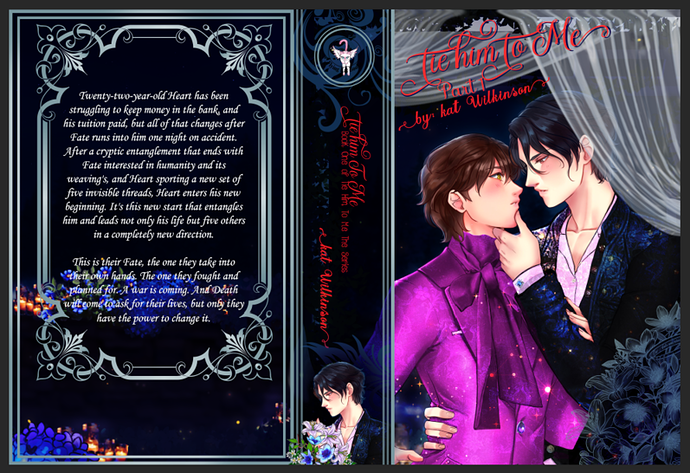
Yes, I like this third one a lot better--reads more YA romance than the others, which felt geared younger because they were so saturated.

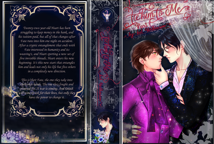
The only note would be to maybe bring back some of that flower action in the back of the book on the right side, right now it's left heavy because you got blue flowers and candles only on the left visable.

It looks great! It was already pretty but now it has this more mature classy feel to it and the values read better as well.

I actually like this one its not very eye draining well to me it isn't because my eyes doesn't really adjust to certain colors that well lol

but nonetheless I like what you have done with this one