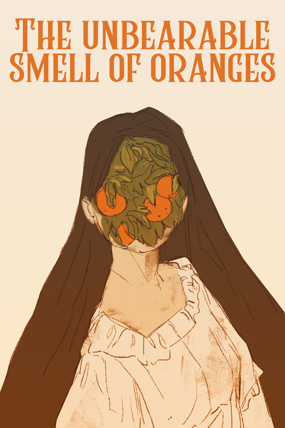
In part mine is designed like this because what I initially tried wasn't working and I had to change some things around... But mostly I wanted to show the tension between the two main characters, who start off hating each other, and to hint at the secret they come to share/kind of begrudging interest that develops as they get to know each other. Did kind of a spooky night setting because it eventually falls more into the horror genre, but it takes a while to get there so it's currently listed under drama as its primary genre so people don't get too impatient waiting for the horror.
Nachos Con Carne's cover art is based off a 4th of July/Canada Day piece of character art1 I made a few years back. One of my main characters--Terry on the right--is from Canada.
We're just about to meet a new character in the Tapas/Webtoon continuity in the chapters to come, so I plan to update it later this year.

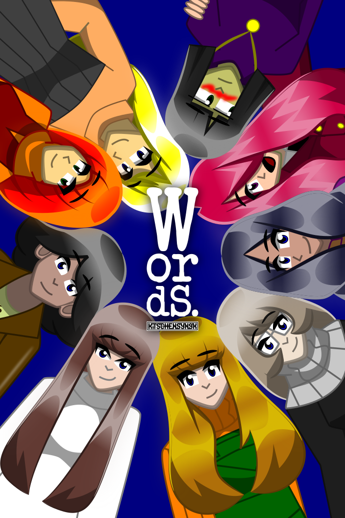
For the Words. cover, I used a piece I made for a local art show last year in which I intended to show off the characters in it.
This is the upcoming cover for my third chapter that i'll be posting next week:
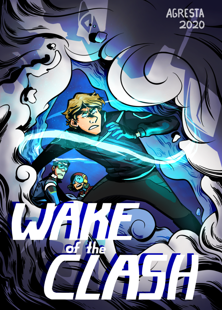
Its always a tricky process for me to choose what to draw for chapter covers. I went in this direction because this chapter begins with an altercation, so I have my protagonist and his co-stars standing in defensive positions. Later on (light spoilers) I'll be re-introducing some characters from his past, which i'm pretty excited about, so I set the three of them in a cloud-filled environment, an allusion to one of the upcoming character's power, and re-used a theme from a previous cover with the looming shadow to foreshadow(lol) another.
Also i just realized I should probably change the year to reflect the date Chapter 3 starts, and not the date it was drawn on aahaha!
For mine, I really wanted to get the decade feel down pat first. I went with a font that is often used by 70s posters and album art, something a bit like the logo for Yes or Budgie, but not quite something like Genesis. Progressive rock is a huge inspiration for everything I do, so I try to take my influence from things surrounding that genre, including aesthetic. I also love using the color purple, my natural color choices work well for the era, I think. 

We have Edwin at a record store, because music is an important part of the setting. While Edwin is no musician, he is certainly in the musician circle, and he's looking through the records, all featuring bands/musicians in the story, though some more important than others. In fact, the one he's holding has a particular importance in the story, but that happens way later...
Here's my cover. I didn't put a huge amount of thought into the composition, so I'll reverse engineer an explanation for my decisions after the fact. Like a champion.
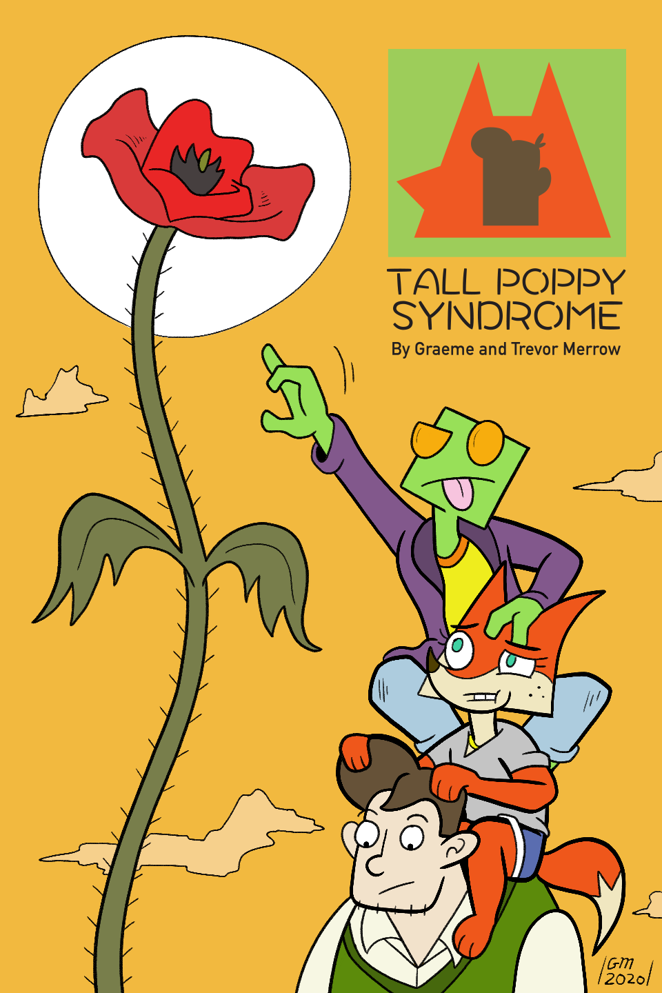
"Tall Poppy Syndrome" is an expression that means: a secret desire to see successful people fail. Building off of that, I have my three main characters reaching towards the top of a tall poppy, reflecting their combined desire to be successful, despite the fact that success is out of reach.
Jim is on the bottom of the character stack, as he is submissive and everyone walks all over him (This is also the reason his head is smallest in the icon in the upper right corner).
The color scheme is warm because I like warm color schemes. That is a totally valid reason.
Cool idea! Here's my novel cover:
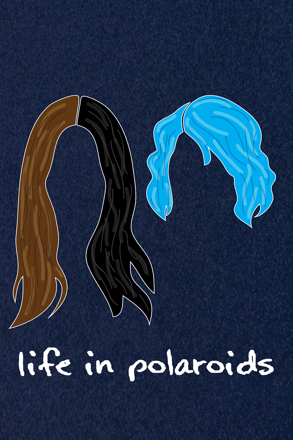
Throughout the book, the two main characters dye their hair twice, ending up like this. It's a very outward reflection of clear character development and confidence growth for one, while it's symbolic for the other as well, just less obviously so (and a bit more spoiler-y than I would like to share). The entire book is wholly focused on these two characters and their backstories and growth, so it made sense to focus only on them, and I liked the aesthetic of only using hair. The background was a function of needing to not clash with or match any of the hair colors, which were already set by the book itself. The font was chosen to be reminiscent of handwriting, which I feel fits with the general polaroid aesthetic.
I also wanted to keep it very simple and clean to be striking at a glance and not require much time to take in, especially since covers display so small here. I played around with silhouettes of their faces from a profile view instead, but it never really worked.
Here's a link to the story. Still very early in the posting!

The story takes place after a devastating apocalypse, and as a result there is just smog and ash everywhere, so I looked for an image that could resemble that. The one I found just had this really quiet eeriness to it that appealed to me. it really had the somber and empty atmosphere I was looking for. then I added the campfire because that's the other part of the story, people sitting around a fire and telling their life stories. The font was chosen because it sort of felt like it was in tune with the dialogue style (very snappy, heavy swearing)
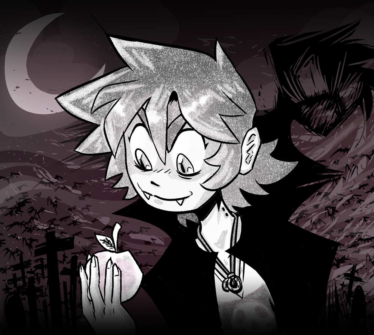
This is my current book's cover, without the text. It's called Grim & The Vampire.
The central subject is Graham, dressed up like a vampire. His high-collared jacket blends in with the silhouette of the living shadow that stalks him, and he's surrounded by crosses - maybe gravestones, maybe something else. Bats and birds and leaves are swirling around in a windy autumn vortex, under the crescent moon. The background is slightly pink, as well as the apple in Graham's hand (a subject of the book and minor allusion to Twilight), while Graham himself is in black and white, to suggest a silver-screen monster movie tone for the story. It is unclear whether Grim is the hero or the villain, whether the shadow is his own, and which one of them is the Grim and which one is the Vampire.
The overall effect is two entities leaving unmistakable impressions on each other, both bound by deathlessness and struggling for their own identity through supremacy over the other.
And... I might change it! I think it makes it too confusing as to which one is which, and it comes from an earlier build of the story where Graham WAS the vampire. I'll share the new one when I make it.
And here's the new one I just whipped up.

I decided to use my old toon style again.
I turned the shadow into a more defined figure of its own, imposing on the central subject, Graham. The protagonist is now more clearly the one who's Grim, while the shadow is the Vampire. A prop from the story, a scythe staff that's missing a blade, is aligned with an enlarged crescent moon that forms an optical illusion of a blade.
The soft pink tone has been relegated to the hoodie on Grim, as it's the most reader-adjacent object on the poster, creating an impression of depth through variation in saturation.
And the background objects, the crosses, are now taller and more imposing as well, creating a warped space that's perfect for a good scare.
Finally, the overall tone was kept pretty friendly to make sure people know what to expect from a PG-13 story.

For my cover I wanted to convey a dash of mystery. She wants you to go with her; follow and see where the waters take you. Also, for obvious reasons, paw prints in the sand. But shouldn't it be human foot prints? More intrigue for the reader! And if you look to the water, it has the faintest pride flag gleaming in the highlights, letting you know that everything in this comic is gay, including the entire ocean.
this one is going to e replaced, over the last few years I've realized that i can do better this was made in 2015 and I'd like to show what the series can truly represent better. :slight_smile

I wanted something to reflex the idea of the comic..... blood and action to be honest i don;t really plan what is a title cover cause i just wanna draw my characters the best i can 
20 days later

This is also a chapter cover for chapter 2, which happens mostly during day, so I wanted to kinda reflect that in the cover (though I think I might look into making a new one before the chapter's out because I changed the art style by literally just a couple pages into it). Most of the comic takes place in the corners of cities, so I figured an alleyway would fit, plus that's literally in the title.
As for the fire, I wanted for it to look as if the comic itself was being set aflame, since fire is such a big deal in the comic (like even within the first three pages tbh).

This cover was inspired by the film "The Man Who Fell to Earth" starring David Bowie. Bowie plays an alien character with a human appearance and there's this awesome part in the film where one of the characters gets an x-ray camera and sees the alien he really is inside, under the layers of human flesh. I took that idea and formed it into a metaphor, that under our soft skin there is this ticking. The person one may present on the outside, isn't the same on the inside and that's what my character Jung is. Jung is on the cover and he wears a mask to cover the scars of his past. On the outside he looks calm and quiet, but inside he has this raging storm of self-hatred. If one could take a camera and scan through all his layers, the pain he feels would be revealed. But technology is unable to read emotions well, and humans are the masters of making oneself look happier than we really are.
I used colored pencil on black paper. Usually, I go for watercolor because colored pencil takes too long, but I wanted to add more realism. The paper is bit textured to add the emphasis of a disturbed past. Jung has had a rough life and I wanted to show that visually.
The bicycle, train, guitar, dragon, and other weird things that are going on the picture are inspired by the film, "Paprika". I love surrealism and Satoshi Kon films and wanted to add to the chaos that Jung experiences in his life. Jung is very similar to Walter Mitty. He has an unusual imagination and often gets in trouble for daydreaming too much. He gets distracted easily as he sees imaginary worlds that no one else can see. He literally lives in his own head and it takes a lot of effort to bring him back to reality. Of course, his imagination is a sign of his intelligence as he is more creative than others, but many people don't see it as such as he is often spaced out in conversations. That's what I like about Jung, and this is all I have to say about my cover


My goal is to show that this family is united and all of them have different characteristics. Nimbus (to the left) is protective of her family, so she's holding a gun and looking stern. Keen (to the right) is more relaxed and doesn't get stressed very easy, so she is thoughtful, but also cautious. Cozmata at the center is the protagonist and wants to explore the universe, but she is sheltered by her moms. So she is looking in awe at the star crossing the sky at the top of the cover. The fact that they are in space is meant to represent just how vast their universe is. The darker tones are meant to propose that there is something shady happening in the story and they are in some kind of danger. Overall, It's mostly meant to showcase the characters and setting to potential viewers.
Cover of my new series. My last couple covers were focused on the action, but for this one I wanted to make sure the character's faces were more emphasized.
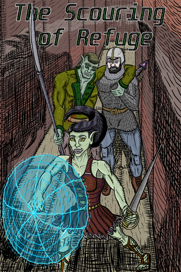
This cover hints at the action to come with the shadows along each side of the wall. Can you make out the lion and snake sillhouette on each side? I want to bring up the question, is this two separate creatures or something else? And of course the heroine Rhunal stepping forward boldly to protect her injured friend Thesh, the orc behind her.
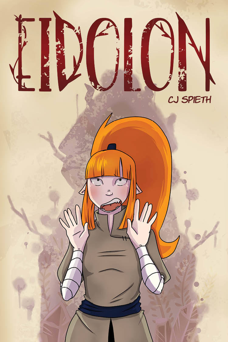
For my cover, I wanted to show a looming threat over the character. I kept that threat as a shadow for the mystery and to incorporate smaller imagery in it. Suck as the ferns and crystals. At the time of crating this cover, I only had 1 main character, for the my senior thesis. Although I have more characters, I need to keep it simple enough, only pertaining to the 1st chapter. I have been thinking of changing the cover later with more characters, now that I can put more into it.