13 / 16
Oct 2019

I recently started posting my comic on Tapas and on Webtoons, and quickly threw together an icon from old artwork of the characters last week. While it wasn't necessarily ~bad~ I realized it poorly served as an icon: the characters faces get cut off in the Webtoons round icon, and you can't tell what their actions are in the image (in the full image they're shopping for clothes)

Now it looks like this, which I feel is a huge improvement.

So I want to ask what catches your eyes as appealing icon art? What works? It seems to be ideal to have one character (two max?) that somehow sets the tone of work (although mine's honestly just my MC lookin cute ahah//). It's such a small piece of art real estate to advertise your comic and could be something to take into consideration, especially considering how competitive it is already. Rambling so excuse me if I'm just talking to air

  • created

    Oct '19
  • last reply

    Oct '19
  • 15

    replies

  • 1.6k

    views

  • 10

    users

  • 40

    likes

  • 4

    links

One of my go to's for people looking for advice on icons is this Medium article from Tapas themselves


Like you said one to two characters tops is usually ideal and artwork that reflects the theme of feel of the story or what it's about.

The main points are usually that it gives a look into the main cast or lead character, gives a sense of the storys feel (drama, romance, horror etc) and is a clear/accurate representation of the comics artwork (obviously styles change and your illustration style may vary from your comic artstyle but so long as it gives a general idea your usually okay)

This is a very useful resource, it's a good thing to read before jumping into posting I feel... It's a comicker's equivalent of a book cover anyhow.

This is actually something I wonder about a great deal because my icon is in color but my comic is almost entirely black and white. Like I still want to keep my all color icon, but is it lying to my audience? I'm not sure. Especially since a lot of good black and white authors have a color icon.

I don't think it's entirely misleading for a black and white comic to have a color icon because in an advertising sense it helps your work to stand out or not disappear among a lot of other bright icons. Some B/W comics have B/W icons and use the layout of the design to garner interest while some stick to color. If anything I think it's more presentation than style; if the content speaks for itself and the style feels consistent it's usually okay

Not at all, all manga is advertised this way as well as a lot of comics. It's getting more competitive with color though as it can be an easy way to draw in readers with full color comics. the time sink is palpable though q__q

Yep, people judge a story by its 'cover' all the time, a thumbnail is basically a reduced cover where you gotta say a lot more with even less real estate.
2 characters are definitely a must if the story is centered around their relationship, whether romantic or otherwise!

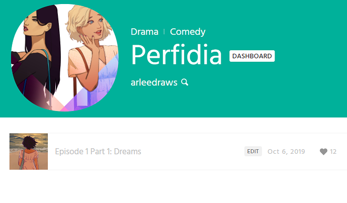
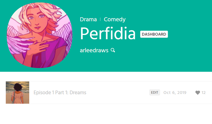
I do like your new icon! But it leads me to think it's a fantasy series with the wings, compared to the more regular/contemporary feel of the first icon. Unless that IS what you're going for!

Personally, I give a chance to lots of things regardless of how their icons appear; particularly with novels, since I know a lot of writers don't have a background in visual art/design.

But one thing's for certain: If I see a anime/manga/webtoon thumbnail, I'm expecting anime/manga/webtoon tropes for better or for worse.

Hmm yes, you're definitely getting me thinking :grimacing: Because you're right, the story is completely grounded in reality (there's lots of symbolism with wings/birds) and uh... I am VERY inspired by shoujo manga! The tropes... I'm concious of avoiding. But I'm keeping that stored away to revisit in the future to be more straightforward about what I'm advertising. Thank you!

Hmmm... Let us know if the icon change affects how many subs you get per update.

I definitely will update back here when I do! I'll try to check with friends/readers later on if this icon affected what they expected from the story.

Icons need to be brief and impactful. I got Stardust scowling at the reader and I got the psychopomp looking at a crow. They both have different tones and impressions.

I've been thinking about this lately. I check the fresh comics section most days (it's usually the only way to locate more obscure works), and I noticed that I usually only open a comic if the art is somehow interesting. The title attracts me much less.

I originally just choose a snapshat of a character that appeared in one page of mine (see below). It's hardly representative of anything. I never really tried to make it at all attractive. The tapas article is really interesting here.

I will add though that, in my opinion, some of the most popular series on Tapas don't have great icon art. While some less than popular ones ahve great art. How much it really matters is an interesting question.

They might not have masterpieces on the icon art, but what matters is contrast to stand out from letters-on-a-background or extremely messy icons. I'm looking through Popular and all of them either have two characters on a well-cropped picture, or a single character/object with good contrast against the background. Your does stand out because it's very simple, but the rules are still the same in that you made it contrasting and readable!

I think if there's one good rule for icon art is that it should be simple!

I'm still getting to grips with icon stuff. and whether mine is actually doing a good job or whether maybe the colours are TOO poppy compared to other comics around (like, my thought process was, "I want this to really stand out when you're scrolling through a bunch of comics", but part of me worries that it has the opposite effect and to people browsing feels more like "This comic feels out of place on Tapas, it's too tonally different from the comics I like") and whether I'd actually increase people clicking on it if it had a character looking AT the viewer and engaging them rather than into the distance. Perhaps it was also a mistake to have the character shown not based on anything in the prologue, which we're about a third of the way through. I thought it'd set up excitement for what the comic is actually GOING to be (young adults fighting monsters with big swords), but it could be that that's a hard sell when the power level of the prologue is so low by comparison...aaaagh, thumbnails are hard!

I say make your thumbnail in colour! It's nice to see the characters in colour here and there!, and I've never had anyone tell me they were upset that they expected my comic to be in colour!

I want my icon to make people go "hm, what's this all about?" I took a cue from lots of other popular comics and stuck my main characters on the front. Then I made it bloody and dramatic and supernatural, just like the story is!