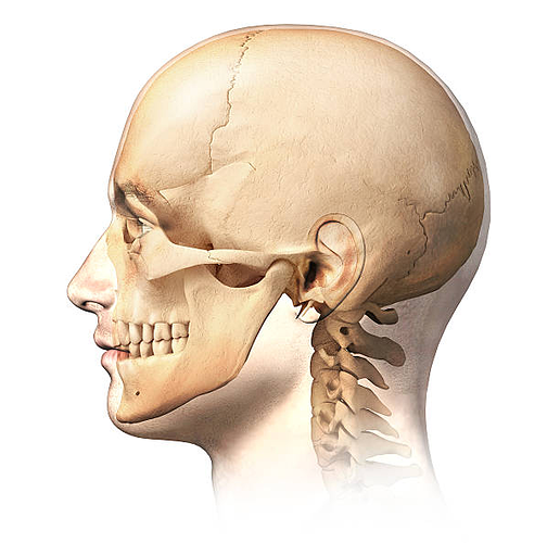
It’s been a while~. I just felt like writing a tutorial today.
So it really bugs me when comic artists can’t draw profiles…particularly, artists who’ve clearly put a lot of effort into studying the rest of the character’s anatomy. Like, drawing people from angles other than ‘front’ and/or ‘¾ view’ shouldn’t be an afterthought; if your characters live in a 3D space, you should know how to draw them as 3D objects with multiple dimensions.
It’s not all artists’ fault, though…like I said in the predecessor to this thread, people don’t teach this enough. Open up your average everyday ‘how to draw’ book, and look at how often they depict faces from frontal views…and then look at how often they depict faces from side views. In the books I’ve looked at, the difference is stark…I got to see individual features from the side (eyes, noses, always ears) but I mostly had to rely on my own reference and imagination to put it all together.
And so, without further ado, here are the things I’ve learned.
Basic shape
So here’s some generic bald profiles, one with sharp features (and an Adam’s apple), one with some rounder features (diversity is important) and one with some more child-like proportions.
And the basic shape behind each of them is this bad boy:
This helps me keep all the facial features aligned with each other. Faces are actually pretty linear in terms of feature placement; if you throw too many curves in there you start traveling into the uncanny valley. And yes, this still holds true for fat people (unfortunately I don’t know enough about fat to feature it in any tutorial yet, but I’m working on it).
The skull starts with a sharp angle to denote the chin, then curves up and around to give a sort of expanded teardrop shape. Then the neck is just about in the lateral middle of this, positioned to cut through the core of the skull at a slight angle.
After you have the basic shape, all that remains is to place the features. I like to do this by remembering a series of proportion rules, which will be included in this tutorial for your enrichment~.
Nose
I start with the nose first, since it’s kinda the defining element of a face in profile. The nose is basically smack dab in the middle of the face, an equal distance from the top of the forehead and the bottom of the chin.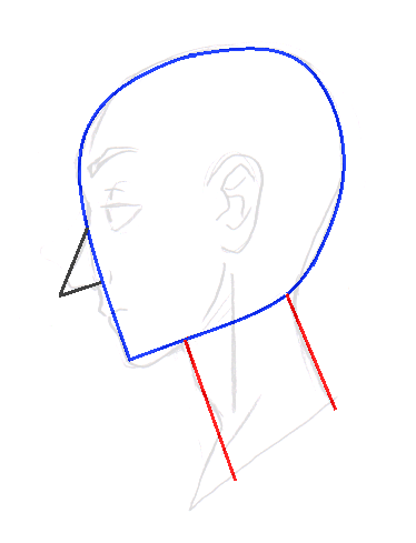
Now there are three main characteristics that I use to shape a nose: the bridge, the tip, and the tip angle.
Bridges can be straight or bent (a slight angle near the top of the bridge). Nose tips can have a wide variety of shapes, from razor-sharp to squarish to round. And the angle of the nose tip is just what it sounds like—it determines whether the person has an ‘upturned’ nose or a ‘downturned’ (hooked) one. You can mix and match these traits to design all kinds of noses.
Mouth
Next I usually do the lips…the toughest part of this is correctly shaping the top lip. Although it may seem small and insignificant, the space between the edge of the lip and the tip of the nose is key to defining the art style…in cartoony styles, for instance, it will often just be a straight line. And on an anime ‘snout’, it doesn’t exist (we’ll come back to that later).
But realistically, it’s usually straight until you’re almost at the lip, then it curves up and out in accordance with the lip shape. For thin, sharp lips, the straight part is longer, and the curve is short and sweet, with the edge of the lip meeting the mouth practically in a straight line.
For full, round lips, the straight part is either super short or practically nonexistent (do what you gotta do) and the curve takes up most of the outline, coming out and going down around to the mouth in a nice smooth, vaguely triangular curve. Although you can do full lips with sharp edges, too, if you want…the important factors are the proportions and the size.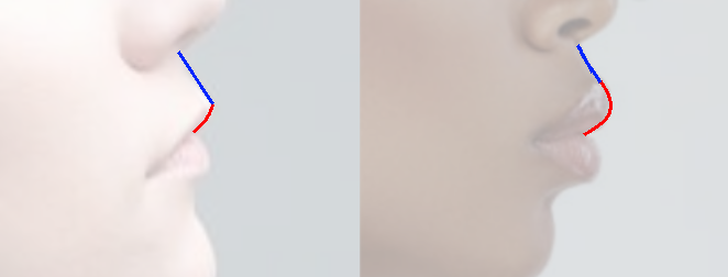
Chin
Continuing on down…the chin is pretty easy, as long as you follow the basic shape and don’t screw it up. ^^ Ideally you want to curve down under that straight line at least a little bit as you round it out, and subtly come back up to it.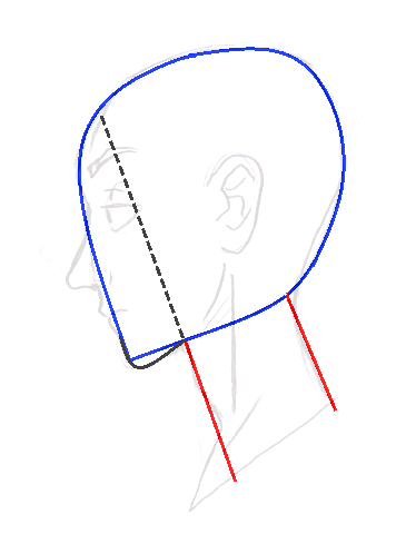
Stop when you get in line with the rear edge of the eye. “But you haven’t gotten to the eye yet, Doki…” Yes, I know. But the thing is, I didn’t actually discover this rule until I started writing this tutorial; before this I just knew it instinctively. =/ It happens.
But the good thing about having proportion rules is that when instinct fails and you draw something that looks off, now you know why and how to fix it. ^^
Neck
Just draw it. 6u6;; Necks are kind of weird…sometimes they curve, sometimes they’re fairly straight. Often it depends on the angle of the head itself, and the amount of body fat between the neck and chin (which varies from person to person).
Adam’s apples are weird too; they really interrupt the archetypal neck shape. I remember when I was a kid and I first noticed that they existed; I flatly refused to draw them for a couple years (with my art styles, it wasn’t hard). ^^; They just look so incorrect when you’re not used to them…like when you’ve spent your whole childhood drawing children and anime girls…
Anyway, the way I go about them is to just draw the normal neck, and then add a triangular or trapezoidal shape with its point right in the middle. And when I say trapezoidal, I mean that the fourth side should meet the chin, widening the neck a bit. A triangular shape is for a subtler/sharper Adam’s apple that doesn’t widen the neck.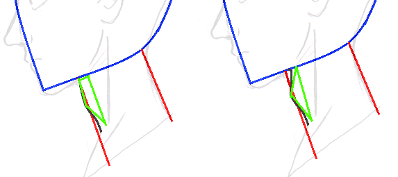
Ear
The ear is pretty much smack dab in the middle of the skull. In terms of size, it should be about the same size as the nose, and with the same alignment.
Do I have to talk about drawing ears here…? I guess I might as well…I feel like it’s one of those things you do with your heart, though; the level of detail in the auricle varies from artist to artist, regardless of style. But here’s what I do:
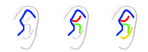
(1) First I start with the tragus and outline the helix (we’re gonna use lots of anatomical terms today~), going around all the way to the back of the ear. This curve is the most commonly-used ear detail; super-deformed versions of this can be seen in all sorts of cartoons (at its simplest, it’s just the helix outline).
(2) Then I draw the antehelix (bottom curve) and its crural (top curve). Sometimes the crural meets the helix outline, and sometimes it doesn’t (like I said, draw it with your heart).
(3) Finally I draw the anti-tragus, fusing it with the tubercle to emphasize the outer rim of the ear and the earlobe. And that’s a typical realistic ear for me.
Eye
I used to be better at this. ^^; I’ve started incorporating this way of drawing eyes into my more cartoony styles, and now all I have in my head is fusion strategies, not the realistic original. But this is how it goes: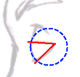
A side view of an eye is basically a pair of rays that cut the circle that is the eye into a slice with a rounded edge. The rays represent the eyelids, and if the eye closes or opens wider, the angle between the rays increases or decreases accordingly.
The placement of the eye should be around the top of the nose, extending about a third of the way down. You can extend it further down or further up to play with the art style:
Back of the head
This is one area where I’ve seen many an artist’s profile fall apart. ^^; A lot of the time you don’t even have to worry about drawing this part of the head, because characters tend to have enough hair to cover it up or obscure its shape. But when you do need to draw someone with a shorter hairstyle, or maybe someone wearing a mask, you gotta know how to do this.
The back of the skull is a round, steady curve so far, but we need to start tapering it back to the neck at some point. This point is generally in line with the middle of the ear. Make a turn, relax the curve into a straighter line, and draw until you hit the back of the neck. 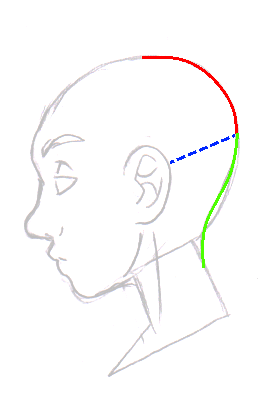
See, it’s not so hard~
Finishing touches
We ain’t done yet! Make sure your profile looks as good as it can with a few more minor details:
-You can detail the eyelid with a vague T-shape that arcs down to the corner of the eye. This is just something I do.
-A resting eyebrow sits roughly one eye-height above the eyeball. Draw it however you like, but try not to have it touch the edge of the face (unless your character has a unibrow).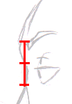
-The forehead starts at the upper eyelid and slants forward slightly. This little detail is very important for realistic drawings; if you ever feel like your foreheads look weird or undefined, you’re probably forgetting about this!
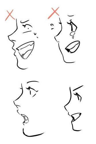
-You can make your profiles look 200% more realistic with just two simple lines: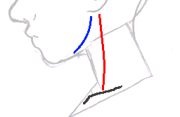
The first is the jawline (blue), running from the front of the earlobe and curving around the mandible to the chin. It looks best when it floats; don’t let it actually touch the other lines.
The second line is on the neck, and this line is created by a muscle called the sternocleidomastoid (red). It runs from right behind the earlobe down to the clavicle. If you curve it, do it very slightly; this line should be mostly straight.
Anime Corner~
As promised, we’re gonna briefly cover anime profiles!
So the anime ‘snout’ fuses the space between the tip of the nose and the edge of the lip, and pulls the chin forward into the bottom lip for symmetry. The bridge of the nose (the structure that makes it look triangular) completely disappears, and the tip of the nose simply melds straight into the face.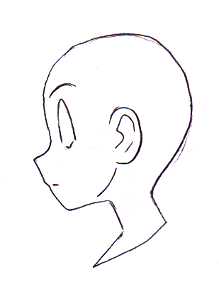
Sometimes snouts are smooth (lip-less), like in Western parody “anime” and in heavily stylized anime…but I think in most mainstream contemporary anime you see very subtle lips formed by a gentle indention below the tip of the nose. The mouth usually floats beside it without touching, until it’s opened (although in some styles, an open mouth also floats inside the face…but we’re not gonna get into that here).
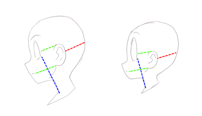
Anyway, take a look at the proportions…they’re actually fairly similar to a more realistic human profile. The chin still ends behind the eye, and the back of the head still tapers off at mid-ear. The ear is a little lower, though, lining up with the middle of the eye and the mouth, rather than the eye and nose.
The same goes for chibi proportions. Even though the eye extends so much further up, and the snout gets so much smaller, and the ear is even lower on the head, you can still see the patterns.
...Well, that was a long one. ^^; Even though I edited out quite a bit...as always, if you have any tips or tricks of your own to share, feel free~
created
 Aug '21
last reply
 Aug '21
- 7
replies
- 2.4k
views
- 6
users
- 27
likes
- 1
link


 )
)
