1 / 18
Sep 2017

It looks fun, a bit too fast paced with the few frames, but then again fitting in with the rest of the comic up to point there really isn't any fault! I loved the last especially "CHEATER!!!"

Keep it up I love the comic so far!

It looks like you took a video and cropped out all the interesting frames. Everybody's frozen in mid-parry. Should've captured the moment just before impact, or immediately after, as the defender throws their counterblow.

I agree with @melindemari the pacing is strange because of the few frames.

I think the lack of frames and the large black gutters make this scene a bit jagged. It feels very staged and unnatural. I don't sense any urgency in it at all. Although as its just a practice fight, so perhaps this was all intentional.

I think future fight scenes, when the stakes are higher for the characters, I wouldn't separate the frames with so much distance between them. Any time you add gaps between frames you slow down the pace. A good fight scene paneling will even some times have panels that overlap. Close, angular panels will help increase the anxiety and tension in your scene.

For example:
16

And then look how squishy these panels are:


The way this is paneled helps the reader feel the frustration and confusion of a real fight. I don't think something this bloody is appropriate for a practice fight, but I think it illustrates a point about urgency and flow.

Great advice! Thank you.
Panels are spaced much closer together on the desktop version on our website1, but I'm sure we could space them closer together for the mobile version as well.

If you look closely, while one sibling is striking, the other is getting ready to strike. However, we can see how it would be difficult to catch and will make it more obvious in the future. Thanks so much for the feedback! We appreciate it and will use all feedback we get to improve in the future.

OMG YES. It helped with the pacing so much! And I like that some of the panels overlap! Much better! I love it!

Isn't it amazing how just paneling can affect your story? I think it really highlights your beautiful art so much better. :slight_smile::heart:

It feels a lot better definitely gives more of a fight vibe now!

I have one more tip for future fight scenes though that I just thought of, I am'a gonna use this one of yours as example! the 4th frame could just be a close up from below on Inpherna & Banis then the 5th a side view from just above Anthis & Banis
This will give more emphasis on drama instead of trying to show all the fighters in each frame.

Nut spacing the panels as you did now sure did the trick in really bringing it some oomph!

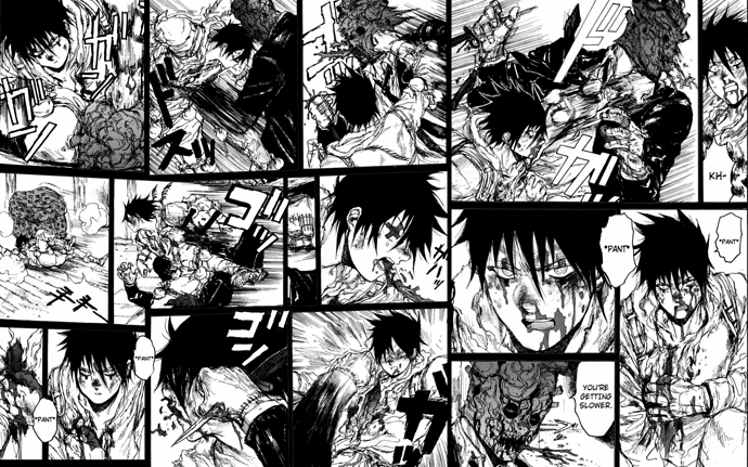
I think you could push the posing more. The impacts don't really feel like impacts to me. They sort of look like they are "going through" the motions, and there isn't a sense of weight or speed. This is also due in part to the far away camera. Don't be afraid to crop in close and focus on the impacts themselves.

The panel where she is running, have her angled forward more, and push out her back leg, it will make her seem like she is lunging instead of sort of jogging. The dude in the back could be squatting a bit more to show the build up of energy.

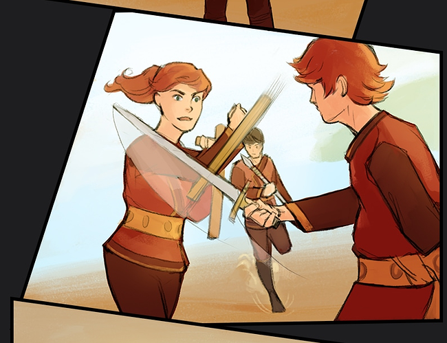
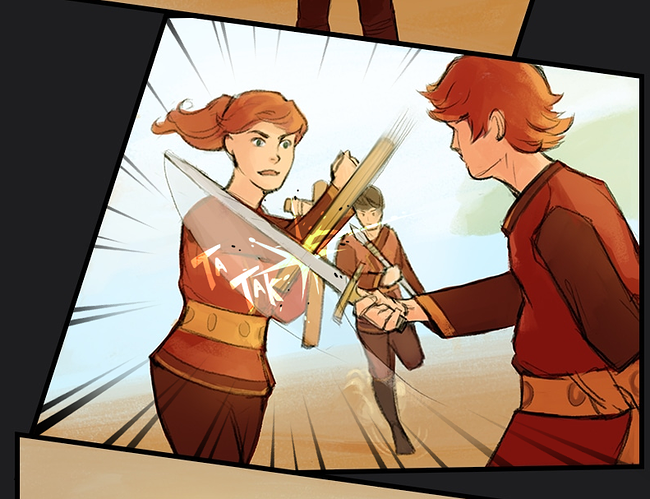
For the next panel you can exaggerate the sword and her weapon, make them a bit larger perhaps. I assume she is blocking him but the action doesn't really seem that way, it is more that she was trying to hit him and he made an easy block. If she was going to hit him and he blocked the motion lines don't indicate where she was trying to hit him.

For the next panel, you can indicate more energy by drawing the spear bowed and having the guy rotated more at the waist, and cropping the panel in closer.

The next one might be better broken into two panels, a close up of the sword hitting the spear, then her winding up to hit.

The next panel might be better from another angle, to show just how close/far she was from hitting him. The way it is staged right now it doesn't look like she was very close at all.

Overall, watch some fight scenes and view some other comics and see at what moment they choose to focus on, usually right at the hits, not the windups. Exaggerate things, the bends, the poses, the sizes to help with danger, and push the poses more so they look a bit more dynamic.

If you ever get a chance to read the "How to Draw the Marvel Way" I would highly recommend getting a copy.
The advice there for action poses are incredible, but here's the cliff-notes.

An action has a begining middle and end.
Never draw in the middle.
Always draw the wind up or the fully extended move.

That's how you impact.

Good luck.

I think it's pretty good, but it could use more emphasis on impact. Sound effects might help.

I think the key word people are repeating here is "impact" which is exactly what the fight seems to be lacking. Some indication of their weapons clashing would improve the scene immensely. The motions are on point and look smooth, but without a visual cue of some hit or damage being taken it all looks hollow.

It's almost as if they're not actually hitting each other but just whiffing each swing they take or stopping right before they make physical contact.

Some easy fixes you can make to add more weight are dynamic lining and/or sound effects.

Obviously this is just a simple example and you should adhere to your aesthetic more so than anything else, so try to make it your own. These "fixes" are fairly shallow, so keep in mind that creating a true sense of impact is more so on your ability to judge space and movement while applying the knowledge onto your own art style rather than quick visual effects.

agree on the above that it seems to be a static fight scene, but I find your drawings to be keen to detail and especially heartwarming!

how do you usually draw (ie. what equipment / software do you use)?

Wow thank You! We will take notes on this for our next fight scene.

We have been shying away from sound effects, but I think we will start using them.

Thank You! We are glad you enjoy our artwork.

Our artist uses photoshop CS6 and Wacom Intuos5. She uses a pencil brush for line and a oilpainting brush for coloring.

Lovely, I use a Wacom for my web comics as well. It's called Baby Alpaca's Adventures on WebToons. :slight_smile: