280 / 587
Mar 2020

Hard pill to swallow: they did not invest too much time and effort and $$$ on the redesign only to have it rolled back, just like that. No matter how much you ask for it. (they would've done so day1 if it was in the cards) The best they can do is just make it not suck as much as they possibly can. The core design will stay the same.

The faster you can make peace with that fact, the better you can adapt (if you plan to stay despite it all, that is lol)

Also, while the staff missed the mark big time, i think we need to chill and not scrutinize every single word they say. "can't comment" simply means that: can't comment. They literally confirmed they were not bought out so no need to keep pushing that narrative.

And here is the thing: they really don't have to listen to what the forum says. We are literally in the minority here. The vast majority of the creators don't even know there is a forum in the first place, or don't care there is one. As long as they can just upload their comic, they're satisfied. But they're going out of their way when they honestly don't have to look our way lol.

They screwed up big time but give them the benefit of the doubt.
And chill.

Just my two cents.

I wish I could send more than one heart for that comment.

Especially for this ^^^^ For real we're whining but here they are taking into consideration the feedback of 60-100 people.

Another problem that didn't seem like one until I started running into it every day - you can't middle click for new tabs with the new notifications widget. It still works on Library, so it's an odd ommission...

They kind of have to. This is the only communication they have with creators, and if they piss off creators too much, they'll go elsewhere and actively dissuade others from opening up shop on Tapas. That's revenue loss for them.
It's not just altruism.

At least they are listening. I'll take that as a positive regardless of whatever their motives might be. Not every company does listen. When Inkblazers was falling apart, they started banning anyone who criticized their decisions--at least, that's what other people said; I wasn't personally involved, so I don't have first hand knowledge.

@michaelson I have a bug to report - I was fiddling around with how Tapas looked on different browsers, opened it in Internet Explorer, and had this mild issue:


Anyways, given I don't know if anyone else has had this issue (and the low overall usage of IE) this is probably a lower priority fix, but I figured I should probably let someone know.

Thanks, Joanne. :slight_smile:

Though I found that out about an hour after my post and was too mad to edit my post, what with all the foraging we have to do now to find out simple stuff on this 'new design' of the site :unamused:

Why is everything important all hidden under weird symbols after this update. Even on fanfiction sites the option for font preference is at the top right corner of every page in plain sight.

And the new subscribe button is almost hugging the continue button. I actually went and accidentally unsubscribed from my own series after the page loaded and jumped. And now, instead of being the first sub of my own series, I am the 188th one. ::angry:

I do think it is funny how Tapas looks more like Webtoon but my little comic is suddenly getting more attention so I won't complain?... shrugs

Dear Tapas(tic),

Close to 90% of the active people here on the forum and possibly many more of the silent majority who don't know of the forum will be pleased to have the previous design and functionality of the site back, with some of the new improvements added.

Imagine 90% of your core providers happier than they are now, and how much more we will be inspired to do for this site, as well as bring more and more of our friends and acquaintances here.

It worked for the Sonic movie.

Yours sincerely,

The 90%

They really don't. Customer Support email is there for this. They can nuke the forums and not have to deal the handful but loud upset creators that is us, but they didn't so we can reach them easier.

I'll just say this: for anyone trying to speak for other creators -- don't.

Please only express your own feelings on the matter. But don't speak for me. While I have my own gripes about the new designs, I'll let that be known via the feedback survey. I've mostly been lurking on the matter, liking posts here and there, and the last thing I need is someone saying "mostly everyone is feeling this way, even those who aren't speaking". No, I'll say something if I feel I need to.

Do not act in my stead.

@Yoon
Sorry something not included in my feedback is a glitch when making comments on Safari (Don't know if anyone else has this issue). I haven't made any comments in the last few days so this just came up.
When trying to reply to someone's comment, there is a 50/50 shot I will suddenly be taken to a different page of that same comic. It happened twice. Once commenting on someone else's comic, and once responding to a reader on my own.

I don't mind the new interface, except for the bugs that have already been reported and the big issues that the team is already working on fixing. I like that the novels and comics are easier to read (imo).
BUT
I miss the yellow.
That's what got me to Tapas in the first place, and one the reasons I've been defending it: it looked warm and welcoming.
Now, it feels like a cold hospital room. The web is full of white sites, with some blue and green here and there. Tapas was colourful, and YELLOW.
Please, please team, bring the yellow back.
Thank you.

The Design
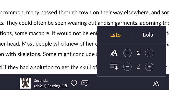
Okay, I have a few complaints about this new ''Design'', let's take a note from Gordon Ramsay and let's just say, it's bland. I have always liked simplicity, but this... this is too simple. Tapas colors are yellow, black and white, but now it's more like white on white with some black text on it.
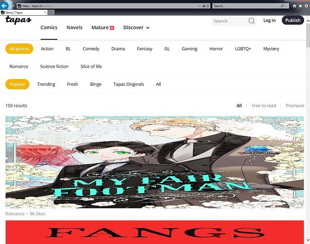
All I could tell from looking at this new design, is that the one who made it, must be a fan of Webtoons. It looks exactly the same. The reason I choose Tapas over Webtoons, was because I didn't like Webtoons design or interface, Tapas covered both, but now I might as well find a new site.
I also hope you bring back more of the community on the front page, because now, it's mostly premium comics on the front page, while the community is being swept under the rug. This one just makes me sad, there are so many new amazing artists that are starting for the first time, and they will never be noticed, unless one of the Tapas team reads it and recommends it to everyone, which we all know is very unlikely.

The Interface
I love the new way of clicking on comics, you now can choose whichever episode you like to start reading, you don't have to scroll for an eternity to get to the latest episode. It is brilliant!
I miss the support button, people who are reading a comic/novel, they will likely read it and move on. Who will bother to go back out, then click on details to then click support. I know you guys have the 3 lined button you can click, then click on support. But I think the support button should be right next to the ''like'' and the ''comment'' button.
I wish the creators could change which episode comes first, instead of deleting a whole bunch to then re-upload it all.
Why can't we mark multiple episodes at a time? Sometimes we want to clean up the comic, and being able to mark multiple episodes for deletion, would make the process so much faster, instead of deleting one at a time.
When you upload pages to an episode, you may have clicked on 1 wrong page, then you have to delete them all, then re-upload, because tapas won't let you just simply move a file up or down.

The new design reminds me of Webtoons, I liked the old design much more! I think the pc version and the mobile version looks just the same, whitch i think it makes it just so much harder to use on the pc. As a creater i really miss the add episode button the most. It was much easier to post before..

Another thing i find frusterating is it seems to be harder to discover smaller/new comics. Seems like all the premium and most popular comic is on the main site?

What i do wish for is a way to merge episodes together and delete more than one episode at a time. Also the idea of a dark mode sound nice. And please bring back the scrolling on the pages!