
@Yoon
Sorry something not included in my feedback is a glitch when making comments on Safari (Don't know if anyone else has this issue). I haven't made any comments in the last few days so this just came up.
When trying to reply to someone's comment, there is a 50/50 shot I will suddenly be taken to a different page of that same comic. It happened twice. Once commenting on someone else's comic, and once responding to a reader on my own.
I don't mind the new interface, except for the bugs that have already been reported and the big issues that the team is already working on fixing. I like that the novels and comics are easier to read (imo).
BUT
I miss the yellow.
That's what got me to Tapas in the first place, and one the reasons I've been defending it: it looked warm and welcoming.
Now, it feels like a cold hospital room. The web is full of white sites, with some blue and green here and there. Tapas was colourful, and YELLOW.
Please, please team, bring the yellow back.
Thank you.
The Design
Okay, I have a few complaints about this new ''Design'', let's take a note from Gordon Ramsay and let's just say, it's bland. I have always liked simplicity, but this... this is too simple. Tapas colors are yellow, black and white, but now it's more like white on white with some black text on it.
All I could tell from looking at this new design, is that the one who made it, must be a fan of Webtoons. It looks exactly the same. The reason I choose Tapas over Webtoons, was because I didn't like Webtoons design or interface, Tapas covered both, but now I might as well find a new site.
I also hope you bring back more of the community on the front page, because now, it's mostly premium comics on the front page, while the community is being swept under the rug. This one just makes me sad, there are so many new amazing artists that are starting for the first time, and they will never be noticed, unless one of the Tapas team reads it and recommends it to everyone, which we all know is very unlikely.
The Interface
I love the new way of clicking on comics, you now can choose whichever episode you like to start reading, you don't have to scroll for an eternity to get to the latest episode. It is brilliant!
I miss the support button, people who are reading a comic/novel, they will likely read it and move on. Who will bother to go back out, then click on details to then click support. I know you guys have the 3 lined button you can click, then click on support. But I think the support button should be right next to the ''like'' and the ''comment'' button.
I wish the creators could change which episode comes first, instead of deleting a whole bunch to then re-upload it all.
Why can't we mark multiple episodes at a time? Sometimes we want to clean up the comic, and being able to mark multiple episodes for deletion, would make the process so much faster, instead of deleting one at a time.
When you upload pages to an episode, you may have clicked on 1 wrong page, then you have to delete them all, then re-upload, because tapas won't let you just simply move a file up or down.
The new design reminds me of Webtoons, I liked the old design much more! I think the pc version and the mobile version looks just the same, whitch i think it makes it just so much harder to use on the pc. As a creater i really miss the add episode button the most. It was much easier to post before..
Another thing i find frusterating is it seems to be harder to discover smaller/new comics. Seems like all the premium and most popular comic is on the main site?
What i do wish for is a way to merge episodes together and delete more than one episode at a time. Also the idea of a dark mode sound nice. And please bring back the scrolling on the pages!
saw this, thought i post here 
http://herald.comicadia.com/2020/03/06/the-tapas-redesign-a-walk-through-with-a-ux-strategist/59
Not sure if this had already been addressed, but my series is appearing in the "fresh" section on the app but not the desktop /mobile version of tapas. It just updated via scheduled update.
@Yoon Not urgent but I tag you so you see this among the many replies. Another "bug" I found...
When replying to a comment, you click "reply" and the cursor doesn't appear in the text box: you have to manually click the box after hitting reply to write the text. If that makes sense?
Also, pretty sure someone else mentioned it, but it'd be nice to see who "hearted" comments. When hovering above the heart. That was quite a neat feature 
I've seen a drops in subs since the change.
Not sure if my comic plain sucks or If it has to do with the genius idea of hiding the subscribe button.

For me the complete oppsite i almost seen a 4 times increase in likes but a huge drop in support and subs

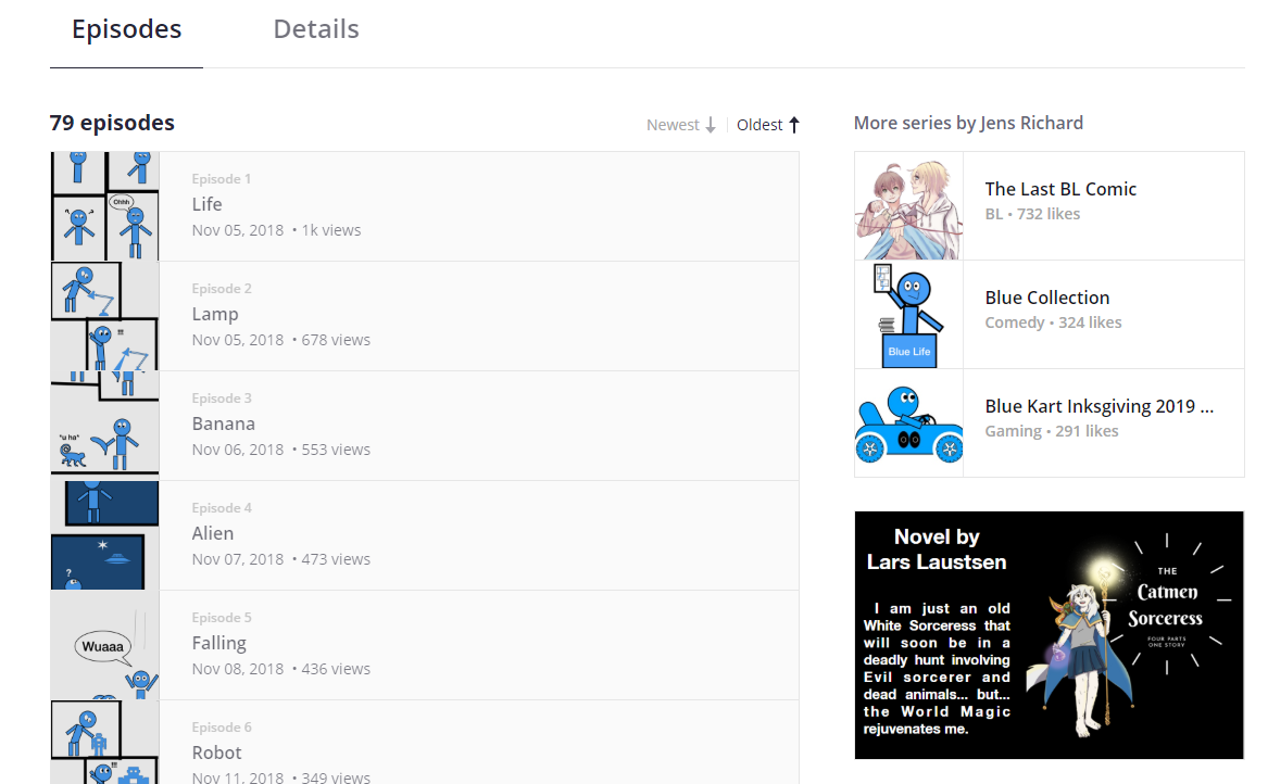
Blue Life is still as hard to find as my homeland Denmark... But if you find it you will be charmed and welcomed.
But my Boy Love comic is as spammed with readers as always.
Nothing new here
Wow ok, I got 6k more views on one of my series' update yesterday compared to the last update prior to the design-revamp. And it's not like it was a nsfw page or anything special.
I also got 4 more subs compared to the previous update, but I think that's small enough that it's negligible.
Lucky you!
I got the same number of views.
And while the likes are up by an insane amount overall, my subs a crawling.
I used to get near the top in the popular section for comedy on update days and now I'm not even registering.
Also, I have no idea how the trending section is supposedly to work. No matter who is trending, the front page does not reflect this.
@michaelson You mentioned that to improve visibility we should get our readers to help us reach the trending section, but it appears that no matter who's trending, it's not reflecting in the front page.
Would I be right to assume that the front page is using a different algorithm?
Gonna be honest guys this kind of stats is gonna take longer then a week to understand how audiences are dealing with the changes- We're really looking more at 2 to >8< weeks (sometimes 12 depending on the sources) of watching the stats before people should freak out if this is overall better or worse ^^;;; just saying, everyone should chill on the stats.
