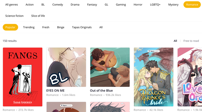
Honestly, I'm probably gonna parrot a number of other users as well but I am not a big fan of the sudden minimalist change to the website layout. As you've acknowledged, the previous layout had personality to it and helped it stand out compared to other comic websites - now it just looks exactly like webtoons save for minor differences here and there. I don't even use webtoons at ALL and when I loaded tapas I was immediately struck by the similarity. I do think some sort of design needs to be implemented to help tapas stand out as its own website.
And smaller thing, I don't like that to read a comic I have to click on two different buttons. It's somewhat insignificant honestly but when I click on a thumbnail, I sort of expect to be taken to the first/last page? I might be biased because of portfolio sites and taking people Directly to your content to minimize any potential of error but I did honestly prefer the previous incarnation of it. I doonn't like the details separation because I frankly feel like that should be the FIRST thing people land on so they can get an understanding of what your comic is about and whether or not they want to read into it.
I feel like the top banner? of comics is a little confusing too, I feel like if you're going to have more than one comic showcased they should all be clickable in some manner, and not require me to click an arrow to get to the comic that catches my interest.
Though positives, I do like the change in the comment section. And the inclusion of more than one genre for community comics as well as the LGBT tag. Though I do definitely want to see where y'all are going with this regardless.
Hm, the difficulty is that the web version was growing more and more behind the more we updated the apps. There are certain features that are app only that would be incredibly helpful but difficult to translate to the web version with the previous user interface. Comparatively, there aren't that many platforms that have a bifurcated web and mobile experience - they tend to aim for as much parity as possible.
Again, there was a definite need to change things with the website - like I mentioned the disparity between the reader experiences for the web and mobile were getting wider. If you were to visit the Tapas web and download the app, the functionality was becoming less and less aligned to the point where we needed to close that gap.
Yes - this is a high priority item for us and we're working on fixing that issue right now.
Yes - all formatting bugs for novels are being worked on and are a top priority.
These recommendations will evolve over time.
We're looking into the load times for the dashboard right now.
That's good feedback, we'll try to figure out a way to re-integrate this level of granularity back into the search.
This still exists on the series landing page but definitely agree that we should re-prioritize it's visibility on the episode page.
If you're logged in, it's on the upper right hand corner.
Thanks for bringing this to our attention! We'll address this in a future build.
We'll look into this bug - we're currently categorizing and prioritizing all bug reports related to the new website.
We'll look into a way to address this since we retired the "Full Site" option.
We'll look into this asap.
This is probably the only area where the app and web are going to remain bifurcated in terms of functionality - the creator tools will largely remain a web only feature and experience.
wait
no
nonononono
are you shitting me
@michaelson do you know how many hours I spent reformatting all 330k words of Time Gate: Reaper's novelized version for y'alls website? I kid you not, it took two weeks to get it all ready to upload and I still haven't finished uploading all the episodes. I'm just thankful that I have 300+ thousand words already uploaded which people aren't gonna fly through. No one reads it anyway.
That aside, you know why I spent two weeks reformatting it?
Because y'alls novel platform doesn't have any formatting tools whatsoever. No right/left/center align. So all the sentences that I had to forcefully shove to the right side using the space bar are now closer to the center and I'm sure the episodes with text meant for the center are now god knows where else on the page. If y'all are gonna change visual aspects like the maximum width on text then you need those tools that make the text static in its position no matter what. Literally web formatting basics 101.
Not that I can check because it won't let me scroll the full list of episodes without hitting the stupid Continue button where it asks me to subscribe (ON MY OWN SERIES). Which doesn't work on mobile btw because it keeps sending me to the episode at the bottom of the list instead. So I have to manually click through episodes at the bottom of the page and it's 2020 and this shouldn't even be an issue.
I'm not going back and fixing it. Screw it. I already had to sacrifice a lot of Time Gate's novelized formatting for the bugs and lack of real writing tools beyond Bold and Italics. If anyone gives a shit they can download the PDF copy which I'm also offering for free. At least that one is downloadable and won't unexpectedly change its appearance without prior feedback.
@michaelson - The visibility for non-premium and Smaller comics keep shrinking.
How long are you guys going to keep this up?
If you don't want other comics on your site, why don't you just tell everyone else to go away?
@michaelson Do I understand it right that NSFW comics are not going to show up in any category like Trending, Genres etc?


