Just a question that I've been pondering recently. Also do colored comics have to have backgrounds in every panel to look appealing?
created
 Dec '17
last reply
 Dec '17
- 19
replies
- 3.3k
views
- 18
users
- 30
likes
- 6
links


Just a question that I've been pondering recently. Also do colored comics have to have backgrounds in every panel to look appealing?
Depends on what the scene calls for. You can use background to set the setting for the story, like perhaps a cityscape setting. You can also use background to reveal more of a character's personality, like say, a room can be a background. There's so much you can do, but it really depends on what you want to show in your story. As an example, you can check out my comic, The Chronicles of SolLuna2 to show my point.
Depends on comic, context and artistic intention.
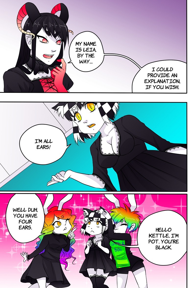
Personally I use a lot of colors, effects and background implications most of the time and only do proper background occasionally to establish environments.
Example (scene switch):
Example (environment establishment):
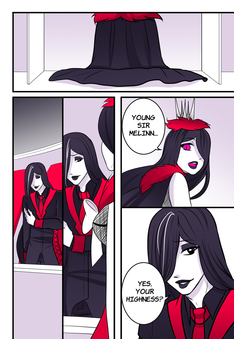
Example (mid convo)
Backgrounds are most important in new scenes and when establishing a scenery/situation. When focus is on the conversation they might risk becoming a distraction. You don't want to waste time on something that will only distract and tire the reader and make them go "TL;DR". Keep focus on character expressions and movements.
Throw in occasional background implications (like the one shown in the last example) to remind the reader of the environment and that will be enough for them to not read it as the characters existing in a space of randomness or nothingness.
If you include a background in every panel it can definitely clutter up a page and I am personally not a fan.
Sometimes all you need is an establishing shot and then possibly some anchor objects to keep a character's relationship with the space they're in.
My biggest comic influence is Est Em and I love how light and airy her pages are.
 2
2
 2
2
 1
1
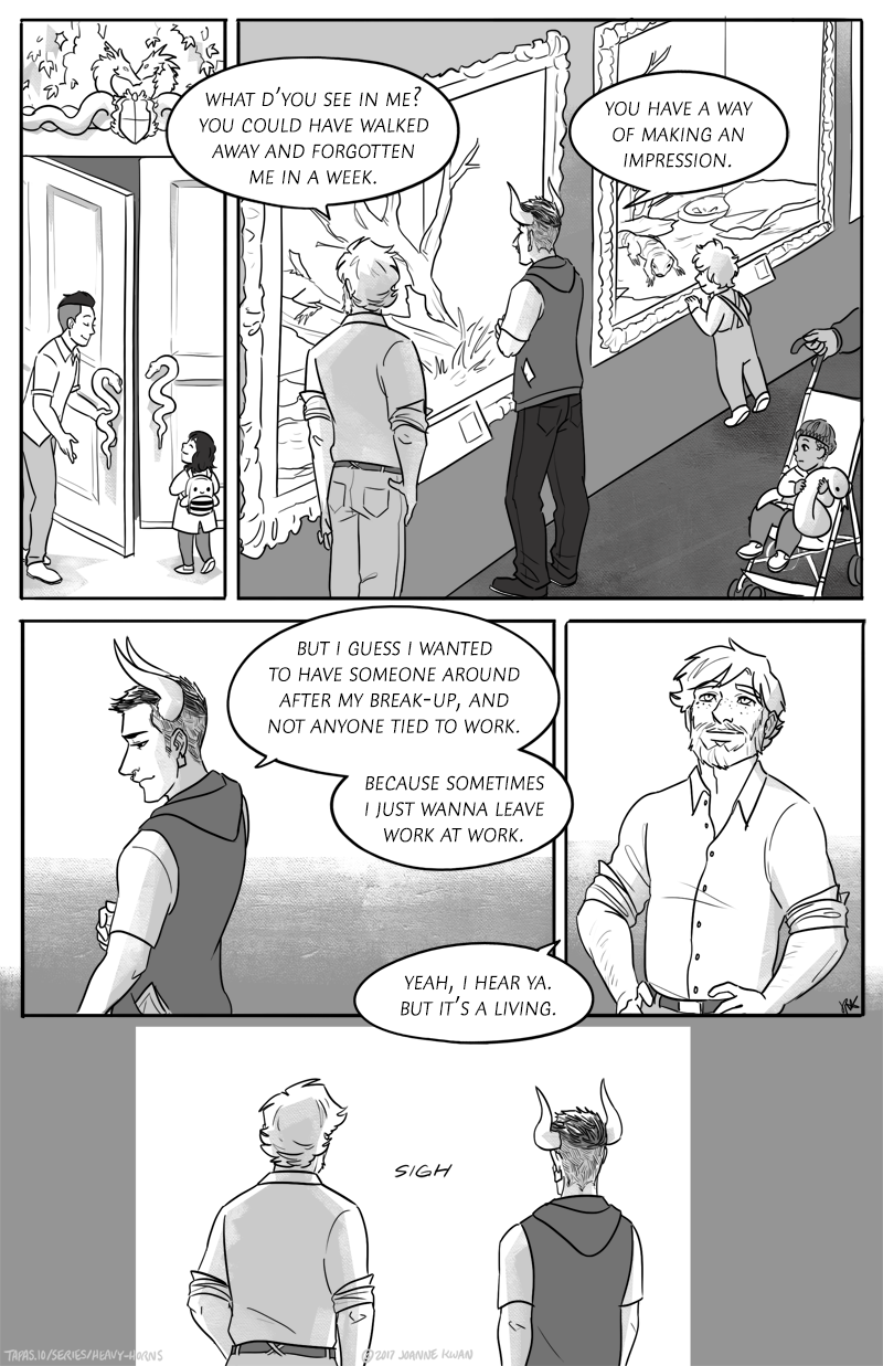
And I do a similar thing with my series, especially Heavy Horns.
I like this link which talks about ways to skip out on heavy background drawing:
I find a lot of times when you are doing more full body type shots you want something behind them, be it a full background, some details, or some action lines. But if you do more of a portrait of the face or shoulders/chest up the background is less important and maybe a simple color or gradient of color is enough. Even as a reader I am rarely focusing on the background when it is a closeup of the person's face. All the attention is on their emotion. But when I see a body I am more curious about how their body interacts with the surroundings.
this might be a bit... much. but i find cartoon cinematography a good place to understand when backgrounds are necessary, and to what complexity. this is a good link13 abt the incredible cinematography that i go back to when im stuck
backgrounds are really useful for grounding a character in a setting, but can also be distracting - if you want a close up shot, for an expression or to show a key object, a background may hinder your emphasis. meanwhile, backgrounds can create emphasis later when you zoom out, and theyre really useful for leading the eye.
backgrounds stop feeling like a chore when you start thinking of them as more of a set and less as an afterthought. in videogames, tv, theatre, and when we used to play with dolls, the landscape our characters are situated in can prove really important to the story - backgrounds are a tool like any other, to utilise.
I don't think it's necessary when you're emphasizing dialogue or when there is no movement happening between your panels (walking and talking for example).
I just did a seq that was very dialog heavy and made sure I pulled back every few panels, to reestablish where the characters were.
As @joannekwan mentioned, have some anchor objects that you throw in every few panels/pages to re-establish where the characters are. @beta1042 also had a great link about this as well.
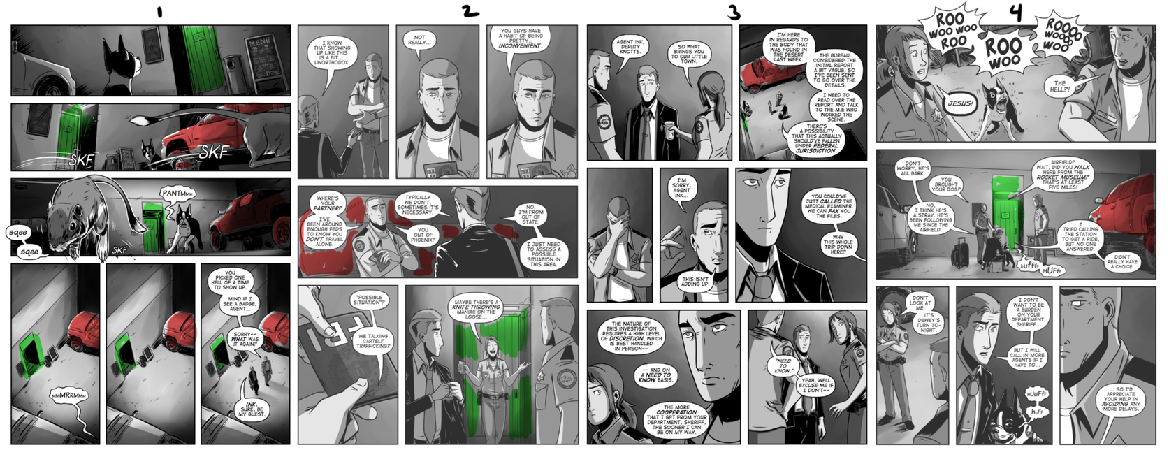
If you look at my first page of this sequence, I establish a lot of the environment before I start dropping the details. Page 3, there is hardly any background, but by now we know where everyone is standing in relation to the building and the truck.
I do think you can get away with drawing less backgrounds when your comic is in black and white. But you can use some effects to hide the lack of one. For example, my comic is partly watercolor and I feel like a nice little watercolor texture looks much nicer than a simple gradient. Sometimes you can use speedlines or a tone in lieu of a background. And sometimes, just a couple scribbled lines can suggest a background more than enough! Overcrowding a panel is never a good idea anyway, if the focus is supposed to be on the character, the action, or the dialogue.
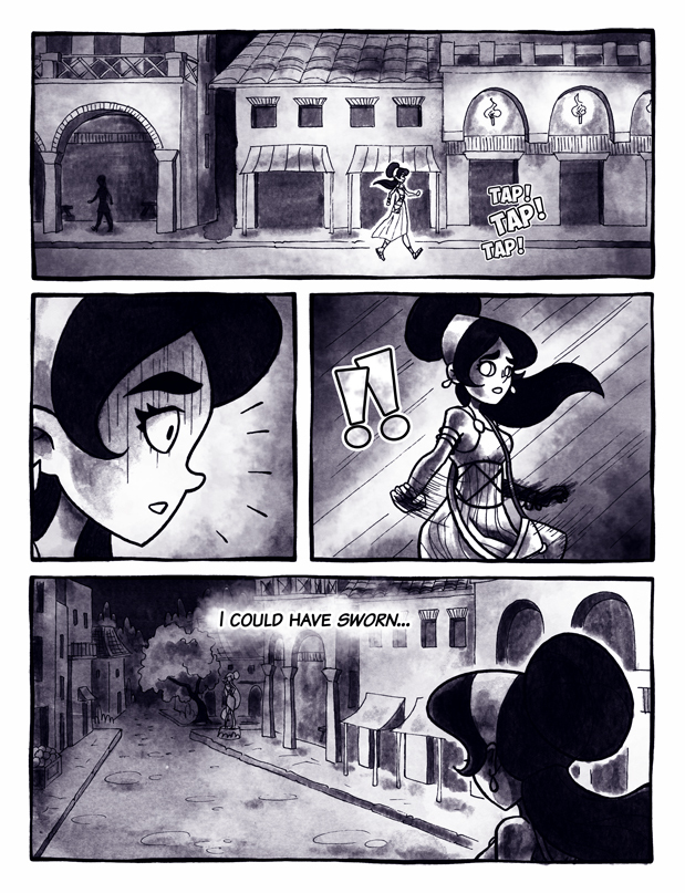
Of course, once in a while a background is unavoidable to establish a new setting, explain a transition or the characters moving in the space, or simply set back and show the characters in their environment. Recently I drew my character running through the streets, and to convey the sense of speed and movement I had to zoom out and show her in the environment... I had to draw a lot of buildings on those few pages!
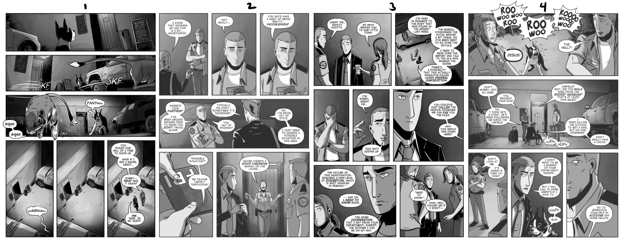
Here's an example of a page where a background was necessary for the first and last panels, but I was able to get away without one for the middle panels:
the way I sees it, backgrounds only need be drawn when it's important. I think it's easier to get away with not drawing backgrounds in color since you can reasonably claim a solid-color background is being used to set tone. Like here:
When the character is the main event or expression. For example, to represent a strong emotion, you could make the background black or a bright color. Either one will define your intention as the artist.
Like others have said, you dont have to have backgrounds in every panel, but you want start off establishing a background whenever you change plot scenes. Also keep in mind that you want to have a balance in your art- you may know how to do backgrounds, but arent doing them because they take extra long...but readers dont know that; all they see is a page full of floating characters and NO background.
You dont have to have panels full of stuff, but a few reminders of the establishing shot.
Sometimes there will be times when you will have to do labor intensive backgrounds in every panel...best to get used to it now!
I don't have anything useful to contribute to this thread but ughhh thank you because it's saving my life currently 
The way I see it, if your character doesn't take up at least 70% of the intended panel, then you should probably have something to help contrast it with and even then, many people will still do minor shadings, tones or textures. I find very few in this day and age go for a blank canvas except again when the character takes up a great majority of the panel or the blankness is intended for setting some kind of mood.
Honestly, drawing backgrounds in all your panels, minus maybe a select few isn't going to clutter things, it's going to enhance it. There are plenty of works that put a great amount of background, be it scenery, tones or textures. Karin Suzuragi the artist for a couple of the Higurashi mangas had this style. Not once is their a blank canvas on page. Every panel has at least something to contrast with the characters. Sometimes it's a full blown scenery, sometimes its specific tones or textures and it looks beautiful.
But that's obviously a lot of time and effort so its no surprise many artists have to, tone it down a bit, pun unintentional. However, some of them go too far and a great example of this is Tite Kubo's manga, Bleach. Kubo has this irritating tendency to draw almost no backgrounds, shades or tones. He proclaims this is because he wants people to focus on the characters but many agree it just devolves them because there's nothing for them to stand out against and enhance them.
It gets so bad sometimes that he will draw two page spreads where his character takes up maybe 40-50% of the page and the rest is just this blank whiteness. It really comes off as lazy sometimes.
I have "something" in the background of every panel, but it varies greatly what that is.
But I'm going for more of a movie look with my comic. If the camera is in too close though, I'll often just have a colour or two with an interesting textured effect for mood.
But backgrounds are my favourite thing to draw though.
Luckily the sequel will be coming out on June 15, 2018!
And once I'm in the theater, I must fight the urge to dropkick any baby going above 100 decibels
I tend to draw backgrounds in most panels and do colorful expressionist stuff for comic effect or to drive home a specific emotion. It's mostly derived from what I've seen in newspaper comics from the first half of the 20th century that I like (e.g. Pogo, Count Screwloose, Krazy Kat, etc.) and classic silver age Marvel comics.
That's just me, though. I feel like if I'm not putting in an assload of effort in some way then what I'm doing isn't worth anything... yet I don't critique other people's work on the same thing for whatever reason.
| Topic | Category | Replies | Views | Activity |
|---|---|---|---|---|
| What’s the Weirdest Plot Twist You Accidentally Wrote? | Questions | 13 | 367 | Sep '24 |
| Plz help me find this comic | Questions | 1 | 272 | Apr '24 |
| Views Disappearing? | Questions | 1 | 191 | Aug '24 |
| Are you likely to NOT read a webcomic if it’s in black and white? | Questions | 15 | 513 | Jul '24 |
| Does anyone know French, please? 👍 | Questions | 5 | 232 | Oct '24 |