26 / 36
Aug 2023

Because colored comics are the standard for webtoons and mobile users like seeing colors (myself included lol). Also it's really nice seeing my panels in color -- especially for sunset and other specially lighted scenes -- like I'm looking at anime screenshots of my own work.

I still like doing a b/w manga style a lot more, especially styles that are stark b/w (not sure how to accurately describe it but ones that don't use a lot of tones, like Naruto or HunterxHunter), but I use it only for special bonus episodes.

I've made black and white for print in the past, and may in the future on a zine or something. On this comic, I wanted to do colour though and to try out a colouring palette influenced by old American comics and to try things like having funky, colourful magic effects. It's also just more eyecatching on a screen and a little easier on the eyes.

Having made both colour and black and white comics, I don't personally think black and white is easier. It's slightly less time-consuming at certain stages, but you have to think more about your compositions, lighting and character designs to do black and white well. Because of this, I prefer to use black and white for short print comics where I can really concentrate and make every panel as beautifully composed as I can, while colour I'll use on a comic where the long-form story is the focus and I have to bang out two pages a week every week for hundreds of pages.

The style I'm most comfortable in is semi-lineless, so black and white doesn't pop. It takes way longer to do but I don't feel it was a bad decision, colours is what gets the most compliments in my comic, even though I'm really not that good.

I did that black & white comics because I´m a big comic noir fan. I love the work of Will Eisner
and Jordi Bernet for example.

I did colored comics because it fit better to the story and how I wanted it to be presented.

I just sent a 16 page comic to a contest today and I´m pretty sure that they will choose a colored
comic over a black & white comic. I think it has to do with a psychological effect and people think
colored comics are more work or more professional or something like that. Not true obviously

Because that's how I always envisioned my story :tapa_pop:

I did not :smiley: If I did, I'd never get my comic done as regularly as it comes out, colored stuff only as a premium :smiley:

Mainly because I have exaggerated expressions and for years I drew my comics in black and white because I had limited resources but a big imagination. Now that any color is possible with digital painting, I can color my works.

I’m not really good at shading either.

I do my webtoon in B/W + greyscale because I 've always read mangas in my life. They ended up being my main inspiration in terms of artstyle and composition. I also studied in a comic school where they focused more on doing lineart and inking (coloring was another course to take aside the comic one).
I'm also a big noob with digital coloring and I don't quite like my artstyle colored in cell shading like anime (I tried on my drawing as a test and I didn't know where to start putting shadows or how much was ok, it was a bit stressful only on a simple drawing).

I know colored webtoons are eye catching and became the standard for some readers but it doesn't suits me, it's less trickier transform it into a vertical format.

I use high saturation colors for my comic beside I use water-coloring for the backgrounds. Aesthetically, it is a design choice that works with the story and character designs.

There ARE exceptions to this rules for my comic though:

Black & White or extremely low color saturation panels will be used when there is a flashback or a Time Mage uses a chronomancer spell like 'Time Stop' or 'Time Reverse', much like the ability from 'Tears of the Kingdom'.

In those cases, the whole panel is frozen in time in black and white, while the Time Mage is in full color, walking around the panels as normal.

It’s honestly a clutch for me. It’s easier to get started on B&W, but much harder to make it look good (or as good as color). It takes a lot of planning and foresight that I don’t have. Plus color is more popular than b&w when it comes to webcomics in general

It depends on your style actually. Black and white in my style seems flat and boring :sob::sob:

I used to make short stories as a kid by drawing and then adding some text. I liked the colour because I felt it gave more depth. Emotion and such to it. Just feel it fits how I tell a story.
I have gotten ALOT of comments about my manga even in my earlier years back. Of when I started it and the drawings were not as good as today. How dark, oppressive, intense, etc it feels depending on whats going on.

When i first started this webcomic hobby, I saw many others were colored (or at least most of the popular ones). I wanted to get with the competition. Later I realized that I get more joy from just making the webcomic. I recently started questioning if I should go B&W to reduce production time.

I use colour in my art for a few reasons:

First, I like the look of it, and I like challenging myself with shading, lighting, etc. My colours are usually quite rich (or saturated, I guess the proper term would be) because I try to make the drawings look somewhat photorealistic.

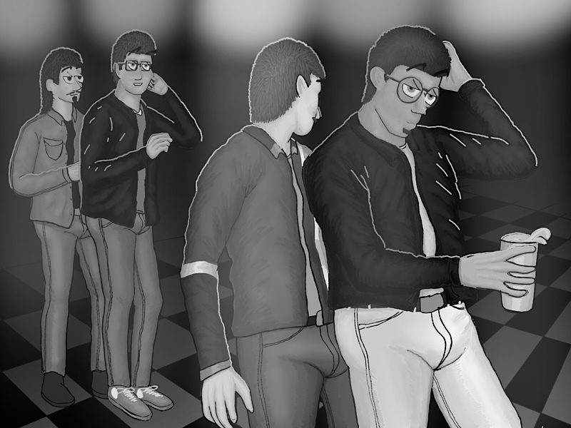
Here’s an example. I don’t think something like this (a bunch of guys in a gay bar in the year 1999) would have looked right in B&W:

Here(if I did this right) is the same image stripped of colour. It just doesn’t “pop” to me, and looks like it would have been 1955 instead of 1999.

Second, because I am creating with online presentation and not print in mind, I think colour simply fits the media better. With print, especially with my rich colouring, expensive high quality, glossy paper would be required in order to keep the detail (or even to retain legibility). Imagine the image above printed on normal book paper. It wouldn’t be pretty. This is not a problem with digital media, where colour is “free”.

I think my comics look better in color, but yeah it takes longer to make them indeed.

I'm just gonna be lazy and quote a bunch of people who have already stated my reasons XD

(emphasis mine)


You too huh :sweat_02: Same, though for me it's less 'depressing' and more 'I have trouble focusing/parsing these pictures' :'D So I consistently have a harder time getting into a B&W than coloured work, and some say that's shallow, but it's just how my brain works T_T

Tbh try to do B&W is actually a great way to challenge yourself with shading and lighting :stuck_out_tongue: Your pictures are a great example; it's easier to see when your image doesn't 'pop', whereas colours obscure that somewhat. If you can make your images 'pop' despite it being black and white, that's when you know you've mastered shading and lighting :tapa_pop: