
Wow what amazing design work!
I'm subscribed so one of these days I am bound to run into your comic. At least you arre smart about this instead of me. I uploaded all my pages, and were my readers wanted more pages I didn't have any.
@otterchild Oh gosh, thank you so much! : >
@jessiepolfliet Aww, thank you too for subscribing. The idea of that blows my mind, but if you feel the story or whatever isn't for you, don't feel bad about unsubscribing later okay? D:
Hey sometimes working page by page is a great motivator! ...It takes every ounce of strength I have not to start uploading now. I don't know how artists like Anna Landin build up their buffers so high. I don't think I could do a 50 page buffer because I'd be too tempted to go back and rework pages which is awful.
....Gahhh. Okay, I'll umm, do one more. A short one because I don't want to clog the thread any more with my crap.

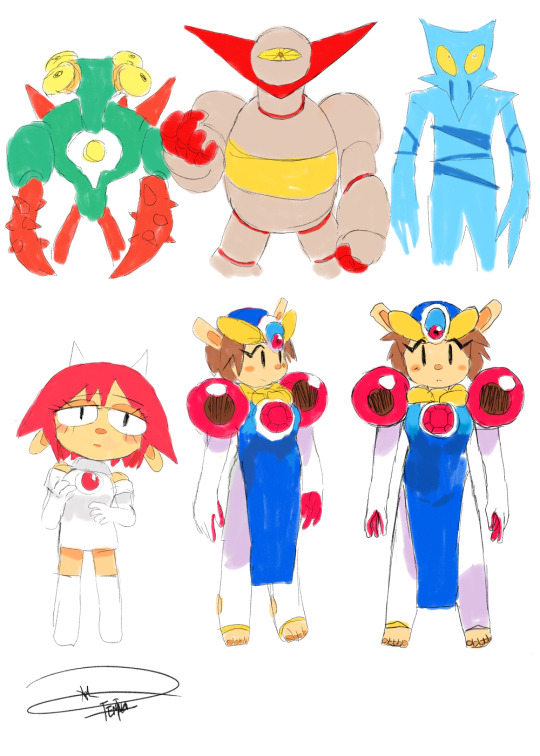
So I have a problem where I can't leave a design alone until I'm 100% happy with it. Amber's design got nitpicked like crazy, because I knew she'd get a lot of panels devoted to her. I knew for her clothes, I wanted a really stupidly designed outfit that is borderline hero adventurer cliche. There is a reason, and it is disclosed fairly early on. So, I'll have to make you wait on that one, but I can talk about the rest.
As far as the colors, in the last design I liked how the orange looked until I paired the design against Skye and realized, oh no, I have two bright yellow-orange characters wearing blue. So I tried to go with a cool palette to contrast Skye and the other two main characters. Since she was armor plated, I looked at beetle shells. I really liked the bright blue-green iridescence they had, but I was afraid it might blind readers so I toned it back quite a bit.
Another big change I wanted was to show she was a growing child of a significantly larger species. So I actually designed the adult Pyromancer first then shrank it down to make what the child looked like. When I shrank it down the first time, I realized something didn't make sense with the design but at the time, I wasn't sure what it was exactly.
So I image searched a lot of baby animals of larger species (a good excuse right?) to see what I was missing, and it sort of hit me in the face. When you have a puppy, what's the first thing that grows? The hands and feet. XD It makes sense, because you've got to grow to accommodate the change in weight in height, otherwise you fall over. So when you're a child belonging to a race of giants, it only makes sense that your limbs are going to look a little stupid for quite awhile.
Okay, I could talk about character design all day, but I'd rather see other people come and talk about it too. XD
Edit: @joannekwan You know you wanna show all your preliminary designssss. XD
Since Superbia's a setting with characters that range wildly in appearance and culture living alongside average American/Superbian humans, I wanted the main character to represent some of those differences, but also the things that everyone has in common regardless of where they come from. Petra Slate is a Nain Rouge. They're responsible for a lot of demon/devil mythology, which really has shaped people's opinion of them in the present day. Her left horn is much bigger than the other one - her mom prompted her to try attending a mixed-species high school, and the right one was broken by bullies on the first day.

Her pupils and often her eyes glow like fire, and often get significantly sharper when she's angry or panicked. Contrary to popular belief, fire-breathing is a defense mechanism, not a weapon, and you have to push a Rouge a long way to get them in that state. She's got a scar over one eyebrow, but that was only from tripping on a playground when she was really young. She'd give you a cooler explanation if you asked.
The nose of a Rouge tends to be somewhat flattened, and will completely seal if they're underwater or breathing in smoke. The darkened area above their eyes is a natural one, and tends to be a little sunken. They've got very long necks and sloping shoulders, which fits a little more with their ram or deer aesthetic, and differentiates them from humans.
She wears a poncho with kind of a green-blue and faded red - these colors are present in a lot of vintage neon signs, and are common in Superbian area signs as well. The colors are pretty important to the setting, so I thought it would be interesting to tie her in with it that way.
Anyways! Thanks for letting me ramble! And take a look at Superbia if it piques your interest! More readers are always appreciated.
These wizards are the most gorgeous creature I have ever seen on this site. Absolutely amazing work. bows and applauds
I like how you are playing devil's advocate to character design. It's important to know why you give design your character because they have to reflect their personality, what they represent or their social class. I think I my recent OCs from my comic In the Midst represent this philosophy.

Sikaru she is kind yet shy. She also has a good taste in fashion.

Amilia is brave and very much a tomboy. Although she has a little femininity.
Elvos is charismatic and wants to appeal to the opposite gender.
My main character Grave went to a bunch of design changes before I got to her look today.
She started out with black, short hair, some jewels in her face and looked older. I liked that look, but was smart enough to talk to friends and get feedback. They reminded me of the basics of character design. The silhouette of a character should be unique and interesting.
With that in mind I went back and updated Grave to the look she has today - and I couldn't be any happier with her.
Ooh neat topic, definitely something to think about!
I typically design based on personality. Serious, mature female characters go well with long hair, usually with a dark color. More energetic female characters I draw with short hair, larger eyes, etc. Either that, or I was too lazy to draw and color long hair XD
My character from Laifu is actually a persona of myself haha
Since the genre of the comic is comedy/slice of life, I use a simple sort of style... Which is an excuse, because I'm just too lazy to create a beautiful character XDD
There isn't really a reason why I design my characters the way they are. If i find it as a good design, I will work with it. and from another thread I talked about how simplicity for character design is important to me. I like to make my designs "distinguishable" if possible.
Examples:


most of my characters started off as doodles - i made several prototype comics (just trying out some possible plots, and trying to get a feel for these characters
after some time, i realized what i liked about those two, and their dynamic and the more well rounded they became, the more the design changed to something that fit their personalities 

and now they look like this:
FOR INSTANCE: i stopped drawing xalem in turtlenecks, bc he isn't just a nerd, he's also immensely creative and slightly insane and doesn't really care about normal clothing choices, so i gave him a dog collar + tie combination^^ kendrion's mark used to be a slightly darker brown, but the mark is a very important part of why she is who she is (at least at that stage of her character at the beginning of the story), that's why it's now completely black - i also used to give her more feminine traits (earrings, lipstick) but i dropped that, bc she wouldn't really have time for that. she's a busy person^^
Because I was inspired by Motoko Kusanagi and Joanna Dark.
Because her age is believable for the experience and tasks she performs.
Because I wanted her to represent a Norwegian in a sci-fi setting.
Because in the military they have a dress code, and because on the moon she needed to blend in but unfortunately the space shuttle got shot down before she could change.
Well I have recently started a comic with myself as the main character - I know, I'm such an egotist. Anyway, I wanted to make it as simple as possible but with enough detail that you would be able to easily recognise me. The only difference is that my character is reaaaaaally short - like South park short - and I'm tall but anyway he's from https://tapastic.com/series/Fo-Funsies and this is what he looks like:
When I joined Tapastic I was already working on another project for quite some time : Cold Hell, this is a harsh universe where my heroin has a violent past.
She is young but serious looking (and the tone of the comic itself is serious) plus due to the weather all my characters wear mostly heavy coat and all..


(she is the one with the blue hair)
Plus, since a project for a numeric label we have some rules to respect : no graphic sex or nudity.
...I joined Tapastic to "take a break" from it (I'm still drawing it but I needed a way to change my mind) and came up with SCAVENGER that is kind of the opposite : I want it to be funny and action packed (in a shonen way even), my heroin is sexy and cheerful and I wanted no restriction hence :

(I know, there is still the NSF restriction haha)
i dress my characters like me
or maybe i dress like my characters? [thinking guy emoji]
because i'm a chump
helps for taking reference pictures tho!

i p much have this outfit and haircut and it's embarrassing


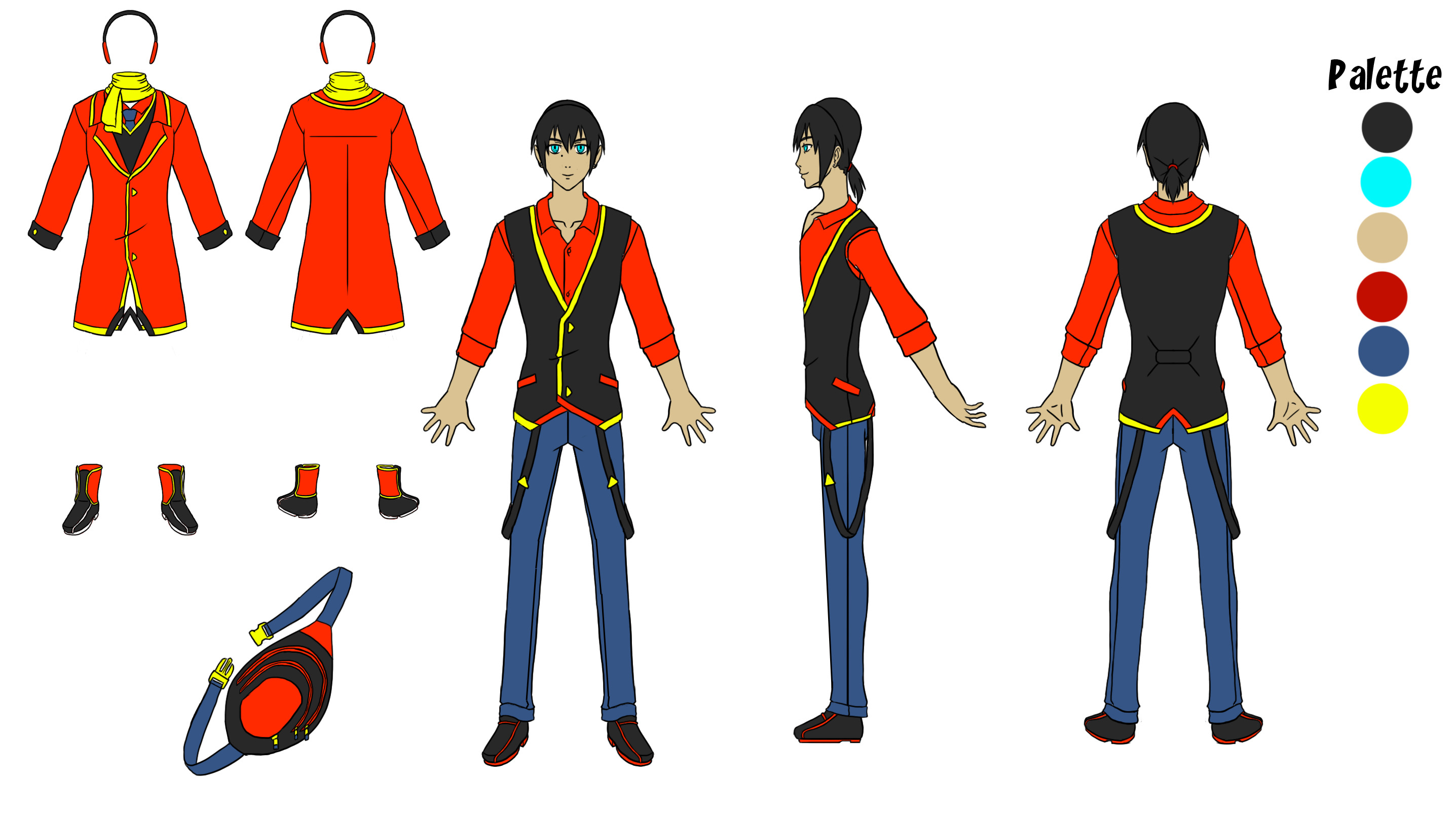
Agent Franklin Ink
White Male
mid 30's
Why Male? I find them easier to write and draw... I wanted a male character who was unsure of himself. Also, I thought of his name first-- so... boom, male  Because the story is based in our reality (to an extent), it felt natural to have him experience the same history as me, so his age is close to mine. He's fit, but not overly muscular, as I wanted him to be sharp dressed with a relatively thin silhouette. His condition plays an important role in the outfit he wears. Being face blind, he's almost always in a black suit so he's able to identify himself. The color choice was also to reflect how his dog (a boston terrier) and him are both fish out of water in the Arizona Desert town of Rocket Ridge. They stick out like sore thumbs.
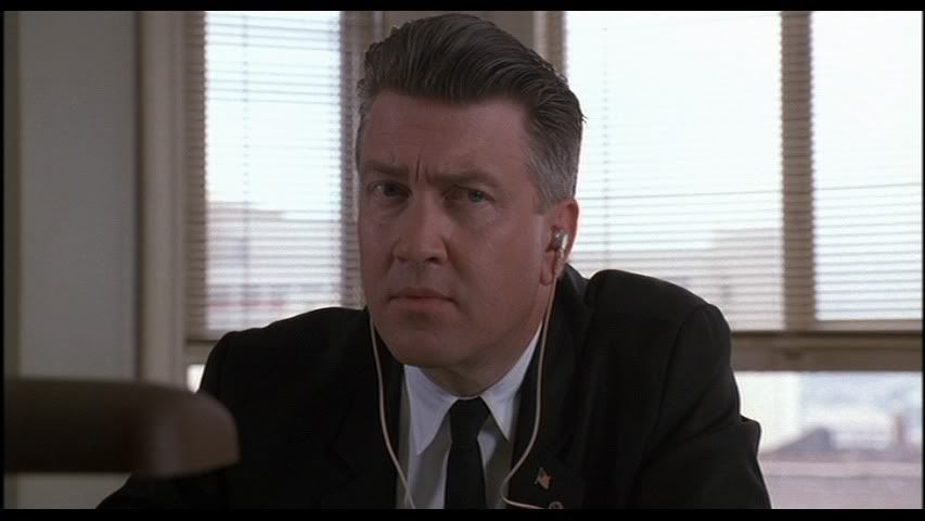
I'd say the most distinguishing characteristic of Agent Fink is his hair. I was watching a lot of Twin Peaks around the time I thought of him... and I fell in love the David Lynchs character, Gordon Cole... and his hair.
But also, it really reflects his love of birding-- his hair mimics a bird's crest (yknow, character design wise, HE DOESN'T do it on purpose)!
A quick sketch of him and his colors.

First of all I love his haircut. And that coat. That's awesome! I'd wear that too if I could. It's a clean easy to recognize design. I like it!
@agentfink I love your comic by the way. <3 I love how you tie in his hair to a bird. That's brilliant!
I have sooooo much fun with character design!! In my practice comic, I honestly just tried to think up characters I hadn't seen before but figured I'd enjoy drawing.
First, Miss Khan. I think a few months before making up the characters, I'd seen an article in some Tumblr/twitter feed about chubby Asian ladies. The idea stayed in my brain because I'd honestly never considered that a possibility before. When I decided I wanted a lady at the head of the story, I remembered that article. Later when I started coloring her, I gave her a darker complexion, yet again because that was something I'd not seen before. She is super fun to draw, so I'm very satisfied with my choices. I always put her in soft/comfy looking clothes, because she's very casual and I like her to look… psh, IDK, approachable? or something. 

For Matt and Stan first I decided they were going to be cousins (why? you guessed it--- because that was something I didn't see much in comics). After that, it was pretty easy to decide what they'd look like. I started with Matt— I wanted him to be a traditional brodude. he's decked out in sports emblems, looks potentially threatening, makes finger guns at everything, really just a poster child white dude. Tbh the beard was because he's a pirate and pirates should have beards. Once I had Matt down, I just made Stan THE COMPLETE OPPOSITE. Tiny, effeminate, black, terrific posture, doesn't have a problem with emoting.
But while I wanted them to initially come across like total opposites, I wanted them to eventually seem more and more similar, so I tried to give them obscure parallels. They use different facial expressions but have the same facial features. They use the same hand motions and neither has a sense of personal space. They both always dress very nicely and frequently worry about their appearance, even though their styles are totally different. They're Drama Queens.

Finally, with Ekat I just wanted an somewhat older lady who could totally beat someone up. There's a lady in my church that I based her physique off of. I'd never tried to draw a woman with right angles in her face. Honestly the hardest thing about her was deciding what I wanted her hair to look like: I knew I wanted it to be long and grey, but there's a loooot of different types of grey hair. I drew her for well over 2 years and changed her hair every other week before meeting a lady with wavy, dark-streaked grey hair and thinking YES. THAT'S EKAT.
TL;DR: I literally just picked random stuff I didn't see often in comics.
8 days later

I designed mines after Miis from Nintendo. Me and my (online) bro's characters (in the purple and red) were designed based off of our actual Miis, so they were around way before the other characters and the actual comic. As for the others, they're my actual friends so I just used their features while combining them with using Mii features that look like theirs. Like the bowl cut, spiky hair, and Nat's hair (girl in green). Except Alphone's hair (in blue) is just his hair and not a Mii's. I also chose the colors and cuts of their shirts based on their character's personalities and preference. The only character who isn't based off of a Mii is C.U.T.I.E the dog because I really like robotic animals and I've never went that route.
Though when it comes to me creating actual characters for things like stories, it starts off as a "in the moment" kind of thing, then I fix them up to look more like how I think they should look.