
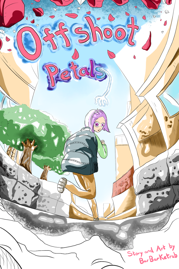
Will I click on it
Probably not, but only because I think it's meant for readers younger than me.
What's my opinion
It looks like a story for younger readers. If I had kids, I might suggest it to them.
What can be better
I think the font doesn't match the style. I'd go with with a more rounded sans-serif typeface. Also, the tree in the background is positioned in such a way as to look like it's right next to the (chick?/rooster?), making the tree look smaller than intended.
Here's mine:

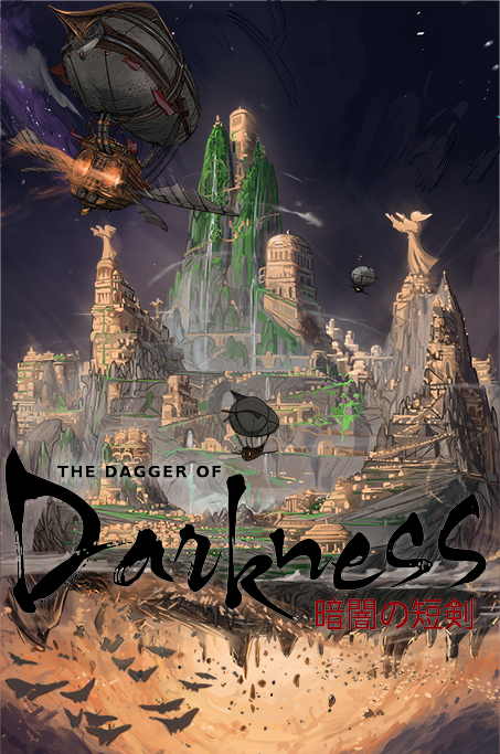
I'm gonna just go off of the most recent comic. I'd like to do this for every post in the thread, but that seems prohibitively time-consuming at this point...
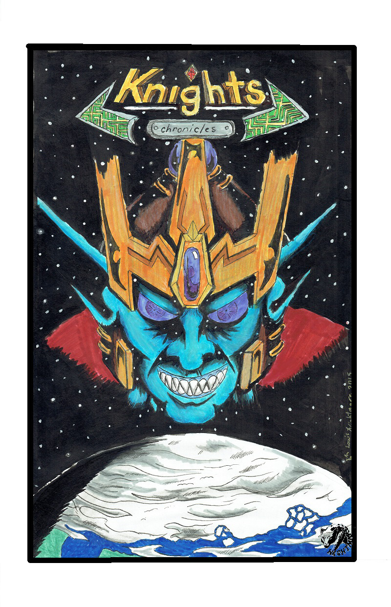
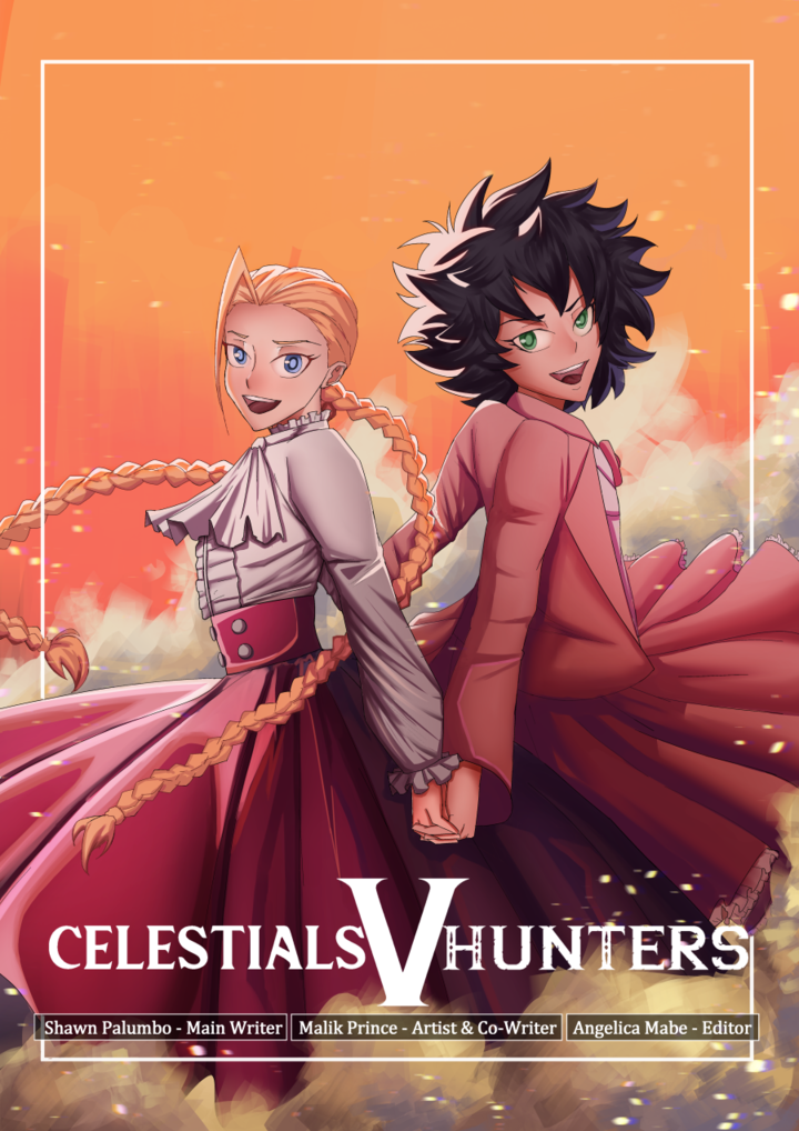
Will I click on it?Obviously yes, given that this whole thread is about the give-and-take.
Under normal circumstances, though, most likely not. The cover is decently composed, but lacking depth. The touch of the stars being visible in the villain's face is nice, but it's otherwise fairly flat. Honestly, after looking at the first chapter, I think your colors are doing you a disservice. I would be far more likely to click on it if it were high-contrast black-and-white. (that's me, though, I'm almost definitely in the minority there. Most readers want color)
What's my opinionI skimmed the first chapter (to see what kind of first impression you made), and the last chapter (to see the most recent artwork), and what really stuck out to me was that your art is very technically oriented. The actual character drawing and acting is the weakest element by a wide margin. I can tell an enormous amount of care and effort went into the mech designs. Mecha is a SORELY underserved genre, and I absolutely adore the fact that you clearly have a strong passion for it. Definitely a lot of little 'clean this up, that could be framed better, needs more contrast here' things, but those are all small little 'you'll get better over time' things. I can see the effort and passion in the detailed depictions of the mechs, the technology, and the environments (something a lot of artists skimp hard on, so massive kudos for actually giving me a good sense of place right out of the gate), and that's the important part: it's the fuel that's going to keep you going long enough to improve all those little fiddly technical details.
What can be betterAs I said above, the character drawing is very stiff. It's not easy, doing a series involving both round, soft humans and sharp, angular mecha. Being good at both of those is really difficult. I can tell you have a lot more experience with the latter, but not so much with the former. Depth, motion, and expressiveness are all really necessary to get the audience invested: The coolest mech battle in the world will still get boring if we haven't been made to care about the humans (or humanoids) piloting said mechs, and good character acting can go a long way towards getting a reader to care.
100% honest opinionOkay, so as I said above, I skimmed the first and latest chapter, but I just went and looked through a few more to make sure of this. I'm... not entirely sure who your characters are. I understand doing setup scenes and cold-opens with non-central characters (I did it myself in my own comic, actually), but the entire first chapter is exposition.
There's nothing inherently wrong with that, but giving a human perspective to help anchor your reader in the world is really important. The general seemed to be doing very little aside from explaining things to the audience (from a meta perspective). The second chapter introduced the pilots, who I thought we were going to be focusing on, but then chapter 3 was almost exclusively exposition all over again. Once we hit chapter 4 I can see the cast of characters we're building, but I think given how long these episodes are, they should have been introduced earlier, and the exposition broken up over time so you aren't frontloading everything about the world onto the reader before they have a reason to be invested in the world.
As I said at the top, I genuinely think your colors are doing you a disservice. The black and white lineart, while flawed, is much better than the very flat, bright, marker-y palettes you're using. There definitely is a boost to readability with the colors, but in a very flat coloring-book kind of way, rather than one that makes the world feel more alive. I think the flashback scene in chapter 6 is by far the best your comic has looked, and I'd recommend using a more limited palette like that in the future; it helps keep things more readable without completely overpowering the dense details you've poured into your inking.
Also as I said above, regardless of all the criticism I've given here, I am genuinely excited to see an honest-to-goodness mecha story, and I really hope you keep working at it, because there's a lot of potential here, and it's very, very obvious you care about making this.
That's interesting! Okay, so...
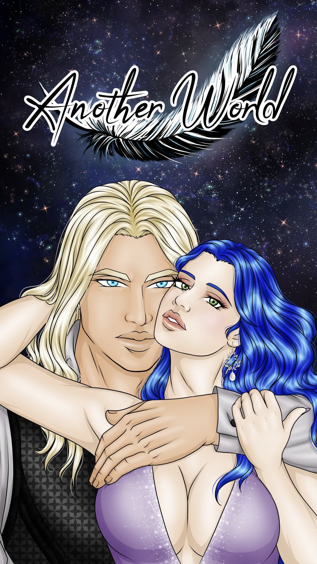
Will I click on it
I think I wouldn't, judging by the cover I would imagine that's a story for kids.
What's my opinion
It's cute! The character design is simple yet efficient, easy for children to remember.
What can be better
But I would suggest changing the font and add more contrast with more vibrant colours.
I'll let you judge, now!
I guess I'll take part too!
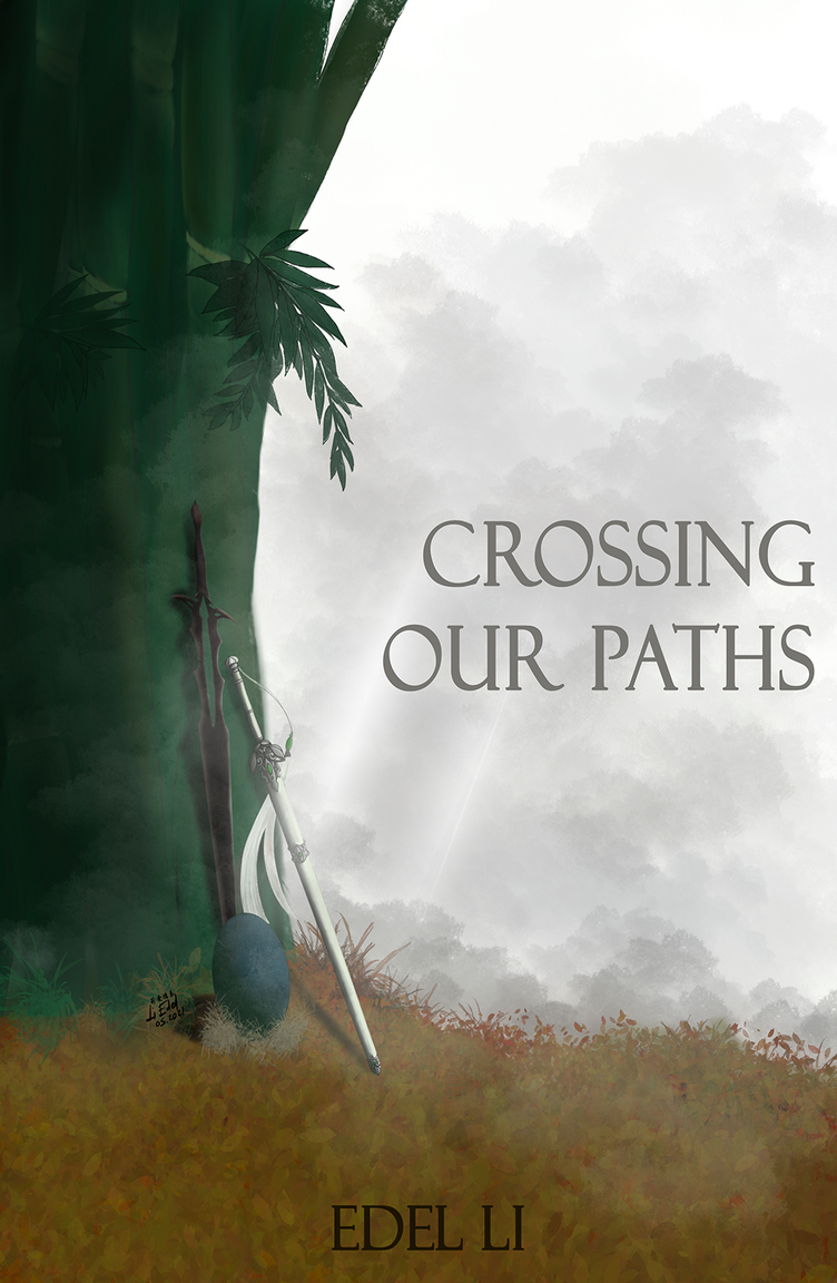
Will I click on it?
I may, but I most likely won't.
What's my opinion?
It looks nice, and the character has a very cute design. I particularly like the clouds or mist in the background, they make the cover feel very ambient.
What could be better?
As it is now, the colours look a little muddy and because of this, the image stands out less than it could. Upping the saturation could solve this. Also, I feel like a more dramatic perspective would make me more inclined to look at your story.
100% honest opinion?
From looking at the cover, I imagine it to be a story which starts off as deceptively silly but then takes a darker/sadder turn around the corner. The cover art does remind me a bit of a kids show, so maybe something like Gravity Falls?
Here's my series cover.
This is a neat way to get feedback 
Will I click on it?: I actually did click on it when I noticed it in the "fresh" section about a month ago, so my answer would be 'yes'. I click on pretty much everything new that pops up in the fresh section.
What's my opinion?: When I saw your cover, I thought it would be an adventure type story. The chick has a determined Rambo-like expression and it's clear that they are leaving their home. So from a quick glance, this is what I thought your story was going to be about.
What can be better?: There is a lack of depth perspective when it comes to the background. Everything seems to be on the same line of sight making the treehouse look like it's too close to the chick and small.
As for colours, the chick does draw the eye to it as the focus of the story, but without contrast everything blends together. Having the chick's colours more vibrant will help it pop out more.
- Honest opinion: Personally I like the rambo-chick character design. It's simple and your artistic eye understands proportion which is great! I also like how you've partial hidden your name in the grass, it's a nice touch
coloring is one of my weaker points but am trying some ways to improve the contrast and possibly having smoother colors, currently i am doing full reworks of the comic before #7 , the first 3 are a long prologue for the main story based on what you said i am thinking i might want to separate them from the main line, seeing it is a massive jump ,but i do thank you for your input absolutely i have some ways to go , in time they will be better ,and I hope you will read it some for your own enjoyment as well,
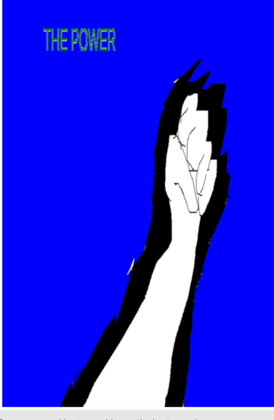
Will I click on it
I don't feel I am the target audience - so honestly, I don't think I would.
What's my opinion
The artwork gives me the impression it is a light-hearted fun book aimed for preadolescence.
What can be better
Maybe a different font, in my opinion. I quite like the art style - however, it all comes down to what your target audience is I guess.
Now you have me wanting to read it and find out 
Okay, I'm curious - I'm going in!
Update: I took a look, and after viewing a few pages I feel the cover art is appropriate and stays true to the theme and tone of your story. The cover art gives you an honest impression that doesn't compromise your readers expectations. I like it.
13 days later
Will I click on it
- Most likely no, but there is a slight chance I would
What's my opinion
- Looks like it has to do something with mother/son relationship in medieval setting. Which is not something I would read any day, only if I feel like it. Also the artwork is kinda cute.
What can be better
Lighting on characters hair is a bit of other thing are fine I think .
Regarding my comic it can be for kids but I made it so it can be for all ages really xD
Thank you for all the critique I was reading comments of all the people that answered and it help a lot
, will definitely fix some thing. I did that cover few months ago so now I have more experience with art . 
Good luck on your comic journey
Will I click on it
Maybe
What's my opinion
Hero on some kind of journey in snowy area. Which sounds nice.
What can be better
Work a bit on the human anatomy. Head looks to small and he doesn't have an forehead. Perspective is also a bit of but I'm bad at perspective myself xD
Also it would be great if you would post a link to your comic
As for my comic it doesn't have anything to do with Metal Gear but I was listening to Mgs soundtrack while making cover xD. It has some metal gear like scenes which aren't made yet but nothing that's true mgs reference.
Good luck on your comic journey
Will I click on it
Maybe
What's my opinion
It looks like some medieval setting which isn't my kind of thing, but from time to time I would watch that kind of movie but comic not sure. Maybe I would like it if I start reading it which I would probably try. The main character isn't really appealing to me and that's important to me. Because he should be the start of the show.
What can be better
His little finger is to big and the hand is a bit off, they are the hardest thing to draw xD
Sword looks a bit wonky probably because of choice of the perspective and how he is leaning to it like it's a feather.
As for my comic it has comedic moment but is more focused on mystery. It is for all ages more like Soft Boiled from Visual Writer or Brutus and Pixie from Pet foolery
I will definitely work more on my cover I done it few months ago anyways
Good luck on your art journey