
I like that trio who are working together to stop Dan. They're some of the only people in the comic who actually seem to show any kind of empathy or care about other humans, everyone else is really kinda nasty and selfish, so I immediately warmed to those three.
29 days later
I'm alive!
Glad I decided to pop in real quick. Thanks for tackling this comic, I really appreciate every moment you took and every word you wrote here. Pretty much agree with all of your criticisms. Definitely planning on improving the inking and taking the time to build up a proper buffer before even uploading anything so I can take the appropriate time with each page. Got an idea i'm really excited about, can't wait to get it out there. Hopefully you'll be able to review it as well down the road, it'll be a while though lol. Seriously, thanks again for taking the time to properly give it a review and thanks for the kind words and encouragement. Gonna take all of your suggestions to heart.
Be safe and take care!
6 months later
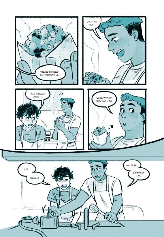
Not an unsettling title at all here, it's The Borrowed Faces10 
THE THREAD HAS RISEN FROM THE GRAVE!
I immediately felt on seeing this, that it was the kind of comic I'd pick up on a small press table at a comics event. Being from that kind of small press print background myself, and gave me those nostalgic feelings like I was at MCM picking up the latest stuff from the Sweatdrop Studios table. This is convenient for me, because my background is small press print comics and a lot of my comics friends are from that scene, so I know which artists made the jump to Tapas most successfully from that world. This is close to professional quality, it's tantalisingly close, so let's see if I can give you just the right pointers you need...
Art Talk:
Raw effort. That's what I think when I look at this. I can see the sheer amount of effort that's been put into this comic. The care that has been put into hand drawing all those panels, the brush-inked outlines, the fine hatching, the backgrounds drawn entirely freehand. You clearly take pride in your identity as a pen and ink artist, even though you are also willing to try digital on your other comics.
Given the history of advice I tend to give in my threads, I'm sure a lot of people might be thinking I'm about to say you should switch to Digital... but actually in this case... I think your traditional work is currently stronger, and I also think the thing that will most develop your digital work is developing your traditional work.
Now, I've said this to the point where it could be a meme at this point, but black and white is a hard sell on Tapas. If your comic had some colour, I believe it would be significantly more popular. I know that colour probably sounds like a pain in the arse after you've put so much work into your lovely pen drawing, but maybe just trying changing the colours from pure black and white to something like a very soft blue or sepia and a dark blue or purple or a rich dark brown. The Photoshop "gradient map" tool would be a quick and easy way to do it. I'd also suggest a colour cover, even if the pages are still black and white to maximise how much you can catch the eye of potential readers.
The other thing I'd suggest for improvement is to look at how you're using the stroke and direction of your hatching to enhance the texture and volume of your work. Maybe look at some penwork tutorials by people like Alphonso Dunn to get inspiration for how to get the most out of your ink lines.
My final art suggestion is to push yourself with your character design. The characters are all quite plain looking here, with the main two being two pale guys with the same nose who are the same height and pretty much the same build both wearing a dark t-shirt with a light shirt or jacket over the top and light-coloured slim-fit pants. They both have medium-short hair. One of them has slightly darker hair, wears a hat and has freckles and a more pointed chin, but I feel like you could push the differences between them to give them more interesting and distinct designs. Get creative with shapes of clothing, character silhouettes and how you use areas of light and dark to give them more visual identity, especially if you're sticking to black and white. If you're stuck for ideas, sites like Pinterest or The Sartorialist, or even online clothing sites can be great for fashion inspiration.
Writing:
This is a competently written comic, particularly on a scene-by-scene basis. I would say that I felt like the writing on scenes was a lot stronger than the overall plotting, which reminds me of my own older work; it gives the impression that you have great characters, an interesting setup and ideas for where you want those characters to end up, but you're sort of just winging it on how you get there. I don't get a sense that the characters are moving towards anything, and the break away from the main characters to focus on the ship characters felt like it was longer than it needed to be, especially with no sense the ship was close the two leads and likely to affect them in any immediate way.
My advice here is to always try to think about how you can introduce ongoing tension and get the audience excited for things that are on the horison. When you think about "I'm stuck in a deadly gameshow!" stories (Like The Hunger Games, Battle Royale or Running Man etc.), there's usually either a clear goal or a ticking clock, so people are dying and the characters see the count of living contestants as it decreases, or the contestants identify the place they need to go or the thing they need to do to get out, but they need to work through the obstacles in the way of that. The wheel of death was promising, but then the outcome was "the price on your head has been increased!" which would probably have been more impactful if we'd seen any other contestants trying to kill the protagonists or shortly after the price increase we'd seen people hunting them and our heroes had needed to escape.
I felt like the interesting concept behind the worldbuilding was let down a bit by the generic feel of the character outfits and environments. The characters in the castle being revealed to be on a futuristic reality TV show was cool, and I expected that the castle was a set for the show and the world was more sci-fi, but then the next place we go is a wooden pirate ship. The clothes being a mixture of standard comic book fantasy and fairly modern meant that I didn't get a strong sense of a specific culture or vibe to the world, and the mixture of magic and technology felt patchy; I couldn't get a sense for what this world was about or what the rules were. I'd really like to see you push yourself a bit with the world building.
You're good at writing characters and conversations, and the scenes themselves have good flow. There are also some great concepts here, so the area to push yourself is bringing up the stakes and adding some tension with pressing or upcoming obstacles and opportunities the audience can get excited or anxious about.
Overall, I'd say this is a pretty solid comic, and if I've been nitpicky here, it's because you have a lot of potential and skill. I think we'll see some really amazing work from you as you develop and build confidence and polish.

@darthmongoose - Thank you so, so much for taking the time to review my comic. It's my first foray into a full-length project, so your feedback and insights here are tremendously appreciated.
My background is in writing, and visual world and character building are completely new to me. I'll definitely work on pushing myself with character, clothes, and world designs! Thank you for the suggestions on where I can look for inspiration.
I also appreciate your observations on improving the tension and stakes. You're right that I do have a destination in mind, but am kind of improvising how to get there - a mistake I won't make on future projects! (And oh yes, the ship chapter kind of got out of hand. I've considered cutting it altogether as it doesn't sit as well as I thought it would, but haven't figured out how to do so without upsetting people. XD)
Regarding the suggestion of changing the colors, I wanted to clarify - did you mean the lineart, paper, or both? A color cover is an excellent idea, so I'll get to work on that! I wasn't sure whether readers would feel duped to open what they assumed was a color comic only to find the rest of it isn't, but I suppose most manga is like that.
Thank you again for taking the time to provide such a thorough assessment of my work - it means far more than I can adequately convey! 
So I'm not darthmongoose, but looking at your comic, if you wanted to introduce a color in a way that still kept the vibe of your black and white comic, I would do it like one of these options...


These are clearly not "color comics," but having that one color or tone does make it a bit more appealing than just black and white to a lot of readers, and can sometimes feel more mature than a full color comic.
@ninjashira - Thank you so much for taking the time to have a look at my comic and provide feedback! I hadn't thought of using single colors like this, and these are some excellent examples. They definitely do still keep that B&W vibe somehow. Thank you - I'll play around with how I can incorporate a single color for sure!
Both, but also Ninjashira's suggestion is great. I'd originally listed a bunch of friends comics that are made to work with minimal colour in my review but it was really making it too long, but some examples of people I know who jumped from black and white small press to minimal colour through various approaches include:
Emma Vieceli: BREAKS
Emma inks digitally, but the general approach is the same as I suggested. She adds a flat colour background, in this case in a sort of yellowish green, and then has changed the line art colour to a dark brown. This is an even lower effort approach than the stuff Ninjashira linked.
Jade Sarson: Cafe Suada
(Note the early pages of this are very old and don't reflect the current look of the comic, I'm talking about the modern pages)
Jade inks all their pages physically (and often does great streams! They're super-nice!) then overlays colours and textures in rich coffee and tea colours and changes the line art colour to a dark reddish brown.
Anna Fitzpatrick: Alien Heart
Digitally inked and goes the extra mile by adding changes to the colour of the line art rather than it being all a single colour, but the textured watercolour look washes that are mostly just flat areas of tone rather than "colouring in" are interesting.
Shazleen Khan: BUUZA!!
This comic is in full colour, but the colour is really very simple and leans on the strength of the strong brush-style inks. Most pages the backgrounds are largely just a light gradient and then the characters are blocked in with flat colour.
Basically there are lots of ways to approach adding a little colour to a comic with strong inking and ultimately just try some things and see what expresses the tone of your comic best.
@darthmongoose - Thank you so much for sharing these! Looks like I've got some homework to do now, haha. I really appreciate your time and your help.
2 months later
Neighbours... everybody needs good neighbours,
With a little understaaaanding,
you can make a better daaaaaaaaaaaaay!
- Okay done with making references probably only people over 35 from like... the UK or Australia will actually get. Let's get to the review! (Also welcome to more fun with comics with titles that are spelled differently in US and UK English!). This is Neighbors6 (With the US English spelling), not to be confused with the Australian soap opera, Neighbours that most British people my age used to watch after school. 
Oh boy.... 288 episodes huh.... (yes, sorry, that's part of why this review took so long to come out. That's a pretty daunting thing to make time to read).
Art Talk
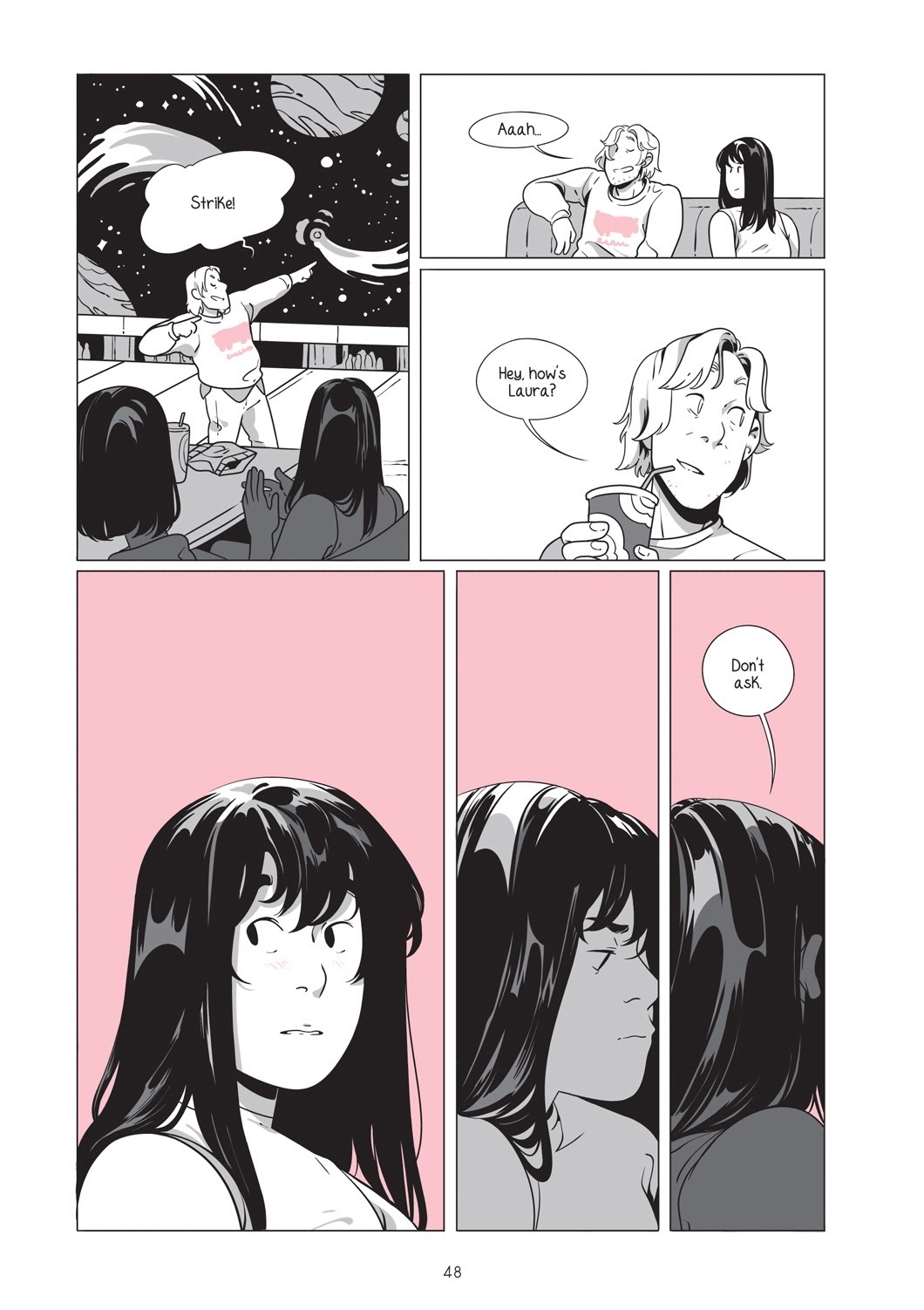
I have to open by saying that this comic is just wonderfully expressive. The facial expressions, bodylanguage and even subtleties like where people look and how they lean or incline their heads when speaking to each other is just incredibly good. The faces always seem to perfectly hit the expression you're going for and honestly I felt like I was learning reading it! No criticism of that area, I just want people following the thread to give it a look because it's just really, really good.
The large character heads proportional to their bodies isn't my personal cup of tea, but I can also see how other people might really like it. Usually heads that big you'd expect to see with much more cartoonish characters, and seeing it with quite detailed heads, clothes and otherwise fairly natural proportions kind of made me think of those old animated sitcom openings for things like Bewitched or I Dream of Jeannie. Overall, it's drawn consistently, so I never felt like the heads being big wasn't a deliberate stylistic choice, and over time I got used to it. It's an unusual style, and I'm not sure how it'd impact readership here on Tapas. Obviously it's not "on-trend", and maybe it's not everyone's taste, but it is undeniably well drawn.
One area of the art I found a bit tiresome was the backgrounds always being that same gloomy purple colour. I like the use of a flat coloured background with simple linework to get across shape, and with a slice of life comic, where the background just needs to evoke "it's just an everyday house/street" I think it's pretty effective, so really my gripe is simply: "does it always have to be purple?" I feel like if you switched up the colour to show changes in location, time of day or the tone of the scene, it would be a really easy way to keep the comic feeling fresh. The purple has quite an ominous feeling, like a dark sky, and doesn't always fit with scenes that are meant to be quite light or easy, and sometimes when the point of view switches from "what these characters are doing in the street" to "What this cat is doing back at home", you could make that scene change as well as the interesting contrast clearer with something as simple as just a different colour ie. "here in the street, these two are having a nice, sunny conversation, the background is a soft, subdued orange, BUT meanwhile at home, the cat is plotting and causing mischief and the background is a moody purple."
The visual storytelling is also strong. You have great instincts on where to focus your "camera" and how to show the spatial relationships in a scene. I did sometimes feel like the shot distance tended to default to being pulled in a little too close to the characters, however. At times the large heads feel a bit crammed into the panels, which are generally not very tall, and it can start to feel repetitive and even a little claustrophobic when so many of the panels are a tight close-up of a face without a lot of space around it. A little more variety of shot distance and angle and space some extra breathing space on panels where we don't need to be pulled all the way in would allow you to use the tight close-up shots to increase the tension when you need it and give the overall comic a lighter, breezier feeling that fits the calm pacing and very low stakes of the narrative.
Design Talk:
A small but ongoing issue I had with this comic was how cramped the text feels. The font is all caps and it's quite a tall, squared-off one, rather than the wider, more rounded form of typical comics fonts. It's an elegant font, but can get just a little tiring to read mainly due to how small the letter spacing is. Combined with the line width on the font being only about as thick as the artwork lines, and speech bubbles that are almost brushing the corners of the text with almost no breathing space and I kept having to force myself to focus on the text while my eyes skimmed over it. I would definitely advise experimenting with some fonts to improve the readability, as well as trying to increase the distance from the edge of the letters to the edge of the speech bubble. Typically it's advised that the space between the letters and the edge of the speech bubble should be at least the width of an extra letter.
Writing Talk:
I should be upfront, as I have been before, that I'm not much of a slice of life reader. I've said this before when reviewing slice of life comics, but I do have a struggle staying focused when reading them to review. I always want to be clear to state this because of the chance any opinions I give about slice of life being coloured by the fact that while objectively I can see that lots of people love slice of life comics, I struggle to see the appeal and so may not be good at giving advice to make better ones.
This is a very slice of life-y slice of life comic. It's extremely slow-paced, particularly because later updates are in single-page format, and deals with small, subtle everyday interactions. As such, it's really hard to give any advice to improve it. Would I like it more if there was more intense drama, suspense and intrigue? Yes. Do I think that the over 3000 people already reading this would like it more? Not necessarily!
I do personally feel like if more happened in episodes, or each one had some kind of a stronger story beat, punchline or surprise that it might be a bit more attention-grabbing, but as I've said when reviewing other Slice of Life comics, there clearly is an audience who like these very chill, down to earth stories of just everyday interactions, and I don't know if my advice would really help performance... it might actually harm it!
One area that does need work is the English grammar. The spelling is generally good (but with some errors. Try to run your script through an English spell checker if you can), but the grammar and punctuation definitely read like "this person's first language is a Romance language". Sometimes it actually added to the charm, because in my head it was like "Oh, I get it, the characters are really speaking Spanish, and I'm watching the subtitled version", so I think having a little of that Romantic flair adds character. Sometimes though it does make me sort of slow down and go "Wait, what?" and need to read a line a few times to get the meaning. The main issues I found were:
- Punctuation: Using more commas and apostrophes would really help make the dialogue more legible. Words that are contractions, like "don't", "weren't", "wasn't", "I'm" and similar read better with the apostrophe, and using a possessive apostrophe s when something belongs to somebody (ie. Kate's review thread) is just good practice (yes, I know a lot of English speakers use this incorrectly, I'll just quietly glare at everyone who incorrectly uses apostrophes to denote plurals like "post your comic's!"  ) . Leaving off full stops (periods) at the end of final sentences in speech bubbles is accepted as a stylistic choice in comics, but leaving out punctuation almost entirely can be a bit rough with a language like English, which relies heavily on it.
So for example these panels:
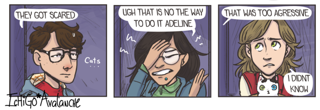
The first panel is fine.
The second should read: "UGH, THAT IS NOT THE WAY TO DO IT, ADELINE"
the third: "I DIDN'T KNOW"
- Phrasing: Sometimes the phrasing is a little stiff or funny. As I said before, at times, this adds some nice flavour, like I don't expect a comic to use perfect British or American idioms, but a little time practicing conversational English, and taking notes of the way English speakers tend to phrase things in films and TV shows (with the note of warning that it's good to pick one out of British or American English to imitate first. We do phrase our sentences differently, so learn one first, then learn the differences so you can choose which to use for different characters and use it to add texture) would really add some extra clarity and sparkle to the dialogue.
Overall, this was an interesting one. Not the type of thing I'd usually read, and very unique! The main area for improvement is readability.
All right... another one to go. I'll try to not have the next one take so long...
Ohhh I'm so happy you have no idea  thank you so so much

I was kind of worried about the lenght of the comic sorry D: but thank so much for reading it all for the review 
I'm aware of a lot of the issues you mention.the grammar is the biggest one DX thank you for your advice! I will go back and make corrections.
About the backgrounds I actually have concepts and drafts where I use different colors O_O but I actively decided to use purple... I can't remember why -_-u and some time ago I did get worried about it being boring, just like you say... but I'm afraid changing it now would be too ... weird? D:
And about it being slow-paced I know! I'm always trying to make every page more interesting (and I fail unu) even if it's a slice-of-life, this is something I really wanna do better.
I feel very thankful and I'll check everything you told me. Your reviews are amazing thank you thank you 
9 days later
Za-ankoku na tenshi no yo-u ni... Oh wait, wrong neon thing. This is Neon Soul6.
Fantasy/Action with Shounen manga influences and a hybrid art style? Well now we're definitely in my wheelhouse!
Art Talk:
The art in this comic improves significantly with steady progress and then a big jump when we hit chapter 3, which adds full colour. I had to throw out a lot of the notes I made when going through the early chapters! Well done! So for the art criticism, I'll only be going off issues still present in chapter 3.
This is a comic where I do wonder if the early pages would put readers off, because it's not just the perspective and anatomy that improves, and it's not just the addition of colour that makes it look more eye-catching and polished, but the visual storytelling and how you block in characters in scenes to show where people are in relation to each other and stuff that improves significantly later on. Ultimately, it's always a hard one, and I don't necessarily want to advise a reboot, so I will simply say this: If you started a comic now with the quality of art and visual storytelling you have in the recent pages of this comic, there's a high chance it'd get more readers. It really does look a lot more polished and read much more clearly later on. Also the colours are great, love the bold palette! (obviously kinda personal preference there, I do love bright colours!). This isn't necessarily me saying "reboot it", but I want you to know that you are on the right track, I appreciate your growth as an artist and I think your future chapters or comic projects will really benefit from this polish.
In terms of areas for improvement, there are two main places I think it would be good to pay some attention: Making your environments feel "full" and giving your figures mass.
You've definitely started putting some effort into your environments in the later pages rather than pretty much just leaving them out like the early ones. I can see you're using 3D fairly well, with the angles generally being a close enough match.
The figures in the street scenes could maybe do with a little more detail, like feel free to leave them as a faceless grey crowd (for both speed and panel focus), but use the models as an aid rather than just using them straight off and do just a little drawing over hinting at jackets, hair and the like to add texture so they look like a crowd of people instead of Putties from Mighty Morphin' Power Rangers.
A lot of your environments are very big empty spaces lacking in texture. I'm not going to tell you not to use 3D models, since plenty of even premium comics do, but my tip for making 3D stuff look good is to add some clutter if you can. Clutter can break up hard edges and add pleasing overlaps. It usually only takes a few things, so some ideas to get you started on stuff you could put into your 3D scenes to add clutter might be: bins/trash cans, signs, hydrants, grids, manhole covers, skirting board, light switches, aircon units or vents, posters, graffiti, stains, scratches, cracks, plants. Try looking around you everywhere you go, or look at reference images. There can be so many little details in an environment and adding them can really add the illusion of realism. Try to break up the hard, empty rectangles in your environments as much as you can, even just adding a little bevel to an edge or breaking a up a big wall into panels (both of these tricks get used a lot in sci-fi games environments).
So now let's talk about GETTING BEEFY  . The figures in this comic are proportioned well, and you're clearly making strides on drawing characters from a variety of angles, but currently you're giving everyone pretty much the same very slim physique like they all have the body of a teenage ballet dancer. The silhouettes here illustrate the issue very clearly:

Usually I'd reserve a physique like that as the "extreme" for a character I want the reader to be able to tell is very agile, probably young and a speedster, dancer or gymnast, because it's a very slim physique with muscle tone, but not much muscle mass and very low bodyfat. I did notice there was a beefier guy in chapter 4, but it felt like his torso was still a bit slim for his arms. I'd recommend looking at how to add bulk and mass to the arms, legs and torso so you can add variety to the cast. Practicing life drawing might also be good for learning to relax your characters a bit. They tend to stand like they're about to do a gymnastics routine with their head up and shoulders back and chest puffed out, which is fine for characters it suits because they're elegant, flighty dancers, but it might add nice variety if some characters have more relaxed body language like slouching, and others perhaps stand in a more heavy, square, planted way like a soldier or bouncer.
Here's a collection of tutorials about drawing various bodytypes. The tutorials vary in style and quality, but it's good to have a good scroll through. WARNING: As with most anatomy tutorials, some of these are a little NSFW. There's nothing too explicit, but there is some mild nudity throughout:
https://imgur.com/a/IqeD24
Design Talk:
Fonts and balloons and the like are pretty solid here, so the main area to comment on is all the padding out of the content
There's a bit too much stuff under the pages. The combination of a large advert for another comic and then a comment showcase and then a CtA to like, comment and sub all padded out with a lot of space is a bit much with the length of the episodes being only about equivalent to a couple of pages . It really slows the reader down. By all means interact with readers in your comments and advertise other comics, but maybe consider cutting that stuff down? It's probably not so bad when reading new episodes as they come out, but when going through the archive it's like watching a video where the presenter stops to tell you about the sponsor, audible or nord vpn or whatever, every one minute or so.
The gaps between panels are often very large. Generally even when reading a long-scroll comic, I expect to be able to see at least enough of the next panel on the screen to know there's another panel when I scroll to the bottom of a panel, but sometimes on desktop with this comic, I thought the next panel hadn't loaded in yet because the gap was so big there was nothing but white space for an entire screen's worth of scrolling. It really makes the updates feel very slow, because the amount of content, as mentioned before, is only equivalent to 1-2 comic pages, it's just spread out over a big distance and then with these big ads and things at the bottom. Used in moderation, techniques like this can make content feel like there's more than there is, but when it's excessive, it really makes the comic drag and feel padded out, like there's a 5-10 second pause between every line a character says.
Writing Talk:
This comic in terms of scenes and dialogue is competently written. It's always clear what's going on and and dialogue flows nicely. This isn't a poorly written comic, so I want to be clear on that before I get critical. The problems are much more with the ideas and plotting than the writing itself here.
The main issue I found in Neon Soul was that the content didn't assert a strong personal identity or get me emotionally invested in the characters. The early episodes feel like we're trying to speedrun a checklist of "things that need to happen in an action webcomic". or "things that were cool in other comics and shows in this genre." There's nothing wrong with cliches and tropes, like I can't criticise you at all for making "a young person with unfortunately no magical talent who wants to be a knight to follow in the footsteps of a famous family member suddenly develops powerful abilities..." because yeah that's also the cliched setup of my own comic! But the thing about a cliched setup like this is that the devil is in the details. The comic definitely improves later on when we get past the training parts and onto the more unique plotline of "squire at the end of his training with friendly, open personality has to go to a dangerous city, but he doesn't know there's a dark unknown history to the power he wields", so you're clearly learning as you go. There is one thing I specifically want to go into though, and that's Quinn.
Quinn, the protagonist, is one of the weakest elements of this comic. There are quite a few characters in this comic with strong, interesting personalities and distinct voices, but the main character is one of the least interesting people in the story. Quinn is just...nice? He's a nice, decent guy without any obvious strong character flaws other than once in a while he can be a little flippant in a slightly meta-feeling "saying what the audience is thinking," way in response to people talking like melodramatic shounen manga cliches. Generally though, he's a good guy and the other characters around him all just seem to be falling over themselves to help him too. He's given not one on one tuition, but five on one tuition to become a knight, like he's a super-valuable rockstar or a prince or something. He has a fitness coach, a personal tutor, a magic teacher and two fighting teachers. Because he has so much support and no rival or antagonist, it really feels like he's leading a charmed life where he gets handed everything he needs. The training is so effective and dedicated that he easily becomes good enough to undergo his final trials in half the usual time with no issues.
I felt as though the story would have been stronger if he'd had some classmates at the knight academy who were either intimidatingly better than him at first due to experience, or who resented him for the special treatment he got or the suspicious speed of his improvement. Either that or if at least one of his instructors, possibly his uncle, had been more biased against him or didn't believe he could be a great knight and had to be convinced over time. Basically, I think Quinn needs a rival or antagonist who throws his personality traits into relief and pushes him to work hard and prove he's not just some lucky guy who gets handed everything he needs. We need to see that even when all that support network is taken away, Quinn has the heart and guts of a hero, and that his niceness is the source of his strength.
Generally, somebody needs to not immediately like Quinn, or even if they do like him needs to at least needs to criticise his actions. The only bad decision he's made so far has been to singlehandedly run off to find and help Holden (I mean, who wouldn't help a Holden in need, am I right?  ), and nobody was angry at him for this, only his uncle got yelled at, and Quinn meanwhile got basically everything he ever wanted with seemingly no downside. Somebody, be it a teacher, a rival or even a friend, needs to think Quinn is a dork or a loser or a fool or a jerk, and he needs to either fail at something or to fail at the conventional approach and to have to scrappily improvise a solution. It's really important for making the audience like a character.
Fortunately the next time we see Quinn he's going to be this fish out of water in this big, scary city, so it's the perfect time to have him experience some struggles!
Overall, I felt like Neon Soul showed a lot of potential and most notably, a lot of improvement over time, showing growing confidence in art and storytelling. The main weak area is various writing and design factors that lead to it feeling a bit slow and lacking in urgency or drama, and that the art could use a bit more depth and weight. Try to push your improvement in these areas to really add some intensity!
Okay..... are you all ready? FOR THE FIRST TIME IN FOREVER five new review slots are OPEN!
Wow, this is pretty good timing because I just finished posting the latest chapter of my comic yesterday (it'll be live on Tapas in just over 4 hours)! As a heads up, I don't do any of the actual art for mine (I do do the bubbling/storyboarding though), so it'd be great if your review would focus more on the story/pacing/characters. Thanks!
(the Tapas version is updated per chapter while the Webtoons version is per page)