Most of my early comics work was in black and white. I was a finalist in the last UK and Ireland Rising Stars of Manga back in... yeesh, it must have been 2007 or something? and did a lot of stuff with UK small press, all in black and white, often with screentones. My very early attempts at webcomics were black and white too because I was hugely influenced by Megatokyo.
But when I started seriously trying to build an audience, I switched to colour, pretty much because it's been common wisdom since even back in the 00s that it's easier to catch people's eye and to look finished in colour.
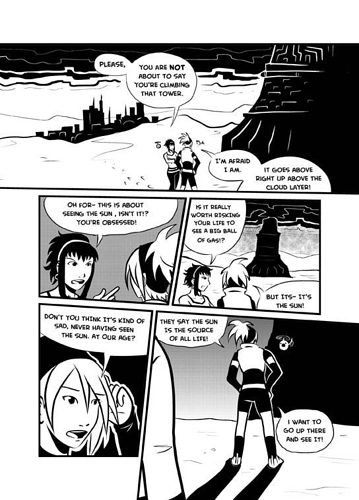
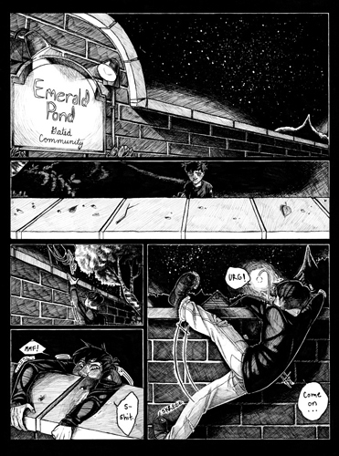
I do enjoy working in black and white. There's a lot of really interesting compositional stuff you can do in black and white that doesn't necessarily work in colour, and I think a lot of developing creators ought to try making a comic where they limit themselves to just "black, white and one mid tone" on a short comic to learn to better use light and dark in their compositions and character designs. I still think "Above the Clouds", my entry that placed in the '09 Manga Jiman competition, is one of the best comics I've ever made, and it's aged a lot better than my colour work from that time:
That said, I often don't like black and white webcomics because...er... a lot of people use greyscale really badly. They fill everything in with a bunch of mid-grey tones as if it's just a colour image that's been desaturated, and it becomes muddy and hard to read. If somebody doesn't have a really strong grasp of how to use black and white effectively to block out light and shadow in a scene or draw the eye where it needs to be or show depth, I feel like they really ought to just use colour. I particularly get boggled when I see somebody filling in every part of their panels with a lot of mid greys and then saying "I use black and white because it's faster!"... I don't really get how that's faster; everything's filled in and with different tones, which to me is indistinguishable from filling everything with different colours.
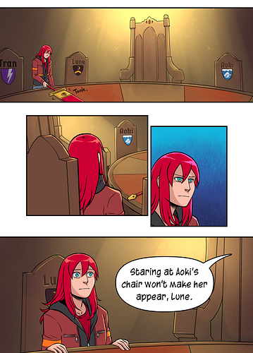
I have a lot of fun using colour for Errant, because there's a lot of fun things to do with colour too, like glowy magical effects, or associating colours with characters to add an extra layer of meaning in places, using clashing colours to show discomfort, or soft ones to create a Romantic mood... it can be a really fun tool to use! Like on this page, where the overall room is in shades of Gold, associated with the terrible King Urien, so you feel like he dominates the scene even when he's not there, and the yellow almost creates a deathly, sickly feeling or one of dust and decay, and then when she's thinking about Sarin Aoki, looking at her chair, the background is blue; her associated colour, to emphasise what's on Rekki's mind.
Colour can be used badly too though, like sometimes I see bad, garish, patchy fills of over-saturated, unnatural colours and I'm just thinking "ugh, this would have looked better left as the line art".
Basically, I like both, but I think creators need to commit to really using whichever one they pick to maximum effect.