Coyote Bison
@SandraMJ
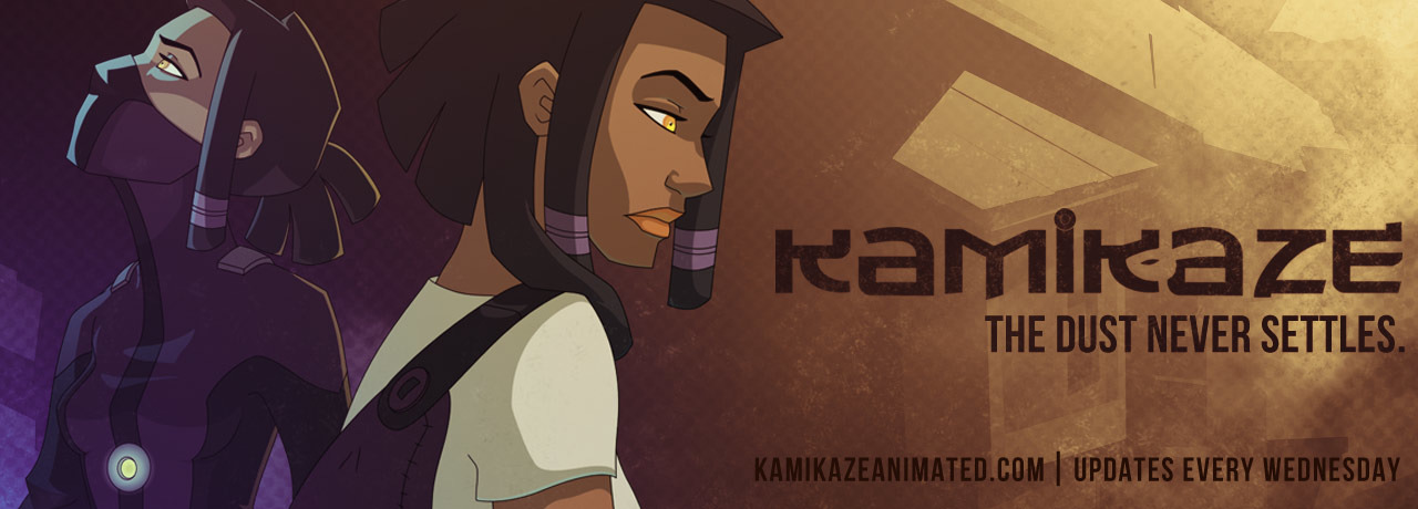
First impression:
Very Lackadaisy-ish. Landscape layout format is not great for Tapastic, but I assume you're using this site as a mirror for another site that uses the landscape format more effectively (or have a book planned). Rendering is very good, colors are great. There are some lighting and shading effects I think you could incorporate.
Further reading:
Okay, so since you only have two pages, I can be pretty specific.
PAGE ONE:
There doesn't seem to be -enough- going on in the first panel, I bet you could do a lot more with the depth and focal points. Something Escherian would work very well here, with views into beer mugs, maybe old grimy poker chips strewn around, flashes of signage from a bar, a wild wilderness night sky crazily winding its path through, more cows. I don't know the character, of course, but I assume you're trying to convey a hangover from a rampage through the town. : )
I thought the coyote character was riding a giant chicken in the second panel. I think some use of gaussian blur would be appropriate to suggest fuzzy depth of field since you're going for realistic textures. Either that, or play up the idea of your buffalo character thinking he's spotted someone riding on a giant chicken.
That said, what you do have is competently drawn and you've got the old west feel down pat. Good job! NOW DO MORE.
PAGE TWO:
I like that you're telling more story here with attention to the character's faces. The buffalo is more expressive than the coyote. Based on expression and detail alone, I find myself more sympathetic to the buffalo and want to know more about him. The atmospheric details are nice, I'm really getting a sense of bright sun and dust.
Maybe this is me, but the flat face of your coyote character and the stripes made me think he was a tabby cat at first. I had to read your comic description to deduce he was a coyote. Coyotes have pointier, foxier faces. It threw me a little bit stylistically because the buffalo is rendered so accurately to reference.
Overall, not super into your bold speech bubble font choice. Something less bold might be nice. I do like how you have styles for transitioning from old-timey muttering into clear speech. Also, the horizontal format shrinks the text a lot and makes it hard to read. I also enjoy the playfulness of the speech bubble placement, how they are sometimes high off the page and cast a shadow.
With shadows and lighting on the art, while I adore all the detail you've lovingly put into this comic, I think there are areas that are in shadow that could have lower contrast details to help attract eyes to focal points in the images. You're clearly very skilled and passionate about making this comic, I just wish my eyes had slightly more direction on where to look in each panel. That said, panels flow well into each other and I don't have any problems keeping up with the story. The gutters are an appropriate size and it's not often that I see textures used well in margins. Very nice effect. : )
This comic is very promising and I believe you'll find an audience hungry for it. Keep up the lush visuals and attention to character expressions, because that's what sells the comic for me and makes me interested in more.
I hope you don't mind that I only chose one comic to review! Thank you so much for putting it up for this.