1 / 17
May 2017

Heyo!
I love color and I'm very curious about the process others went through to choose the color scheme of their comics. My comic Gifts & Curses250 uses a limited pallet. Well it's actually a bunch of limited pallets, but most of them aren't in use. The pallet in use is a pallet I spent a long time tweaking and remaking, the others are still in progress. Originally I had developed them on Paletton195.

35

I used them at the time just for individual characters, but when I started expanding the pallets to other characters I realized the colors weren't quite what I wanted so went through a process f tweaking and mixing until I created a new pallet.

153

Basically for this comic I'm going for a very bright cheerful type of world, though I have to be really careful about over-saturating the colors. For a different comic I'm planning the color schemes are going to be very different. It's because the tones are very different.

So it made me wonder how everyone goes about choosing their colors.

Is it a meticulous process or do you just use whatever? Is there reasoning behind you colors? (Each of my pallets has certain symbolism attached to the colors)

Do you have a certain pallet? Does you're overall scheme lean toward warm or cool? Is it monochromatic? Do you even have color?

I'm very interested in seeing others processes and reasoning.

  • created

    May '17
  • last reply

    Oct '17
  • 16

    replies

  • 10.9k

    views

  • 16

    users

  • 23

    likes

  • 27

    links

for my comic236 I guess i choose 1 main color for the scene and then i'ts mostly random and following my feelings
if you want to see my different colorschemes :
ep 1 to 3 are cold green
ep 4 to 7~8 are blue
ep 8 is blueish green and 9+ are yellow

I'm not a very meticulous person laughing I mostly go with the flow

I love comics that use colours in creative ways. At the moment on The Celebrity Babyverse210 I just do flat colours with two (not fifty!) shades of grey markers, it's simple but I'm really pleased with the way it looks. And for someone who isn't so confident in their own artwork, having something unique like an interesting colour choice can help make your art feel more special, I know it does for me.

This is nice, I adore limited pallets and you've taken it to the extreme!

For palettes, the first step is deciding the time of day/lighting/and mood of the scene. Everything else is informed by that.
I don't even bother having a color reference for characters since I never use the same exact tones for them anyway once a scene changes. I just know to keep hues at certain values to pull off the correct contrast like for skin vs hair.

Like here's an example with my protagonist Tula. I first choose the setting's palette, then pick her skin and hair tones after.
27
23
11

I just use the basic colours you get on Photoshop. I'm really really surprised no one has criticised me on it so far hahaha

I'm still kind of a newbie at coloring my comic,70 but I try to remember my art lessons: Reds, yellows and oranges are good for active, faster-paced scenes, and blues, greens and violets (or purples, depending on how you like it) are good for the quieter scenes. But, like I said, I'm still a newbie. I'm learning... Here's one where I mostly led up with with blues and violets.
36

I choose one primary color that is the sort of "color trope" of the entire series, but I don't use it overtly. For Mallory Bash, the color is lavender. I try to incorporate it where possible, but only when it's appropriate to the lighting of the scene. I take some liberties in daylight, where during the prime daylight hours, the shadows are all in purple tones.

Other than that, the color palette is determined by the lighting of the scene. I always paint the backgrounds first, so I know exactly what lighting tones to use on the characters when I paint them. If it's night time, I use blues and purples. Generally I'll paint the characters their normal base colors, then I'll color pick each part of the character.

Say I color pick their natural skin tone during a night scene. In the color window, I'll pull the slide to the blue or purple area so it's the same value as the skin, then I'll pull to a darker and less saturated value and use that as the new color for the skin. I find that this keeps the value relation among the character's colors proper and when it's all done, even though they're all blues and purples, the eye is tricked into seeing the actual skin tone in a dark environment.

Like this:

41

(sorry this is long I'm very passionate about colours)
I'm gonna use my comic 150 Days34 as example because i was very conscious in my colour picking in that one.
I usually pick the mood of the scene first and build everything around it. For this one it's a short story so I blocked out all the colours in a colour script first. (no pictures just colours per chapter and see how the chapters look next to each other)

I use the same colours in 1 scene i just vary them in intensity. I think this creates unity in your art without having to use the same colours in your whole comic. That's going to get boring if your story is long.

For example in Chapter 8 & 9 (wich is one continious scene) I've changed the pink from a soft "romantic" mood to a more intense fighting scene
68
There is only a few panels between each of these but the mood is very different.
Sidenote: I like to use minimal colours for action scenes so it gives an illusion of fast movement and you can control the intensity easily.

I personally think people should forget the whole "red stands for this, blue means this" rules because you can use any colour and set any mood you want. It al depends on saturation (like the example above) or context like the one right here
84
Out of context they may make not that much sense (I don't wanna spam this tread with pictures) but These are from 3 different chapters portraying 3 different moods. Fear/sadness and romantic all while using the same exact colours and saturation.

If the story leaves room for it I adjust the time of day to the one I can use the colours I want in. Although I do not shy away from unrealistic colours either if the mood calls for it. (These 2 things I do in my two other comics) Decide beforehand though because if your comic is all in realistic colours and you use unrealistic ones only once it can feel weird and out of place but if you use it as a tool multiple times it ties in again.

If your comic is going to be full colour I wouldn't set on a palette for the entire comic mostly because I think it can limit you as an artist and the emotional credibility of the scenes in your comic. A character can say they are sad but if the background colour is the same as the one before in a super happy scene it's just going to remain as words not an emotion.
This is also where I agree with @joannekwan 's comment of not using a set colour for your character because they will feel like they are just stuck on the background instead of living in it.

This is just how I do things. Colours come to me quite naturally so I just go off on feeling most of the time and I'm only now learning to put those in words. By any means just try out stuff and look and listen to various people to find what works for you!

If I need a particular color, I'll search "hex code color for [insert item here]" otherwise it's basically: "this color looks nice to me."

i think a large part of the twaw colour scheme is me trying, again and again, to do a limited palette colour scheme and ending up, again and again, not doing that. so theyre like, semi-limited.

the colour palette in There was a War39 obviously changes with the scene; its a big way of setting the mood and sense of place. i have it generally split into three categories; the grey of Balor's cell, the brown of the tunnels, and the blue of the magic cave. all these palettes are limited, which is kind of a narrative point but idk how to explain it this early in the morning. sometimes this opens up to non-limited palettes, usually outside and also narrative relevant. but still, therell be a scheme of colour decided based on the mood, light sources, and time of day.

i think overall my comic is very warm paletted, but the magic cave, the most important space in the story, is cool paletted. so go figure.

theres also a gold motif but again, cant explain the decision behind that this early in the morning.

I rely on my colors a lot in Numb10, but the funny thing is I barely plan them before starting. Instead I just go by the feel of the moment. I use any color I feel like using.

But some general rules have still formed. For instance when there's a regular scene happening the colors are quite normal, but with supernatural elements involved the palette chances drastically. I also use different colors to convey the mood of the characters. The background color changes whenever they go from happy to mad etc.

2

I don't really use color in my comics most of the time because it takes me forever. But if I do, I have different approaches to each comic.
But for Halfsoul5 I going with a limited color theme I think looks nice, coloring my flats before painting over the shadows and highlights. Because I screentoned the pages beforehand, I don't have to worry so much about the lighting, because what needs to be dark will stay dark and so on.

11

Never really used a defined color palette. I tend to just decide what the drawing needs on the fly.

5 months later

Interesting question! :smiley: I have thought some about the colour use for The Changeling's Sister12 but I haven't as such gone for a palet.

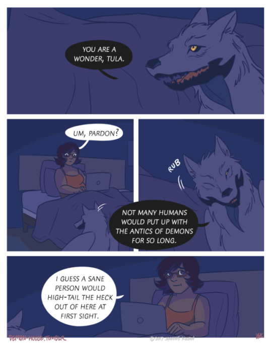
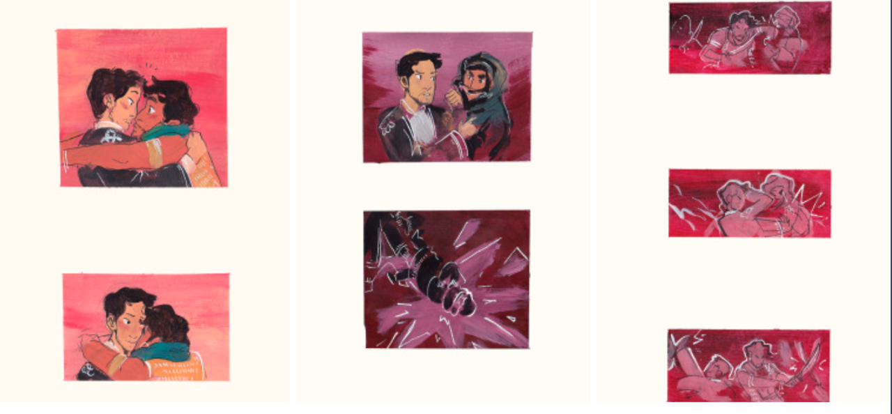
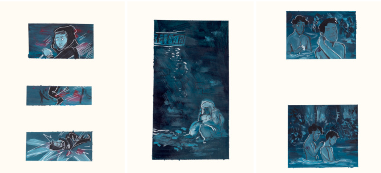
Since the tone of the story is quite dark I went for a darker feel in the colours, Like it being a bad memory sprouting up. I can best describe it as, if you have seen Howl's Moving Castle, where Sofie goes through the door to Howl's refuge home in the flower field, and it grows out of the darkness. That's why I use black panels instead of white.

22

In the ball room scene I thought about the uncomfortableness Rose feels in the scene, how angxious she is, and how her senses are in high alert because of it, and everything is just a bit too bright and off with the colours, going for a cold yellow and green. (I'm not sure I got that across though, I think it just translates into a bad colour scheme for everyone else :S)

I also gave Rose and Doll-Lily the same coloured dresses on, but desaturated Rose's and oversaturated Doll-Liliy's to show how unatrually beautiful Doll-Lily is and how Rose almost blends into the walls. (Again I'm afraid people have just read it as not balancing the colours properly, but at least some have picked up on the dresses being different colours)

3

So I guess I'm not thinking as much in colour schemes as how I can convey how the characters are feeling in the scene.

I generally also pick a background colour and then match the rest of the colours to that.

5

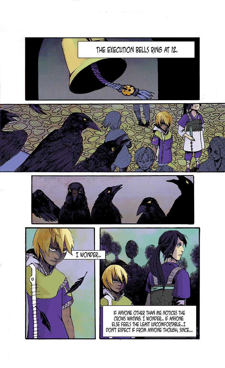
In general when I envisioned the story I also thought a lot about green and violet. That was how the story is coloured in my head (I haven't gotten to those parts yet though).

my go to has always been the FOLCOTONE swatches in Photoshop. They look beautiful regardless of differences in monitor calibration and are varied enough to give you a wide spectrum of options