51 / 80
Aug 2024

...I never said they were... ._.
I said the fact that their face is almost invisible will make them LOOK like a caricature, or at least feel like one. The average viewer isn't going to know that you just had poorly-executed good intentions...the fact remains that it's kind of a wacky-looking mistake that a lot of people might give the side-eye.

If you've seen how black people have historically been portrayed in cartoons and anime, you shouldn't be surprised by this...and again, I wasn't trying to accuse you of anything; I was just illustrating the degree of the error. =T Some people DO need to be told/warned; I had no way of knowing whether you were aware or not.

Yeah, this was my goal. And also, thank you for all your help and tips, it makes a lot of sense.

My goal is definitely to improve so the characters can be represented the best way possible. I think I just have a tendency to be hyper-sensitive, since it's very important to me that dark-skinned girls get their chance to shine

Alright, that makes sense. Maybe i'm hyper-sensitive. I know I have a tendency to get touchy about the lack of representation of dark-skinned queenies in the media, so I may have misunderstood your statement.

A good thing to practice as an artist is to view an image on your phone vs how it might look on a desktop. It might also be worth going into setting on your computer and making sure you are using a proper color balance.

I edited the image on the left to show how it appears on my phone and why some people might be a bit shocked about why her skin is so dark.

The image on the right is me using your photo reference to pick a skin color for her.

yeah, i realized when i switched to a computer that the colors don't show the way they do on my tablet lol

(there's a subtle edit between the first and second version)

Alright, following lots of the advice people have given me, can someone, or everyone tell me, on your personal devices, are her features visible?

It's better than the first one, however, still pretty hard to see for me.

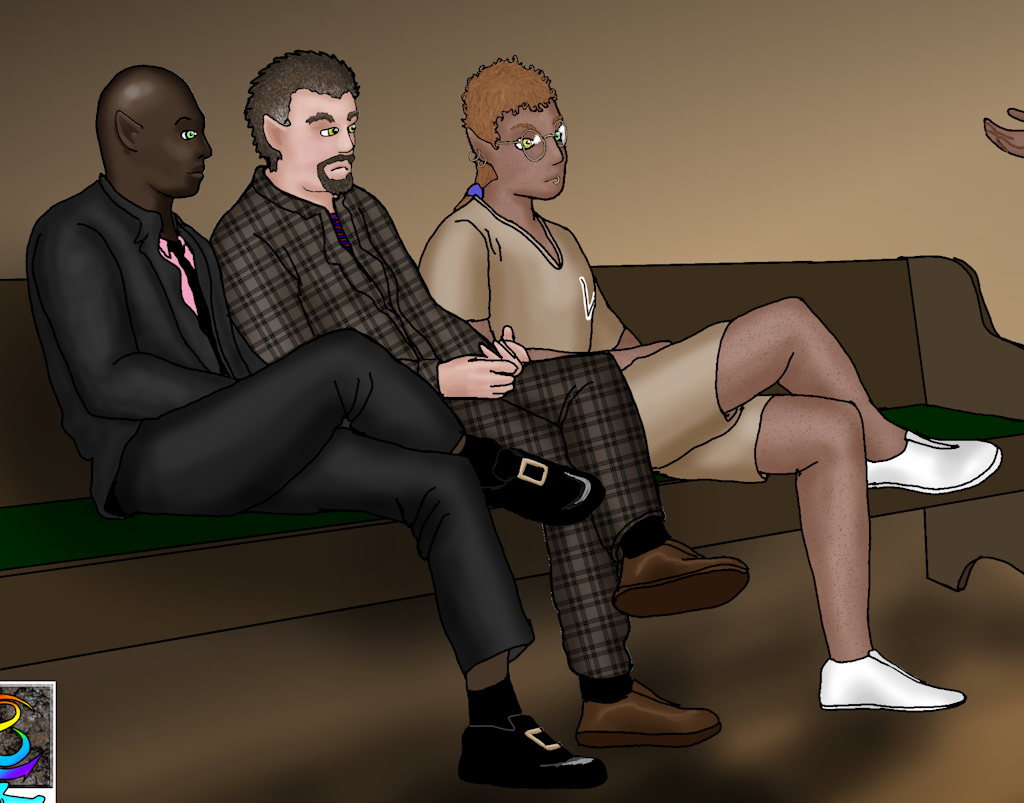
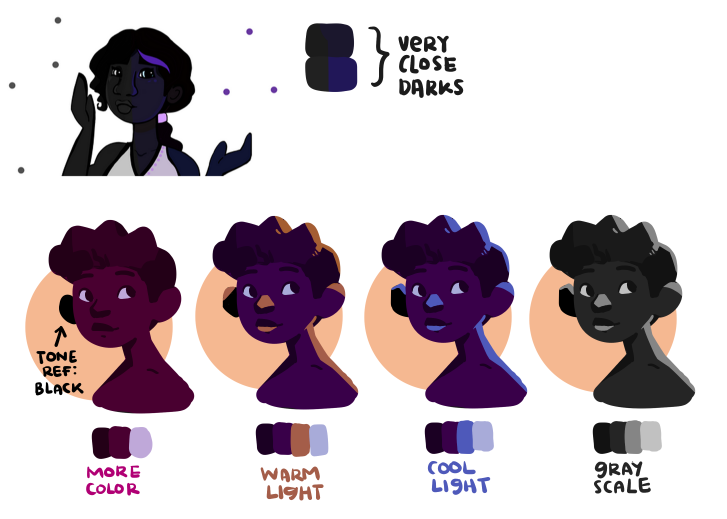
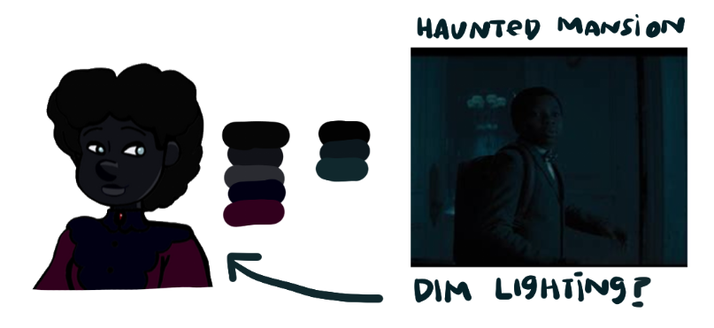
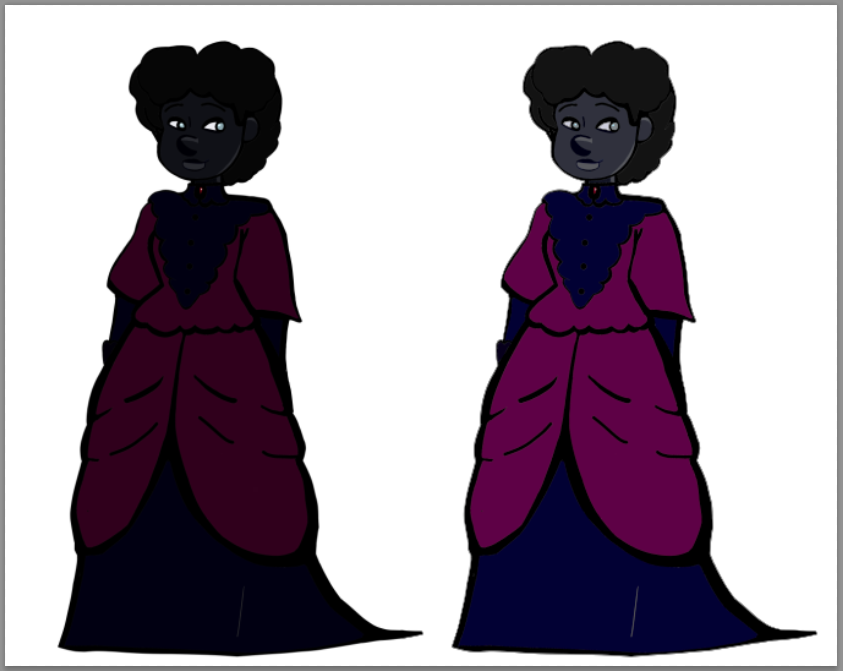
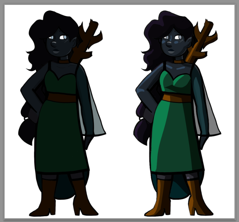
I use shadows and lighting, just as I do with light skinned people. Black people are not "black", any more than white people are actually "white". Black people are brown, and even when they're really dark brown light reflects off them.

I probably make my colouring way more complicated than I need to, but what I do is get my final ink layer finished, then make a copy of that layer. Paste it underneath the main ink layer, make the original layer invisible, and then colour the new layer with little regard to "staying in the lines". Often while shading I will create several other layers just for the shading and textures so that I can trim them down to "within the lines", then merge the colour layers. After I'm done I make the first ink layer visible again.

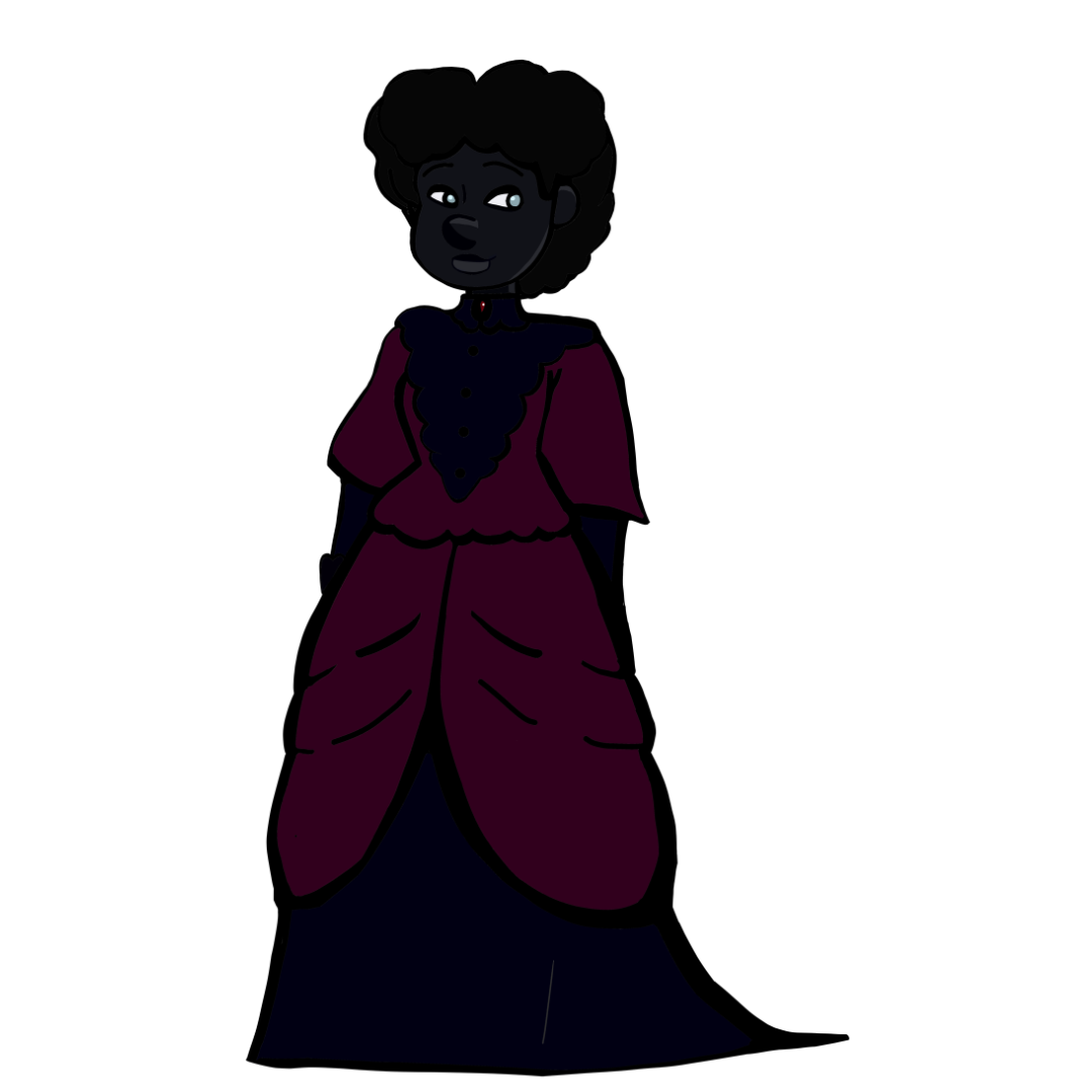
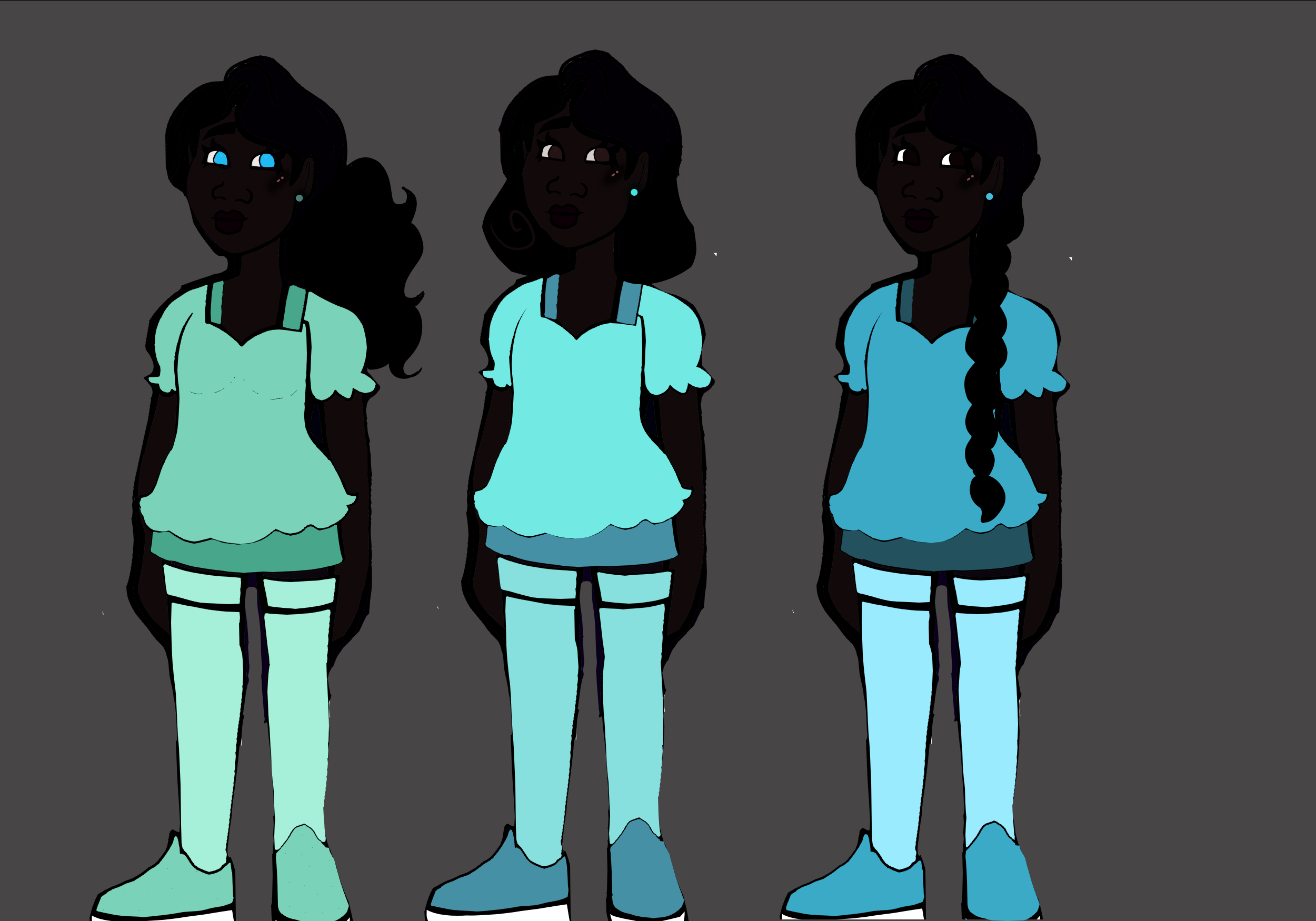
Here is Leander (black), Owen (white) and their son Evander (mixed). You can see the use of light instead of dark to bring out the features of Leander's skin and clothes:

It's visible, but still can be a bit hard to see (if the phone is really dim).

I have a similar issue with this, but I feel the scenario and the character's qualities won't be changed, so I played with the shading as a way to sculpt his face for it to be more defined/visible.

When the time comes for us to see your comic, we can see how visible she is within her environments.
Proud of you! :^)

it's actually just art for my novel, not a comic, but thanks lol

Her whole face is visible, but still pretty hard to see - though my monitors are never at full light/bright settings, so all the darks start to blend together the dimmer it gets. :sweat_02:

Perhaps a more contrasting color in the lines or highlights, since they look very similar at first glance. This can be either:

  • lighter or darker colors
  • brighter or muted colors
  • warm or cool colors

I did a test drawing playing around with brighter colors for the skin (same dark as your drawing) and lighter highlights for example. The eyebrows are still hard to see. . .

ooh excellent reference!!! that really helps to show the contrasting

Alright. Take...I don't know...6 or 7 lol.

Could anyone tell me how well they can see Mora's features in this picture?

It's an improvement, but I still find it hard to see. The overall values of your color palette are still too close to ech other I feel.

All of your colors exist in this bottom space of value scale which makes them all blend together.
The red in the dress is the biggest outler, but it helps that it is contrasted againt the blues. But it too is really really dark.


As an example, the color palette I use in my work has this range on the value scale

I agree with KevinReijnders, yes improvement :smile_01: but the hues are too close in darkness to see clearly.
It feels like the character might be wandering around in the dark. . . same suggestions as before.

Additionally I want to show some quick edits. All I did was change the contrast on your drawings (ironically I had to lower the contrast, because the colors are just that close to each other.)

Both characters became instantly more readable, without losing that deep dark skin aspect of them.
Now in both examples you'd probably wanna tweak the saturation somewhat so it blends more harmoniously with the rest of the colors.

If you actually wanna start practicing shading and rendering as a whole, I would definitely advice to use lighter colors as your base, otherwise your shadows will drown out what little contrast you have.

Did a very quick and dirty render. Fun little detail about this one, the shadows on my edit are your original colors.

Ok Here are my big tips no 1. contrast, I think that because she's always in a white void is whats making her skin tone blend with her hair. her incredibly bright white clothing also contributes to this, so consider putting her in a grey void and switching up the colour scheme. no. 2 because the hair is the main thing thats conflicting with her skintone, consider hairstyles where it wont intersect with a lot of her body. I like her long flowy hair but it does make it difficult to see her arms and neck

as part of my switching up the colour scheme, i did darken her eyes. I assume that she either has magic abilities, or cataracts/another visual shorthand for blindness. given the magic, just use a darker blue. given the blindness, she can have another vision imparing condition that doesn't effect how her eyes actually look. most blind people don't "look" blind, I'd advise giving her a cane or a seeing eye dog, as it still serves as a shorthand but doesn't mess with the contrast. (plus doggie!)

yeah, unfortunately, my app glitches and won't let me color my bgs, ever without crashing. Also interestingly, her eye color has nothing to do with magic or blindness, just her gene combo.