...I hope this wasn't directed at me, but on the off-chance that it was, I'd like to clarify my explanation:
I wasn't trying to say that certain colors can't be used at all to depict dark skin, I was trying to say that in certain contexts they do not REPRESENT dark skin well, simply because they make the image way too difficult to read.
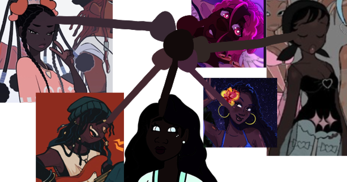
There is a reason that POC cartoon characters don't usually have skin colors that are near-identical to the lineart colors-- the viewers won't be able to see! Lightening/brightening the skin color to fix an issue like that is not an "excuse", it's simply a color correction on the same level as toning down hyper-saturated colors so that the viewers don't get eyestrain looking at your characters, or changing the color grading of a film so your characters don't get lost in the shadows. When done correctly, the character's skin should still read as 'dark', just in a more skillful way that allows the viewer to understand and enjoy the art.
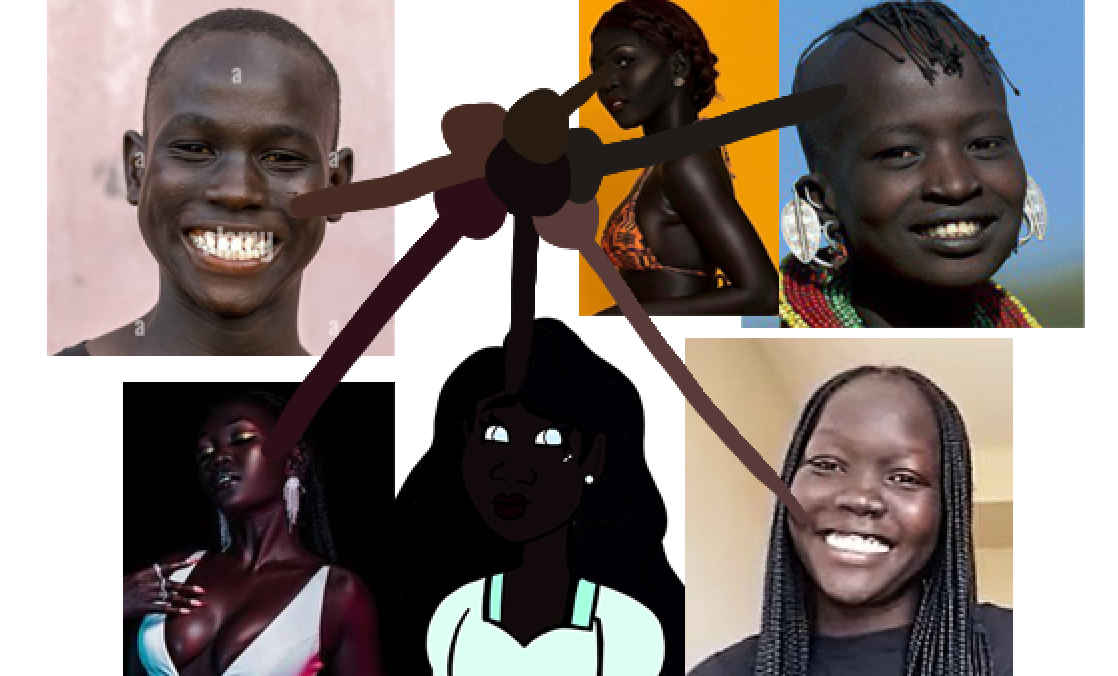
As I stated, real black people's faces are visible. So the faces of your fictional black characters should still be visible. There are TONS of shades you can use to make that happen; there is no skin tone that cannot be adequately represented by some color somewhere. But not EVERY color is right for the job in every instance, and there's nothing wrong with that.
Or I guess, to put it a different way: every skin tone can be represented by a range of different colors, the artistry lies in putting the right ones in the right contexts. A context where the color of your lineart is nearly the same is probably the wrong one to use that color in.
Like, even with a white character: you can't use your favorite vampire-white skin tone if your lineart is also white. No one's saying that skin color isn't allowed, they're saying the piece won't be readable if you use it there. So you need to either pick a new color, or change the surrounding colors. The context matters.
And yes, the simplicity of a style also matters, because simple styles tend to lose readability more quickly. Photorealistic pictures can use a wider range of colors and still read well, because they already contain a huge range of colors, along with more lifelike visual cues to tell the viewer what they're looking at. A photorealistic piece that's 99% shadow and dark tones can still be readable if you know what you're doing.
Meanwhile, if you're using a simplified style-- say, B&W manga-- and you decide your one black character should just be a fill-bucketed black silhouette because they have very dark skin, they're going to read poorly, and you're going to look like a lazy, racist artist. Deciding to use dark screentones instead isn't playing in anyone's faces, it's making a better artistic choice that actually represents the idea of a dark-skinned person in your artstyle, rather than looking like a caricature.
I hope I explained myself well enough this time; I really don't want it to seem like I'm saying something I'm not (artist of color here; I may not have darker skin myself but most of my family does, and I've been coloring characters of color since I was a child mixing the peach and brown crayons together).
At the same time though, I have to insist that dark skin is not magically the one area of art where anything goes and nothing can ever look wrong. You absolutely CAN make dark skin look wrong by making bad color choices, the same way you can make any other aspect of a character design look wrong. It is OK to choose one color over another EXTREMELY SIMILAR color if it makes your piece look better, and no mature artist will shame you for it.
...I really think we have to be able to acknowledge nuance in these issues if we want people to take the time to learn how to depict people of color well and feel comfortable attempting it. I've never liked how scared people sound when asking questions about this topic, but I can't blame them because critics are so quick to assume the worst...there are plenty of artists out there who are actually overtly colorist/racist and deserve that harsh criticism; there's no need to pick at someone who shifted a character's skin tone by 5%.
less at you and more of a general statement which is why i tried to include the note on spoons since i was tired while responding in the moment
i do understand the sentiment of lightening a color since the lineart has to be readable but my issue is when it comes at the expense of killing the saturation and making darker skin tones look grey. which isn't to say those shades dont exist but they also don't always look the best depending on how it's painted
as a fan of many art styles i'm aware of how folks have to make certain changes or adaptations to show things a certain way whether it's pixel, black and white, watercolor or otherwise and also an artist of color myself so hopefully itt's clear there's no shade there. its a big reason why i like to follow a breadth of artists to see methods to handle certain things stylistically coz i know i'll alwways have more to learn
i do apologize if it seemed like i was jumping the gun and i'll leave this as my last response
@Leyelle, are you black or know any black people? I'm going to assume no since you're having this problem, but getting advice from your subjects is usually good advice.
Practically speaking- Find some books on the subject. Malik Shabazz (Not the hotep guy) had a very well regarded art book called How To Draw Black People some years back.
I just did a search for it on Amazon, home of undercutting the competition, but it was over $100. This suggests to me that it's out of print now. I couldn't find it on his website either. Might be worth asking your local library about it.
Personally speaking- There's skin tone and there's skin tone manipulated for media.
I'm assuming Nyakim Gatwech is the inspiration for wanting a very dark skinned character. It might help to realize that a lot of photos of her are Photoshopped to exaggerate her features, like with all models. Wikipedia3 has a photo of her under normal lighting conditions you might want to look at. She's lovely naturally and her skin tone is good for manipulating into something striking, but it's still manipulated and thus, unreal.
What I'm getting at is that you can have a dark-skinned character with clear features without them being, well, drow from D&D.
I now see this was covered but it bears repeating.
Unless you're making a drow, or even Mr. Popo1. But those both require a far different approach.
BTW, my advice for anyone reading this post for drawing Mr. Popo is pretend you never heard of this character before and never will hear of it in the future.
excuse me, but i'm going to have to disagree with a portion of your statement. This character is not a caricature by any stretch of the imagination, i'm a black woman myself, and wanting to express the beauty of my diaspora. No, I do not have the skills to execute this properly yet, but that does not detract from the point that this characters complexion is a beautiful and INTENTIONAL choice, however (currently) poorly executed.
I am in fact black, actually, i'm just trying to improve a skill set i don't have yet.
Great! Grab your camera and take some shots of your arm under different lighting conditions. Then grab the eyedropper tool in your art software and start sampling and making swatches. Once you get a decent range of colours to work from you can start expanding and experimenting from there until you get some skin tones you can live with.
Dude, not all black people have the same skin color.
@Leyelle Is obviously trying to depict people who have darker skin, maybe even more so than her own.
like Sanegalese
Or South Sudanese
In hindsight I will say that my comment about desaturating nighttime scenes could probably be taken out of context; I agree that making dark skin look gray is probably not the right choice. I just meant that there are techniques to making colors look darker without having to make it invisible on certain screens.
The references from @theyrebothakilogram's post are a great example. All of them read as very dark, but I can still see them on my monitor, because the artists were able to utilize techniques that make the colors look darker without using a shade at 7% brightness.
But I'm white as a sheet with not as much experience drawing darker skintones, so that's about as much as I can say on the topic, lol.
This post was flagged by the community and is temporarily hidden.
which is totally fair and why i'd hoped to add some more artists i know of who also accomplish this with their styles
like one of my absolute faves recently has been rockybloo especially their comics beanstalked and glitter an guilt since you can see darker skin tones used not just in standalone illustrations but full comic scenes and they still look great and read well
This is true, and I think most people agree with you, they're just trying to say is that it doesn't read the way you're meaning it too
most of these characters read very well as dark skinned characters like you're going for, but you see their color choice is very different from yours, and you can see something similar when you color pick from real people too I included the unedited and edited photos of nyakim gatwech. and I think I see your vision (let me know if I'm wrong) the skin tone you selected it very similar to the color on Nyakim Gatwech's cheekbone
the only problem with this is that it's from the part of her face thats in shadow, for a style like yours I recommend selecting a color from the nose/forehead region because they tend to have less highlights/lowlights. you can see the same thing on white people where you don't want to select the shadow region because it will read very differently
heres what you character would look like if you sample one of the references color palates (I also desaturated to teal a little to make it easier to see)
and here's what your character would look like if we sample Nyakim Gatwetch's color palette
I hope this helps, we're not telling you to change your characters complexion, just trying to find a better color to represent the skin tone you're going for if that makes any sense. Do you have a picture or reference of the look you're going for?
...I never said they were... ._.
I said the fact that their face is almost invisible will make them LOOK like a caricature, or at least feel like one. The average viewer isn't going to know that you just had poorly-executed good intentions...the fact remains that it's kind of a wacky-looking mistake that a lot of people might give the side-eye.
If you've seen how black people have historically been portrayed in cartoons and anime, you shouldn't be surprised by this...and again, I wasn't trying to accuse you of anything; I was just illustrating the degree of the error. =T Some people DO need to be told/warned; I had no way of knowing whether you were aware or not.
Yeah, this was my goal. And also, thank you for all your help and tips, it makes a lot of sense.
My goal is definitely to improve so the characters can be represented the best way possible. I think I just have a tendency to be hyper-sensitive, since it's very important to me that dark-skinned girls get their chance to shine
A good thing to practice as an artist is to view an image on your phone vs how it might look on a desktop. It might also be worth going into setting on your computer and making sure you are using a proper color balance.
I edited the image on the left to show how it appears on my phone and why some people might be a bit shocked about why her skin is so dark.
The image on the right is me using your photo reference to pick a skin color for her.