24 / 36
Jul 2019

Totally agree lol also best to keep the originality and personality of the original drawing

Totally agree. To me the edit looks like the character has also been slimmed down. To me it appears that OP intended this character to have a wider face than that edit.

I didn't notice anyone giving this critique so I'll go for it-

Trying to work around algorithms aside, there is a good chance of when/were you update VS were/when your audience checks in is in completely different time and places. Its very common that all the big sites tend to share the same general audience groups- but which ones are bigger and more active varies.

Personal example- SmackJeeves gets joked a lot for being basically a PMD site. If you write/draw a PMD comic, your best bet for your audience to find you is to upload there, regardless if you like the set up of the hosting site or not.

There is also generally spreading out and saying hello in other places. Kind of like what you are doing right now! But going to large sites like Reddit and finding the subreddits that cater to your themes is paramount. Most of my audience has found me from linking my work to reddit.

If all of that is tried and you feel algorithms are still not with you, fanart can help your audience find you. No, not just any fanart- fanart from works that have directly inspired your own personal work. People thirsty for those shared themes are always looking for more. I noticed you have some Earthbound pieces, perhaps sharing links to those pieces on various fanboards will help!

There is also the fact that said Instagram has only 20 pieces right now. That's 20 chances in a crazy large ocean for people to find you. To expect to grab a sizable audience with so few pieces is expecting the craziest amount of luck.

Wish you best, figuring out how to get your audience to find you is one of the hardest things as an artist.

I did it quickly just to give an idea what it might look like with it proportionally, the artist can take liberties with it and use it for reference not as a final drawing. It's a critique, let the artist judge for themselves. Also I don't see why im suddenly destroying the integrity of their art just cause I moved around the face slightly.

The eye spacing is fine, I put a “cyclops eye” on the original drawing to check the
proportions and it looks normal. The average spacing between two eyes is the length of one eye so it’s fine. That being said everyone has different spacings. Some have larger and some have shorter

Well I don't want to sound rude, But the proportions on the original are better. The space between eyes is the same length of 1 eye

Okay if its bad critique let the artist decide if its pointless or not? Like why is this thread suddenly turning into critiquing critiques. You guys are spamming this thread, lets get back on topic.

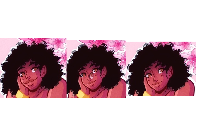
This is a great technique to measure distance between eyes and keeping them evenly spaced. Did you know this also applies to the measurement between the nose and the eye as well? (There are a lot of ways eyes can be used to measure the proportions of the face).

@nightwingwife

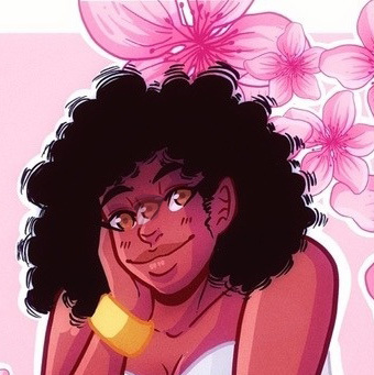
I know it's hard to be gone a while and not be met with a lot of fanfare upon return. That being said, it doesn't mean there's anything wrong with your art itself. Sometimes it has to do with the season, it IS summer so people are busy, on vacation, doing their own things, so it's possible season has something to do with that. Plus, like others have said, there are a lot of artists on Instagram so, finding your niche will just take time, it doesn't mean you don't have skill. :slight_smile: Now, with regards to your artwork itself, I actually think you make beautiful work. You've got a good grasp of color, shape, texture, it's all pretty solid. You just have a few tiny proportion issues that've cropped up and don't worry! Everybody has them, it's just a thing that happens. (Heck, Rob Liefeld has been in the comic book industry for a million years and he still struggles with drawing hands and feet) That measurement I mentioned to Dawgofdawgness is actually one of them and I'll show you what I mean so I don't leave you in the dark.

Not only can you measure the proportions of the face and where the eye should be across the forehead, you can do that to determine where the nose should be in relation to the eye you've drawn, using the style you're working with. It's a handy little trick and I've done a very rudimentary photoshop of Peachy to show you what I mean. (It's not perfect, just a quick example) Here:

The first picture is your original piece. I copied the eye from the original piece and put it on the face to see where the Ala of the nose should be (that's this part, just scroll down to the first picture) When you do this, it informs you of the general anatomy of the face based on the eye type you're using and it can make putting the face together super easy! So, once I had the eye in place I adjusted the proportions of her nose and mouth to match. Essentially you match the tear duct of the " false eye" you're using for this measurement, to the Ala of the nose and the Lateral Canthus (corner of the eye), to the tear duct of the actual eye. I know that's a lot of jargon but I wanted to include it in case you ever had to look these things up in future. (It can be a pain to have to do a bunch of preliminary research just on what all these pieces are before you can actually get answers to anatomy questions.)

I did try to leave her lips a little longer and fuller since her smile is the focal point of her face and, indeed, the piece. This helps sure up the proportions of the face so you don't have to worry about there being parts that are too big or too small and so-on AND the proportions will match your style. Also, if you ever just need measurement advice in general, this is a handy resource1 to have at the ready just in case you need something quick to look at. Bottom line is this though: You are not a bad artist, you make beautiful work, and don't get down on yourself. I know that's probably the hardest part because as artists we're all our worst critics but, if you ever have a day where you feel bad about your work, I suggest doing this: Take a piece you made when you were younger, something you remember being super proud of, and look at it. It won't be a perfect piece now, you'll find things you did wrong, things that make you think "Oh geeze I was so proud of this, what happened?" and then, look at your current work. See how far you've come, how much you know now, how your technique has changed. The thing about art is, the artist is a flower that's never in full bloom, we're always in that middle stage because there is no end to a life long journey of work and discovery.

It's okay to be critical of your own work for the sake of self improvement, just don't forget that sometimes the journey and the experience thereof, is just as important. Be proud of your hard work and effort Nightwingwife, don't be discouraged, you'll get to where your headed in your own time and in your own way. :slight_smile:

RE: The edits on this page, I prefer the original version with the fuller lips and shorter nose. There is perhaps something slightly off about the eyeline of the original drawing, but I think we have to be really careful here about suggesting that the way to make artwork more engaging is to tone down the elements of the original drawing which to me signified the ethnicity of the character. There's nothing unattractive, unappealing or wrong about that shape of nose, or emphasising fuller lips?

Hello guys! I been checking the replies and I appreciate all of them. I'll try to put those tips into consideration. I also don't mind the critiques, I don't mind learning new things and such. I will say that I was doing the eye width thing for the space between the eyes. I will admit, the first picture, the eyes do look off and not alike so that's why it looks odd with indagold's edit to me. My bad on that part. :sweat_smile:

Also, I agree fully with Jabbage. I was trying to get the ethnicity of the character, which is a black female. Thus why she has the big nose and lips. I do understand that the artwork should be more engaging looking and whatnot, but I rather not let the facial features get changed up since that was the theme I was going for. Like, look at SynCypher's example. I really do like your comment, really good. :ok_hand: Although, your edit kinda takes away the features that makes her black, you know? It's cute still but...idk. :thinking: I know you guys mean well, so don't take this the wrong way. :smile:

I'm absolutely not skilled enough to tell if there are small anatomical mistakes (I see nothing jarring but I'm an amateur artist only), but yes, keep the elements that makes your character be your character! I like her way more the way you draw her, without thinking that there were any debatable thinking behind the edits: I just like your version better because it depicts a character who has a stronger personality, with these nice, bold features! I really like your characters and their energetic, fresh looks!

I experienced the same thing. People only want to see fetish art or something viral. Even if you do put a lot of effort into your works, often times people don't notice.

All I can say is that it just takes patience and don't stop creating, and don't stop being you. 'Cos you don't have to draw fetish to be popular.
~Hati

Well the important thing is that you know it's all a process in the end and each thing you do as you go teaches you more. Like I said before, everybody makes anatomy mistakes all the time, on their good pieces, their pieces they might not be too happy with, on everything. You could find a piece of art you like the most and notice something off about it, so don't worry! You're doing a fine job. :slight_smile:

I hope the comment and the resources therein will be helpful to you. Like I said, the photoshop work I did there was rudimentary and more to illustrate the point I was making about proportion and measuring that proportion, not so much stating that what I changed should be the end-all-be-all. How you use the skills in your repertoire is always up to you, the best part about being an artist is you can choose how to ply your trade. It's been a lot of fun for me so far, so I like to try and make it fun and uplifting for others, as others have done when giving me advice. There's always something to appreciate and there's always something to improve for everybody. :smiley:

I didn't see anyone really mention color... But that's a thing. The top 2 images you posted are kind of the same color throughout. Not a bad thing, but you can tweak in by adding some more purples/blues to mess with the hue of the flowers or the background to make the art pop a bit more. Right now they look extremely monotone, which isn't a bad thing, it just causes the eye to gloss over it since there's no real focal point. Like the top girl is in white, so your eye is drawn to that, but then immediately is lost because of the background being white also. All of the flowers are the EXACT same hues - like a copypaste of a single flower rotated around.... Flowers in real life even on the same plant are hit different by light.
The third image by comparison has a huge amount of green in the corners which stops the eye to make it pull into the image (also the way the leaves are facing).
I have a post somewhere on here about eye movement... Lemme find it.

edit:

I like the second more because it takes foreshortening into account. While the first is in fact one eye in between them, it ignores the slight 3/4 view that's going on. The lips are also shortened accordingly.

Nothing wrong with your art in particular. There's the usual "could be a little better at everything from detail work, backgrounds, small anatomy errors, and perspective" BUT I think honestly, the main thing is that Instagram is art-competitive, and your art is pretty generic, no offense. It's not stand-out ugly, but also not stand-out jaw dropping. It's just.. art.

I can't comment on much else since the 3 samples + IG account you've shown us tells me that you basically only draw a general lack of background or variation in your pin-up style. You'd need to show a larger portfolio of your variables for me to really get grindy into a full critique.

Oof... I feel a bit attacked after looking back at my art and what you said. :laughing: But no hate, though! I understand that my art is kinda...lacking, I guess.

Anyway, here's my deviantART. I got rid of most of my old art and kept the nicer looking ones.

Your art is pretty, don't get me wrong. Something that you should think about is trying to keep the focus on the thing you find most important in the image. It actually took me a second glance at your 1st drawing to realize it also had fruit motif (I did after noticing it in the second and third one). That's mainly because of the flowers that are supposed to be framing the image, but because they are so detailed and textured as opposed to the rest of the drawing, they are actually pulling attention away from the girl and the peach. The same goes for the drawing with a banana girl. I just can't stop looking at the leaves, the lines that are parallel to each other can easily distract an eye.

My favorite of the three has to be the second one. It has a nice balance of details (even tho the flowers seems a bit more detailed than the rest, still). The colors are complimenting each other and working together.

On Instagram thumbnails are very important I noticed. On the Internet, strangers that aren't specifically asked to pay extra attention probably won't give it. So unless you catch their attention instantly they won't even see how pretty or cool your art is. Unfortunately :confused: It's usually the drawings with striking colors that pull the eye towards the image. (Take a look, for example, at Vetyr on Instagram). Contrast is also a very important thing.

As some people already said proper hashtags are important, but unfortunately I'm not good at hashtagging to help, heh. Though I'm sure that your art will bring people in, with time. You said you joined a month ago. Don't be so harsh on yourself, it would honestly be a stroke of wild luck if your art became overnight famous. I'm sure it didn't happen that way to any of your art idols either. You'll get there.

One last thing. I think that on the Internet, in general, it's a bit hard to get people interested in your original work. People usually are more interested in already established characters, stories, etc. So, yeah, don't be harsh on yourself like that. It's hard to get noticed, but definitely possible. :kissing_heart:

Honestly, I think it's gorgeous. I know there are a lie of professionals out there that have a specific style that everyone loves, and yours is a bit more original, lush, and curvy, like a melanin woman. As a black woman I love the way it looks, and I'll follow you sure. I've found that, until you're crazy popular, it's like people are stingy with the love. I'll send my hashtag list to your dm, maybe it can help