
I feel like this could also be a discussion of cover composition. Really, the icons on this website are the front cover of the comic that you would normally see in a comic shop. As with anything, I feel that strong composition techniques always win the day, even if the art isn't top-notch. I think that would include things like rule of thirds, and colour contrasts.
I would personally go for the yellowy one in the center row on the right
I guess the values from that one are most pleasing, and I just feel like the colours fit the style of the painting better. But then again I don't know what the comic is about (yet) so maybe it doesn't fit the mood yeah ^^
But it looks really nice, would definitely click that!
These are my newest icons for The J-Man1 and The Valve1 that I introduced about a week or so ago. I was trying to go simple and mostly show of their symbols. What do you guys think? Is there anything I should change?


16 days later


14 days later
I'm seriously worrying about my icon for a few months now (basically since I saw this topic here), and changed it a bit since then, but I'm still not sure about it. Here is the comic btw
First attempt (with title D:)
Second attempt (without title but lots of SPACE)
Current icon (zoomed in as the scale looks nicer/more interesting imo)
I have the feeling it's still rather dark, and since it's VERY paint-y, it doesn't exactly reflect the actual comic style, but even though I'm currently on a hiatus, it seems to attract some readers?
huh-uh yeah I'm curious about your opinions!
I personally actually like the old one a bit better, it's less crowded and has a really simple colour scheme, and through the 3D red/cyan it still is very catchy and vibrant
In the first one, the planet boy also has more "other-worldly" look to him than in the second, Carina looks more space-y and also takes all the attention, even though the series is called "Planet Boy"
I really love it! The new one would definitely draw me to your comic if I saw it on the main site. Zooming in was a good idea and dropping the title was also wise, it gives you more room and it's right under the icon anyway. You've done a great job, and as for it being it being in a different style I don't think it's so different that I'd feel cheated if I read the actual comic, but that's just me.

OK, I know this is old but I like the second one more, even though it looks a bit too blurry.
OK, I am not epileptic but I do have issues looking at certain images (I can not watch 3D films or look at flashing lights). The first one sort of makes me ill and dizzy.
Any who...

I recently changed my icon to this...I am not very good at icons but I think it came out Ok
@NickRowler
I would maybe use a bit less space between the characters, like this, they are very far apart and also don't really intrigue me because their relationship might look interesting. They both look rather unhappy, so something like an embrace might work for mutual comfort (I haven't read the comic so idk if it works for those characters)?
The icon has very little space as it is because 300x300 px isn't big, so make the most of it, especially with such a simple background!
I actually really liked your very first icon where they stand back on back and have this side-glance at each other, through which they kind of interact with each other and create a dynamic, there I just would change the angle a bit to make it look more interesting, like slightly from above. There are so many icons that show us something frontal, so be creative!
And if hugs don't do it right now, moving them closer together and zooming in, or copying the old icon (the one I mentioned) but with their sad expressions, might have a nice twist to it, too.
I hope this helps!
I think I need help... I don't know how to fix these icons: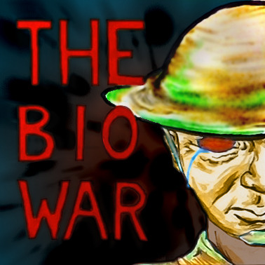

Is the saturation wrong? Are they too dark or too light? I can tell they aren't quite right, but I can't figure out why...


Oh thank goodness for this thread!!! I had one of my comics get picked as a staff pick, and of course it WOULD be the new, rough and quick biographical comic where I put hardly any effort into the icon.
I feel like I'm not making best use of the publicity because the icon doesn't show off my artwork very well... but perhaps I shouldn't mess with unexpected success...
I'm trying something meta with my icon, as these two are the poster boys/girls in my series and I'm using them to promote the comic, though that's about as deep as I've gone with it.

@isaacfriedman Honestly, I think they read fine. The last one is the best in my opinion! I would bump up the brightness on that orange background so that the armor contrasts more. Also on the first, it's strange that the hat is low quality while the rest of the image is crisp. Probably not as noticeable when it's shrunk down though.
@Neil_Harrington Haha, honestly, it might give you less views. XD There are quite a number of readers that avoid BL tags like the plague.
@Helengreetham I would maybe pick a good emotion that defines your character and have that be the face of your icon. Right now I guess I would say she's (or you're) pensive? Perhaps confused? I don't have a good read on what the character is like is what I'm saying. XD
--
Uhh, as far as my own. I worry it reads too much like it's a romance. D: Which couldn't be further from the truth. I dunno. Maybe I'm just crazy and it doesn't read that way at all? Advice please? XD

@JessJackdaw - It's difficult because it's a series of short comics that aren't about a character as such - I did the one with the back to the reader because i thought it looked contemplative which would fit the vibe of the comic, but I'm not sure it's great for inviting people to click on it.
I've only just started the comic and wasn't really expecting the thumbnail to be thrust into the spotlight just yet, so I haven't got a lot of ready-made artwork to use.