56 / 64
Feb 2021

No problem at all! I understand real life can keep a person away from webcomics :slight_smile:

I'm thankful that you liked the way I portrayed the action and training in my artwork! I've been recently cutting down on the amount of panels for that very reason of organization and clarity and I'm glad it helps(used to average about 7 to 9 panels per page). Thanks for taking the time to review my work!

@KoreanTacos

An awesome place to put some foreshortening and angle; it adds depth to the whole picture! I also love how you put so much detail into the ropes, wood, and leaves -- and the texture in the trees! And the fireworks! And the hand-done shiny gold letters look Very Good!

@O-1-D

Yoooo, that lineless drawing? Awesome. It's all color and yet the boundaries stay perfectly clear. And how you keep everything in the black to red spectrum except for the eyes really makes them pop out from the rest of the drawing! Plus, the safety pins are a nice detail to see how the hood is clasped together!

10 days later

YO OOPS SORRY FORGOT THERE WAS A POST my bad

@Freemints30

I like how you portray light and dark! Like, everything's dark except the fleck of bright in their eye which really brings out that shinyness. And the dark background especially brings out your brightly colored textboxes! And in addition, Your style is So Good Mate, Satisfying and In General 100/100.

Awww thank you. I'm glad you thought the lights and darks were good. This was one my rare pages where everything was in complete darkness.

I'm glad the style was to taste

@alcchron

I love how you draw colors! The page has a beautiful color scheme, and none of your shadows or highlights are devoid of a bright pop! It works really well with your line layer too, since none of the colors are extremely dark, letting the thin, clean lines do their magic.
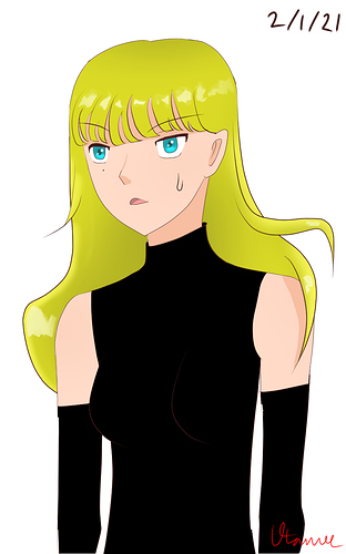
@Utamee

Your lines are so very good! I rarely stray from just using black on the line layer, yet your lines are smooth (especially with the end of the bangs, that really brings out the texture in the hair) and crisp, with each different base color having it's own lining color!
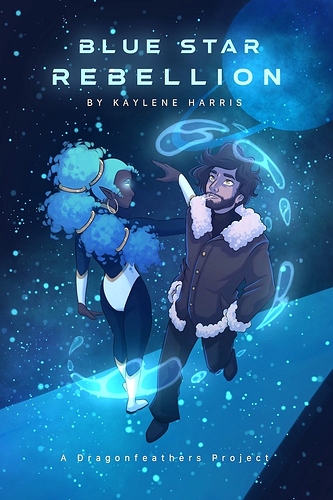
@Kaydreamer

The way you draw light, both the source and how it reflects, is stellar. Like the glowing water? Casting a blue tint everywhere? Amazing. And you didn't let cold shades be the only hues on the cover either -- the way you let the blue interact with the warmer colors on the jacket and skin is probably my favorite part!

@Tulmut

How on earth do you get that city architecture lining so good? Because however you do it is perfection. Your foreshortening and dimensions are beautiful, and the amount of detail you put into the windows and rooftop is insane! Plus, I've always loved a pretty scene in a dark city, so you can imagine my happiness seeing one in this thread!

@Kiweevil

The a t m o s p h e r e in this panel is immaculate. The light coming from the corner really emphasizes how in darkness the creature is, and also lets the edge highlights do their work. The vibrant eyes catching the eye in the top, darkest part of the screen and everything sort of phasing in and out gives it some very good spook!

If you are still doing this, a positive word is much appretiated ^^, Also thank you so much for doing this :smiley: As much as I love honest criticism, atm I just need to hear what is good about my stuff...

For context, the important scientivic work of the guy with glasses got stolen by his rival and they are getting it back now.