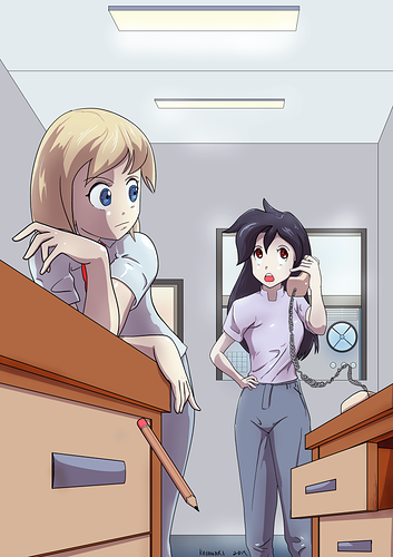
You should keep your comic in color.
The colored illustration has better mid-tones that helped unify the whole composition.
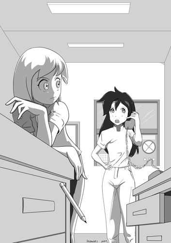
When I turned the color illustration into grayscale to compare with with the actual grayscaled one, the colored illustration still wins in terms of grayscale as well.
The bottom grayscaled illustration is flat and had barely contrast except for some weird areas.
Left woman's strangely dark tones behind her left hand and forearm, her pants, the underside of the desk drawer, and the right woman's hair and neck creates an uncomfortable level of very high contrast against it's surroundings. I know that different materials have their own inherent values, but something is definitely off with the "shadows" or occluded areas.
In the colored version, the left woman had some ambient lighting bounce back to light the left side of her shirt, as well as some of her hair. The grayscale illustration made it seem like there's no ambient bounce lighting, and made it seem strangely occluded, like no light can escape.
You want to go for that 1, 2, 3 tone value readings from various angles by using varying tone values to help flesh out the form and shape of an object. The good news is that as a style, you may be able to pull it off with a 1, 2 readings since you're going for that cell-shaded anime look.
You even took away details, like the desk, drawer, and drawer handle different colors and values; the pencil's shaved part, body, and eraser colors and values; the room's darker values, the sides of the ceiling lights values; the women's darker eyes; the right woman's darker pants; the darker window frames. Those all added nice contrast to their surroundings, and they were taken away.
So the colored illustration wins by a long-shot.
My suggestion is that, if you want to go for the grayscale look no matter what, because it saves time an whatnot, first figure out what the base value for each material is and fill those areas in. Then make a new layer, use black and drop the opacity(less opacity or more opaque for dark scenes), and go over all areas where shadows or occlusions may be, to get a uniform looking values, no matter what the material values of existing objects in the illustrations are. Then to do highlights, make a new layer on top of everything else, this time use white and drop its opacity(refrain from pure white highlight unless its super shiny), then highlight all the shiny areas.
In my opinion, pure computer grayscale does not look good at all. It is not the same thing as the tones we see from Manga. The good news is that grayscale can easily be converted into tones if you're using a program like ClipStudio Paint.
As a reading recommendation, may I suggest the following:
How to Render: the fundamentals of light, shadow and reflectivity by Scott Robertson
And if you really want a strong basis for art, read these too:
How to Draw: drawing and sketching objects and environments from your imagination by Scott Robertson
Framed Perspective Vol. 1: Technical Perspective and Visual Storytelling by Marcos Mateu-Mestre
Framed Perspective Vol. 2: Technical Drawing for Shadows, Volume, and Characters by Marcos Mateu-Mestre
Best of wishes. Keep doing what you're doing. =)