Like, specifically the process, not all that stuff about shape language and silhouettes and whatnot. Those things are just knowledge; tools. Even professionals who already know all of that still have to go through a process to create a good character design. So that's what I'd like to talk about.
It's only recently (now that I have three big ongoing comics and a possible 4th on the way) that I've started to take my lifelong passion seriously, so I've developed some strategies to produce good character designs without relying solely on inspiration, which, as every mature creative knows, can only get you so far. 6_6
1) Imagine the character in motion
A lot of the time when I start a character design, I find myself fighting off the dynamic animated figures I see in my head in favor of a clearer image that just 'looks nice'. But lately I've been trying the opposite, and honestly, I get better designs that way.
First off, if you design a character based on a moving figure, you more or less eliminate those "good concept, awkward execution" designs that look good as a static image from the perfect angle, but quickly lose comprehension when you actually have to use them in a work.
And secondly, it helps you quickly plan out the basic design elements that you want to include, before you get bogged down in details.
What do you see in your mind's eye? The character's cape, billowing in the wind? Their long ponytail whipping around as they leap over the rooftops? Reflected sunlight gleaming on the row of buckles on their boots? That's the stuff you wanna get down first.
There will be plenty of holes in it, of course: for instance, what are they wearing under that billowing cape...? Maybe you don't know right away, but you can fill it in later. This is a process, after all.
2) Select a theme
This is most helpful when you're doing more abstract designs: like non-humanoid aliens, or inanimate objects like furniture and vehicles...even clothes.
It's also where your shape language tools will come in handy: say you want a design that feels violent and shocking: you see lots of jagged edges and sharp angles in there, right? Try taking it a step further and limiting yourself to just lightning imagery, or just flames, or just stars. If your designs are too chaotic or unfocused, this will help you to calm them down into something that's easier to visualize and build.
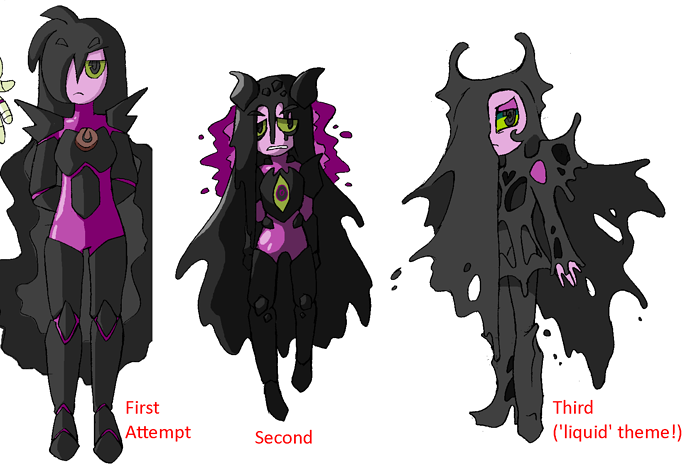
Here's an example from my own experience. In the beginning, I was designing this character with a lot of themes in mind: 'black bile' (so, 'liquid'), 'knight', 'otherworldly demon', 'coagulated material', 'poisonous gas'...those are themes that are hard to fit together in the first place, let alone on one design that's supposed to be simple and almost all one color...but in my last attempt, I decided to settle on one theme-- just 'liquid'-- and build from there. You can see the results for yourself:
Lemme tell you, I didn't even know I could draw liquid that way until I let myself try. ^^
Anyway, you can see that the third design is much more cohesive than the first two. It also has a completely different vibe; leaning more toward 'otherworldly demon' and veering away from 'knight', but I liked it so much that I honestly didn't care. Sometimes the character design process surprises you that way~
3) ITERATE
By this I mean, draw the character again and again and again. Use different poses, different gestures. Do it freely: pay less attention to how 'accurate' each sketch is to the initial design and more attention to whether the character is recognizable.
And most importantly, pay attention to what your tendencies are: which parts do you enjoy drawing the most? The least? Which parts tempt you to run back to the original design to make sure you're drawing them right? Which parts do you keep on forgetting to include??
If you're an artist who thrives on simplicity (like me), this is very important. You want to cut out as much unnecessary junk as you can and strip the character down to only the most memorable essentials.
If you keep on forgetting to include a certain detail, maybe you should omit it altogether. If all your 'running' sketches look better with a certain type of shirt, maybe that's the one the character should wear, especially if they're meant for an action story.
In this way, each successive sketch will be closer to the ideal than the last: you will gradually change the design* into something that's comfortable to draw and easy to recognize, two very important qualities for main characters especially.
*Sometimes (in fact, a lot of the time) this happens naturally as you use the character in a comic, as you've probably noticed by reading older works (e.g. Garfield). This is okay! And it goes to show the power of iteration~. But if you don't want your 'before and after' comparisons to be that dramatic, you should do as much as you can behind the scenes. ^^
4) Do not fear the unknown
When working on a tougher design, sometimes you'll find yourself clinging stubbornly to certain elements that you just WANT. I was doing that just yesterday with a very old design that had always had a lot of white on it: namely, a long white jacket.
But since those older days, the character's hairstyle and personality had changed, and now all that white, blank space was just making her look boring.
Did it have to? Could I have somehow figured out a way to design a long, white jacket that would better fit her new image? Probably. But in the moment it wasn't working, so rather than staying in that mental space and racking my brains to solve the problem one way, I decided to leave it behind and look for other options.
What about a short jacket? Or dark colors: I had contemplated a 'thundercloud' color scheme for her once before; why not actually try it?
So I did, and this is what happened (it was a long process that's been on and off for literal years, so I'm just gonna give you the tail end of it):
Technically the third picture doesn't exist (if I had just drawn that, I doubt it would have convinced me...); that is a 'flat' version of the real thing, and it was by doing the dramatic lighting and playing with the shades on the real thing that I fell in love with this new design. But this shows the progress a little more clearly.
The point is that my first attempt at departure was still full of 'fear of the unknown'. I was so afraid to leave behind the old design that in attempting to improve it, I just made up another design that was just as weak. It was only when I let it go completely and started taking inspiration from new places (namely, the weapon design, which has been pretty solid for years) that I was able to get something I actually liked.
In fact, I feel more capable of going back and trying the 'whitecoat' design again now than I did before. I probably won't, because this is pretty rad, but the simple act of getting myself out of that rut has made me able to see more possibilities, even ones related to the design that "didn't work". It's like magic~
Well, that's it for me (this ended up being longer than I intended)...If you have any questions or your own tips to share, feel free~