
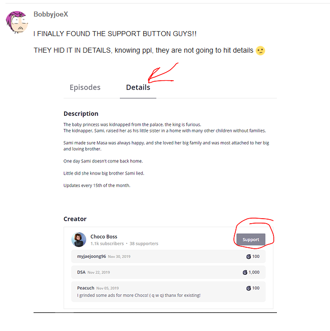
People have already brought up the hidden subscribe and support buttons enough, but I'd REALLY like a dark mode if the website palette can't be changed as is. It's giving me a headache to look at it.
I'm aware this must not be the easiest thing to get data on, but one thing I'd like to add, is that in my small 2 years of use of Tapas first as a reader and then as a creator, I've seen a tendency of a deepening of the gap between the expectations of mobile readers and website readers. Obviously mostly around the app censorship issue, but not only. Although not a clear cut thing, I feel we have now 2 relatively distinct populations, and thinking that what works on app will work on website may not be the right mindset.
At this point, I feel a lot of people read on website to AVOID the app experience, because they don't like it. Obviously the new changes would be upsetting to them.
I feel it would be better to keep the app and the website different enough, to give the choice of the experience to the readers, and only implement changes that are adapted to website subsample of readers.
I understand the need for some universal 'Tapas' feel, but sincerely, it was there (black and yellow) and was removed.
I'm just a simple reader and this looks BAD. And I mean really really bad!
And I feel readers where not the priority at all with that design update. I feel we've kinda been completely forgotten. While our experience should be the most important thing for you guys. I mean focusing on creator is a good thing but if it is at the expense of the people who read their work it doesn't work. They will loose readers and you will loose them.
A fixed width design? In 2020 Really? Are you guys still using 800x600 4/3 CRT? Because from a 1080p 16/9 or a 1440p 16/9 it is looking soooooo small on every pages.
Where did the infinite scroll went? For me that was the MAJOR thing making me stick to tapas. Because it was way more comfortable for reading than on any other website.
Where is the side bar when reading something? It was really helpful to know where we currently are in the reading and to go back on a previous page if I wanted to look at something from a page I've already read.
Where are all the colors? now tapas looks bland and sad.
For now its all I've seen and I'm not I want to see more and discover some more butchered things.
That is what I feel too. All that mobilization of the web is a bad thing. If I read on a computer there is a reason and I4d like my website to be adapted to my monitor size.
Screw the "personality".
I'm more concerned with the ever shrinking lack of visibility for anything that isn't premium or ultra popular with every change you guys make.
Woah, slow that roll, buddy.
Let's take a bit of a step back here and try not to lose it on the Tapas staff.
Really? blackdevil is right kind compared to some of the comments in the other thread.
And their concerns are extremely useful as they are a reader.
I just find weird that the site reccomends you the same 4 comics in each genre (For example, Al the comedy comics have this same four comics in the "More like this section" and another differents 4 one for drama, another 4 for actions, etc)
I get those are popular and they worth the reading but I'd like some variation? Maybe, find something I didn't know yet.
Overall I like the new navegation better, less elements all around the page to focus the focus on it.
Can we have horizontal comic format, please? Like here: http://smacmag.net/v/sma12/never-late-by-lucas-marques-and-priscilla-miranda/?lang=en#017 or here: https://comic.pixiv.net/viewer/stories/182863 . Pretty please. 
Look, I'm not saying that their concerns shouldn't be heard.
I'm saying that blowing up at the Tapas staff instead of calmly explaining isn't really gonna help much.
I understand the need to vent, that's why I made this thread here:
For their part, the Tapas staff has been remarkably responsive, especially compared to some other websites, and for the most part seem legitimately interested in improving their website to the benefit of both the reader and the creator alike.
Everything is really hard to find, and for some reason the "dashboard" button loads so slowly I had to give up after over a minute of waiting and go via my profile -> my series -> edit my series -> add episode, and publish that way.
By everything being hard to find, I mean finding comics. I can't figure out how to sort by views, likes or subscribers, if that's even possible. The only way I can seem to find comics is via trending and popular the last 24 hours, all comics with no filter whatsoever, staff recommendations/spotlights, and some premiums... although those are really hard to figure out the sorting for, too.
To those who complain and claim this was done benefit the "premium/ultra popular": It doesn't. Please stop trying to make everything into a big vs small creator matter, this is a sorting issue at large. I was in top 5 in the old "creators" page (before it vanished???) and with this recent update I find it hard to find my biggest comic through anything other than my profile page. If it's that hard to find one of the most subscribed comics on the site then that says a bit about the new design's user friendliness level...
Now let's not be onesided. Things that were good about the recent/ongoing updates:
Full covers are being introduced for community comics
Integrated crosspromotion/suggestions provided by the site based on readership and genre
LGBTQ+ and GL genre have been added!!!!!
Ability to pick 2 genres will be added for community comics
A lot of good things are going on. We just need the design change to be adapted so it can fit into that box of good things and we'll be golden.
Thank you so much for this.
I was so caught off guard by the huge change and the negative backlash I totally forgot to look for the positives.
one huge disappointment for me with this update is the loss of the customised button that we creators can use to send people to websites or in my case the place where i sell my comics. without it then I have to consider if it is even worth me keeping my comics here and after being on this website for so many years would be a shame to leave now only $10 away from being able to claim my $25 its take years to even get close. I wont rush that decision and hope you give us back our customised button please.