1 / 17
May 2019

To add space and/or time. That's basically it.

It's like in film, where a director can choose to do a shot that has a voice over of the actors speaking, but shows a city skyline or an ocean sunset or something. It distances the viewer from the characters for a bit. You can use this distance to ease the transition into a timeskip (say, the next day) or a location change.

You can use the distance for other things, too: Comedic effect, mood. In the end it all comes down to time & space.

On the first one it's just slowly brings us to establishing shot (but I don't know what was on the previous page too) or whatever it is this building means in this page. Nothing, sky, tree, building... etc. Just distance.
On the second one Togashi clearly was ill and just made lots of lazy pics again, that's all, no reason ¯_(ツ)_/¯

It’s also a good way to get quick snippets of the background/surroundings without having to draw a full blown backgrounds.
Or it could set the mood of the location. Like quick snippets of the ocean water, a portion of a boardwalk or something would show it’s probably warm and their at the beach. But they don’t have to use a full panel to get that point across and it saves time.

To show passage of time, to create negative space and draw the focus of the eyes elsewhere on the page.

sometimes i like to think it's when the character speaking is out of view, or maybe the MC is staring off

Just a note that may or may not be important on that HxH page.

Both of those empty panels are not blank in the printed vol.

So it's likely was Togashi was sick and needed to cut time, as he was always constantly struggling with his health during that arc (and pretty much all arcs after it)

Time, they have to draw 19 pages a week, you try doing that and not do this from time to time.

woah this is cool - I don't read a lot of manga so I didn't know this was a technique. I dig it.

When you have schedule like this29 using short cuts and cutting corners very much to be expected.

it kind of feels like a layout/design choice to fill empty space. Sometimes I see it as a 'fade in' effect that would occur if it were animated.

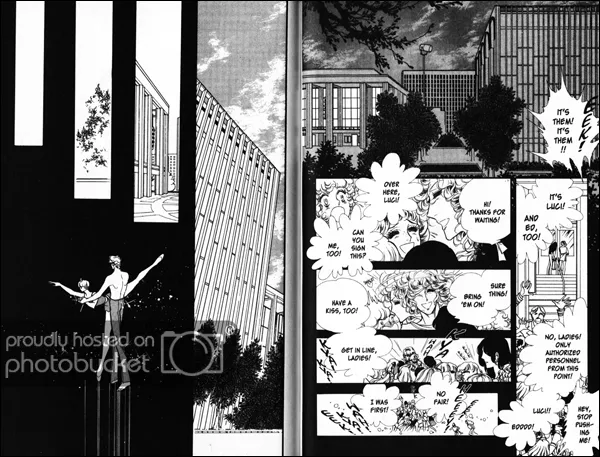
I use this technique relatively often and it's always to show a lapse in time. It's usually followed up with a shot of a background, like in the first example.

^This page uses the blank panels to show that it's transitioning to a completely new scene. On the next page, the first panel is a background shot to show that the story is in a new place.

It's used moreso in shoujo manga I think because it helps create a mood for the page and shoujo manga are very mood-driven.

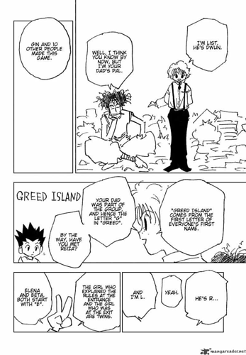
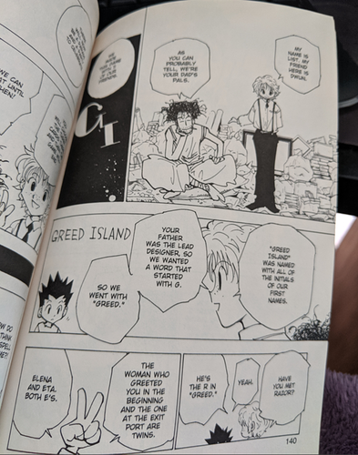
Kura is spot on about the Hunter x Hunter pages as Togashi used to use basically sketches for his pages due to his poor health. Nowadays, he just takes extended hiatuses so when he does his ten chapters a year or whatever, they're completely done in the magazine.

Holy crap. you explained it so well. I use it occasionally in my comic. and I do know how to use it but I've never tried to understand why I use it. I just know how to use it HAHAHA bravo. I'm excited about this haha! made my day :smile::+1:

Wanna know something funny? I was half-asleep when I wrote that. XD It amazes me that so many people found it adequate; maybe I should always explain things when I'm drowsy...

Sometimes people just leave extra space between panels to denote timeskips/scene changes (below is an example from my comic; although I wouldn't say it's the best example possible ^^; ). I can't think of any other related techniques at the moment...