1 / 18
Mar 2021

Back when i tried it out it looked pretty neat, colors like purple or red always seem to ruin my drawings instead
I wanna do it again but don't want digital art connoisseurs to call me a pleb :disappointed:

what's the big deal?

  • created

    Mar '21
  • last reply

    Mar '21
  • 17

    replies

  • 2.5k

    views

  • 18

    users

  • 49

    likes

  • 2

    links

They just think it looks cooler to shade with other colors. Stark black has its own merits as shading too. It really depends on your individual art style.

This is kinda like when people give cliche writing advice like "show don't tell" -- the truth is subtler than that, but they say it because they want people to try showing instead of telling, to have that kind of experience. So, similarly, I'm just glad you tried shading with other colors, and I think that's the real point of it.

I’ve always learned not to use black because there are no true “black” shadows, there is some other darker color. But your art and style is...yours. I don’t do super dark shading for my more realistic drawings, but for more animated styles there’s nothing wrong with it. It’s your piece, so do what looks best to you

Black shading usually makes colors more "dirty" looking :information_desk_person: Try more blue-ish tones maybe, not pink or red ones. Really, just experiment more with this stuff, it will depend on the picture.
Just as a quick example, black shading on the left, non-black on the right.

Summary

Although I don't really think people would call you a pleb for this?... :sweat:

I agree with what everyone else is saying. If it works for you, if you think it looks good, then go for it. I feel like a lot of the “rules” out there are kinda limiting.

It's not that you can't shade with black.

It's that you need to know what you're doing when you shade with black.

That's the thing -- what merit does shading with black do for your art?

Does it highlight the colors better? Does it make your work stand out and become more three-dimensional? Does it allow you to set a better tone with your work?

I sometimes shade with black to set a serious mood, mostly leaning on morbid and terrifying. I also mix and match a bit of shading while shading with black:


In these two examples, even with my black shading, I don't just have flats. I have highlights here and there, I added different shading and some lighting.

If you know what you're doing, shading with black will amplify your art.

But overall, I find this is poorly worded advice aimed at beginners: the type of artist who just doesn't understand the merit of different shading and the merit of shading with black. It's supposed to encourage you to experiment and try different ways, but the better way to say it is,

"Shading with black isn't the only way. Experiment and find different ways to amplify your art. And if you find yourself back at shading with black, then you know for sure this method works."

Well, I’d never say don’t ever shade with black. Especially if you’re making something in a traditional comic book style. Hatching and spot blacks are ubiquitous. But if you’re trying to go for most other styles, it’s a very unnatural color to shade with. There’s not too many situations where black or a very dark, desaturated color would be realistic —harsh lighting conditions and the shadow like right beneath an object come to mind. But if you use it for everything, it tends to make things look duller than you might want.
Like others are saying, keep experimenting and finding out what works well for your style

Okay, I'll try to explain this as best I can without getting too into really complex colour theory...

So obviously when you're making art that isn't 100% photorealistic, you always have to use shortcuts or "stylistic shorthand" for representing the world. It's all about a balance of that and getting something that looks good.
We know that shadows are created in places where the path of light is obscured by a physical object. But you can observe in the world, and so will likely reflect in your artwork, that shadows aren't usually completely pure black. They tend to look like the colour of the thing, but a bit darker. Why do they only look a bit darker if the light is blocked? Now this is the key piece of info here:

Shadows only look a bit darker than the part of the person or thing the light is hitting, because light is bouncing around in the environment, and this bounced light hits the parts the direct light isn't hitting. Also some shadows aren't completely dark because light is passing through the thing. This is the case for human skin, which is translucent.

Why is this important for an artist to know? Because when light bounces, it picks up colour from the things it bounces off, and when it passes through things, it picks up colour from the thing it passes through. So generally shadows tend to be tinged with the colours of the world around, often blues (because blue has a tight wavelength so it travels further, this is why the sky is blue), and the characteristic of translucent materials is why shadows on skin tend to look reddish; because the light is shining through your blood.

So when you shade an illo with pure black, the skin usually looks dead, which is one of the most immediate problems, but also the overall atmosphere looks very cold, like a picture taken on the moon, because there's no sense of atmospheric colour.

Generally, it's looked down upon because it makes pictures look 'muddy' and dull (mind you, this doesn't apply to black cel-shading, which actually does the opposite ^^).

But some people go as far as saying it's also unrealistic, and that's actually not true. Right now I'm sitting in a dim room on an overcast day, and many of the shadows around me are grayish or straight up black; yes, even the ones on my skin. Any photorealistic artist will eventually need to master the use of very dark, colorless shadows; you can't really depict the real world without them.

That being said, there's use for black shading in unrealistic styles as well (see 90% of horror art) and if you are good enough at shading in general it won't necessarily look 'wrong' if you do it. Just pay attention to the atmosphere you're creating and, as always, do what you think is best for your art.

I think I have a plausible explanation!

The other day I was reading a book about optics and eye anatomy (don't ask why).
The thing is that it seems like rod cells, which are more sensitive to environments with less light, are more sensitive to the wavelengths where the color blue is located.

This could explain why they always advise you to shade with blue instead of back. It may be a more accurate way to represent of how we perceive light and darkness.


Who looks down on shading with black? Professional illustrators certainly don't.

I use black all the time, and in school my professors were always really annoyed whenever we said things like "aren't we supposed to not shade with black" because you do, all the time, even in realistic paintings.

But, there's a time and place. For me, I like to add black to neutralize my colors, and also to cool them. So, if I have alizarin crimson, I can add black and white, and get a much more pastel shade that isn't so harsh. It does have a tendency to feel like the color is pulled backward in 3d space, which is very helpful if that's what you're going for.

Black is also the color you use in occlusion shadows, which are shadows that can't have any bounce light (so your armpit, for instance, or underneath your shoes. Places light won't go) I like to add a little bit of red on there to make it a "hot" black (although it's not a hot shade usaully) so it feels a little more vibrant, but black works really well there.

There's also using black stylistcally, which we often do in comics, especially in Western comics, where all shadow can be black and it looks really good.
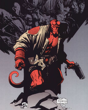
But overall, I think we were told to shy away from it so we'd be encouraged to see the turn of form as changing colors. So when I paint an apple, it's red--but the light side will be a different color of red than the shadow side. This is because light itself has a color to it, and shadow itself will also have a color transferring to the apple. This helps things look more 3d.

So use black in shadows? Yes. But only black? no. Not unless you're doing comics like Hellboy which...you might be, and that'd probably look really cool.

I can only speak about traditional media. But for watercolor its about the different colors that light passes through (white of the paper + layers of paint on the paper). So the goal is the put more than one color to make it interesting, dynamic, and more "real" looking. It gives the form depth and makes it look three-dimensional. Also, I've discovered that by adding cool tones in the shadows it makes it look like light is bouncing off of them. So in the photo below, there is a skin tone wash in cad red+ yellow ochre. Then a wash with pthalo blue underneath the shadow. Finally, a glaze of burnt umber. so that's three colors in the shadow. The light parts I left totally white.


This only applies if you're trying to paint like photorealistically-ish. You should feel encouraged to explore your own style.

I may be wrong but I think a lot of it has to do with the change in medium. When I was taught about comics (which was a long time ago in a galaxy far, far away) full black shades were the norm because the endgame was PRINT (newspaper/comics etc.). Black shades translate well to PRINT but not so much on cell phones or internet, which is much more receptive to animation-like color and shading.

It's one of those things that don't really have a right answer to me, but depends highly on the comic itself and the tone/mood/genre/environments/style and if the endgame is really to make a PRINT comic or Webtoons etc.

EDIT: I'm going to add it looks GREAT on more traditional-styled comics (webcomic or not) while it does muddy up more modern takes (such as someone using a Stephen Universe/Disney/Nicktoons style with way too much black shading.)

Shade however you want. Shading with black creates a much darker tone, so use that to your advantage if thats the type of story you're writing.

Well, I have heard that its not good to shade with black, because you can't go farther than that, but everything depends on the style, really. Detectivesque comics, or dramatic ones may use a lot of black to highly contrast their pieces. To graphically demonstrate the danger or situation where the characters habitates. Here is a little example from Daniel Clowes comics.

Also can be done with black and colour. Here is a painting from Sol Barrios. She highly contrast her paintings with major black zones, so we can focus just on hands and faces. Also she add a little religious theme as a personal detail.

As you can see, black can be your friend. If your work needs black to show the dramatic ambient, go for it. Practices different styles until you can properly show what you intend to represent.

Isn't it that it's not "looked down upon", it just looks bad when you don't know what you're doing? It's a tip given to beginner artists as guideline who (and I'm only assuming, cause I did the same thing) were just doing their shading on a single multiply layer with a slightly lowered opacity. In a fully colored picture depicting a bright, sunny day, that wouldn't look... right?

But I def haven't seen people acting like pompous asses over this tip :eyes: