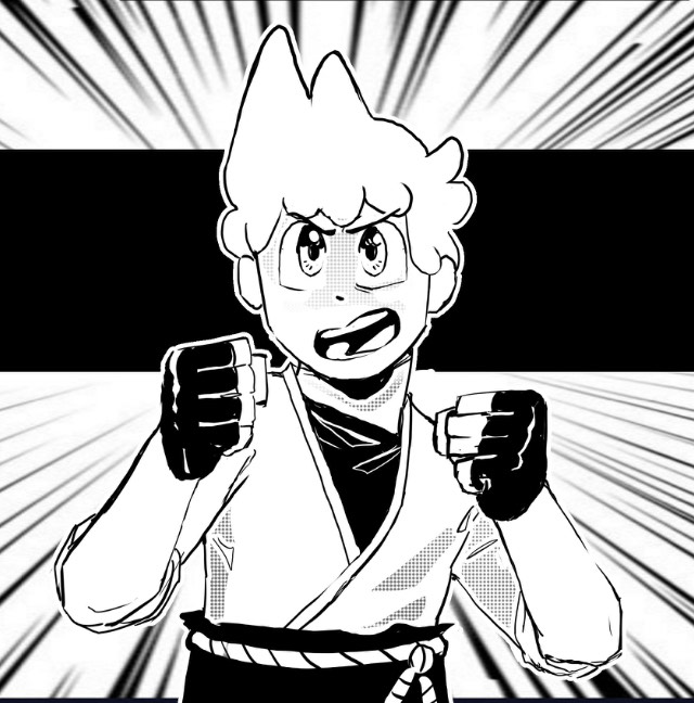
Oh. A thread on art criticism! Gotta try it...
Will I click on it: Well, I clicked on it with all honesty because I thought it would be similar to Diego Palacios' Rocky the Rock tapas comic.
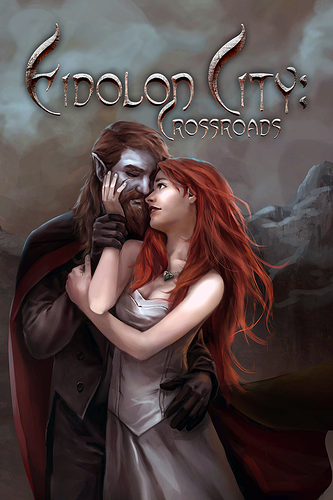
What's my opinion: It looks a dirty in the background which evokes uncertainty, tension, and ambiguity. I think the title should be more about the MC instead of the conflict (conflict isn't even human or personified so how can we relate to a fog?).
What can be better: For me, the mist must be white instead of grey and the chicken's color should have bright yellow skin like a bit neon so it looks appealing to readers interested in your genre. After all, one of your comic's tags have #friendly on it so the cover must look friendly.
100% my opinion!
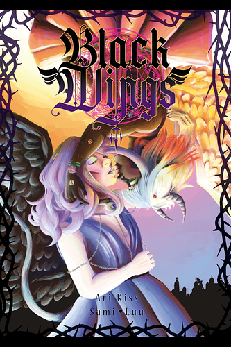
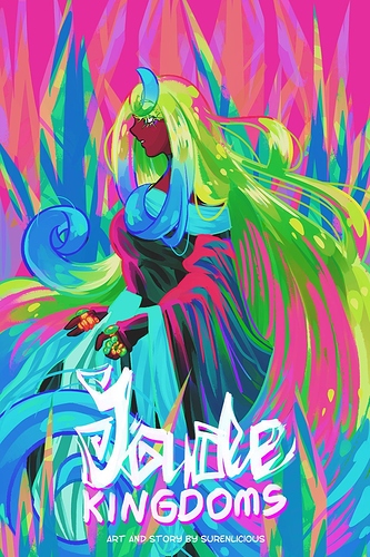
I've been meaning to change my book cover too but I need honest opinions on this:
I may even go hiatus if there were comments that help me alter this cover a bit or more.
Thanks for this thread!