
The template page I made for my comic in Photoshop has all the panel arrangements I use in different layers. I just turn on the layer with the panel arrangement I want to use. I'm not sure how much time that's actually saved, but it feels like some at least.
Here's a fun thing: In Errant, the only things that usually are fully shaded are skin, eyes and teeth (and even that is simple cel shade). Everything else is a flat colour. There's another layer above it transparency locked to the flats on "add" mode with a simple edge highlight on it. A lot of people don't notice this until it's pointed out to them. I came up with the style as something to balance speed and an interesting visual look similar to things like Enter the Spiderverse. In early style tests, the comic was fully shaded, but it was way too time consuming.
The backgrounds are just lineart, a quick and messy colour wash and some white pencil highlights on edges. It really speeds up the process while giving this overcast, damp atmosphere that works for the British setting.
For anything complex, I use 3D models or photos and roughly trace to make them fit in with the style while avoiding perspective grids. I also sometimes copy-paste backgrounds or props I've already drawn, sometimes as a guide to ink over (if the scale is different) or just straight up drop them in if I can. Excalibur, for example, I cannot be arsed to redraw from scratch every time. 
Oh, and the Clip Studio panelling tools are a massive time saver. Just make a frame and slice it up and you're good to go with consistent gutter widths even on diagonals. Saves me a lot of time.
Clip Studio also has the "Close and Fill" tool, which if you set it up right can neatly fill in any area that is enclosed by a black outline. It can be pretty effective for getting your flats set up, especially on bitty things like the binding on Rekki's sword hilt.
I'm afraid I don't have any time-cutting advice since I pretty much do my linework on paper.
However, a shading technique I've been trying for the last couple of weeks is making a new layer and filling it with the flat colour that you want to use for the shading. And then I erase the parts I want gone instead of adding shading.
So in short, I use the eraser tool for shading instead of colouring it in. And it is a little bit faster for me. (Cell shading)
Paint bucket tool, CSP brushes that look like things but other than that no other time cost stuff, i do wish i could take my work into a different room to keep going but i dont have any stable equipment for that as my study tends to get really hot during the Aussie Heatwaves >3<"
So far, it's mostly been copy-pasting spaceships... but eventually I'll need to draw them from different angles, so I can't rely on that forever, haha. I'm also only four pages in, but there are a few things I've earmarked as useful shortcuts.
- Copy-pasting background elements. That dashboard in the ship interior has only been properly drawn once, I've just grabbed elements and rearranged them for every other panel.
- Simplifying my illustration style. (Which basically involves not over-rendering everything.)
- Using line art on the backgrounds. At least for artificial structures. I'm not sure if I'll keep this, because I really love painting environments, but it's been a lifesaver for interiors.
- Grids and drawing assist. And perspective guides!
- Copy-pasting previously used panel layouts. I haven't done this yet, buuuuuut I will.

- Tracing my own photos.
- Using posing apps on the iPad where I can't find a good full-body photo reference.
- Specialised brushes. I'll be making my own set as I go along, for recurring interior features which keep popping up.
I make my webcomic on Procreate, and I've been averaging about 6 hours per page so far, start-to-finish. Given the style I've chosen to pursue, and matching my working time against how long the industry pros spend per page, I think that's pretty balanced. That time will go up as I start introducing more characters to each page, but I still think it's a reasonable pace.
Especially considering last year, I was spending exactly the same amount of time per page on a friend's comic just as a colourist!
@cookyroach That's a resource I've seen many times. I think it can work really well in B&W comics, also it could lead to some interesting panels in color ones with showing mood by putting a plain color as background!
@nathanKmcwilliams I believe I'll be joining you soon in that path XD
@rajillustration Oh! I hadn't thought about the quick actions option. It's true that the little set up things piling up can lead to a big waste of time
@migxmeg YES!! Gaussian blur is the best help when it comes to quick easy backgrounds. I would be mad already without it XD
@darthmongoose You really nail that simple shading though, it fits the overall comic so well! I've been on edge of doing something similar for my second project but I'm afraid of loosing the appeal of my actual style with that approach 
@dualdragons That's a nice trick! Sometimes I use that when I'm feeling lazy to contour the shading areas, it's quite helpful tbh
I do the exact same thing, I call it my cheat sheet! It's also got things like a colour illustration of all my characters so I can just eyedrop the colour if I need to do things quickly like shading hair.
I think you saved my butt with choosing which panels get the background thing. I've only recently been making comics, but here I go trying to slap a background everywhere. XD
I'm gonna second what others said about using 3D models to work with complicated poses/perspectives and backgrounds. I rely on a 3D model converted for The Sims to draw Adrian's Harley Davidson, and sometimes I make my own custom poses to use as reference for panels. I rarely do straight-up tracing with characters, though, since I find sims models to be a little too blocky for my taste, so what I usually do is just making a rough sketch of the mannequin in the pose I need and then draw everything on my own. Sometimes sims pictures I already have are just used as a placeholder instead of actual thumbnails, too XD
I also copy-paste backgrounds:
And I don't really bother with "proper" perspective on small/unimportant background objects. That house on the background is completely flat, there isn't any proper depth to its windows or decor, but honestly it doesn't matter because it's so tiny and balloons are gonna cover a good chunk of it anyway, so why bother? XD
Another thing I did (though I have yet to use it) was to create a full page view of Adrian's kitchen, so that I can copy-paste, cut, crop and use parts of it for my backgrounds:
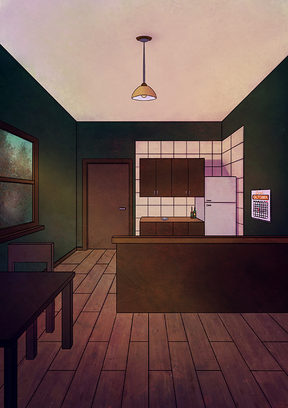
I also did a "night view" of the same room (read: re-used the same illustration and changed the colors to make it look like it was night, lol) and I plan to do more views for the rest of his house, too.
Copy-pasting is also used for stuff such as:
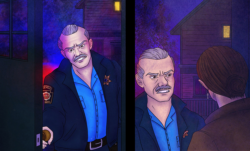
- Police sleeve badges. I have a separate transparent png of that sleeve badge so I can just copy-paste it into a panel and then use the warp and perspective tools to make it fit on the sleeve.
- Adrian's face tattoo. It has an uber complicated design and, being on his cheek, it's always visible, so instead of redrawing it every single time I just copy-paste it.
As for other tricks I use...
- Character flats are all on the same layer. Character shading is all done by masking the flat selection and creating a new layer set on "multiply". Only backgrounds (and, occasionally, foreground elements) are done on separate layers.
- If the environment has a different kind of lighting (see the blue/red police lights), I create a new layer, set it on "linear light" or whatever and brush whatever color I need on it to make characters "fit" into the scene.
- Textures and special brushes: instead of drawing uber complicated patterns or spending ages drawing stuff such as rocks, grass and so on, I either use textures (as seen in page 2 of my comic) or special brushes. The "Hartz", "Sword Grass", "Aurora" and "Snow Gum" brushes in Procreate have been saving my life so far.
- Lineart? Which lineart? Stuff such as trees and leaves don't have a proper lineart. I just use the aforementioned special brushes1, maybe add a couple of black sketchy lines with the procreate pencil tool and call it a day. My first page was originally done in watercolors and used a similar technique, so I'm trying to keep the same feel in digital as well.
I work traditionally for everything except color so my whole system is just made to save me time.
I work on different sized templates for different projects as long as its not smaller than print size I’ll draw it really small and that saves me an enormous amount of time. One of the books I’m working on now is a 200+ page graphic novel that I’m drawing at roughly 5x7 which is almost exactly what its going to be printed at and I print out my templates two to a page so I have a nice spread and I can work in page batches of two. I can ink easily four pages in a day in a few hours and I do often but most days I ink two pages from that comic so I can get to other comic projects that are a little more labor intensive and drawn larger. On any given day I will have inked anywhere from four to six pages.
For colors I mostly just do flats unless there’s a very specific atmosphere I’m going for but even then I tend to keep it really crisp and simple. Coloring is actually the one thing I’d like to phase out of my process and have a colorist or an assistant do because I love picking out palettes and I think I’m good at it BUT I don’t like looking at screens and it feels like the longest part of my process even though realistically its probably the inking that takes me the most time.
I think for saving time honestly the best things a person could do is get really comfortable with drawing in general and really practice it AND practice drawing faster. I don’t think a lotta folks realize that speed is something that is practiced and attained a lot of the time.
Glad to be of help! I still like drawing (most) backgrounds so I would say that like 75%+ of my panels still have them in some form, even if it's a relatively simple one. But I have been able to remove quite a few still by thinking more critically about whether the background is serving a useful purpose in a particular panel:
establishing a new scene/area,
showing where characters or props are in relation to one another,
filling a large negative space that would be too much "nothing" without a bg) and found that the answer is sometimes no, especially in panels where speech bubbles would be covering up most of the background anyways
If none of those are the case then you can probably get away with doing something much simpler to leave the focus on what's important.
Yeahhh for real! Simply upping overall speed is definitely the figurative pot of gold at the end of my comic rainbow  Making more comics faster is the dream!
I colour my comic so I try to cut corners wherever I can lol.
-THIS BRUSH THAT ERASES ALONG THE LINE4 - Like... it's magical... I only recently found it on the asset store.
-keep shading simple. 1 Multiply layer for shading and 1 Airbrushed Overlay layer for lighting and that's it, they go over bother bg and characters!
I don't think you have to change your base colours for different lightings, just knowing which multiply/Overlay combos to use is enough. I feel like editing base colours (like maybe making them more blue-ish and darker for the night scene) takes too much time I don't have with the comic.
I made a tutorial for how I shade a while ago, it's honestly really fun to see how different the atmosphere changes when you change the multiply and overlay colours.
Heres an example:
If I want to add some even darker areas in the shading, like maybe some hair streaks or clothing folds then I still use the same multiply shading layer but with a slighly darker coloure. Although I don't really like to focus on smaller shading areas. Bigger shading areas add more to the overall atmosphere and they're more important in my opinion than adding shading to hair strands and clothing folds.
Also at this point clip studio assets might as well draw the comic for me lol.
I use brushes for things like rails, trees, clothing patterns.
Something that saves me sooo much time, if I can use a 3D object then I do...
things like mugs, laptops, cars, furniture just any object that would be reoccurring in the episode a lot and I don't have to draw it over and over again in different angles. It actually saves so much time.
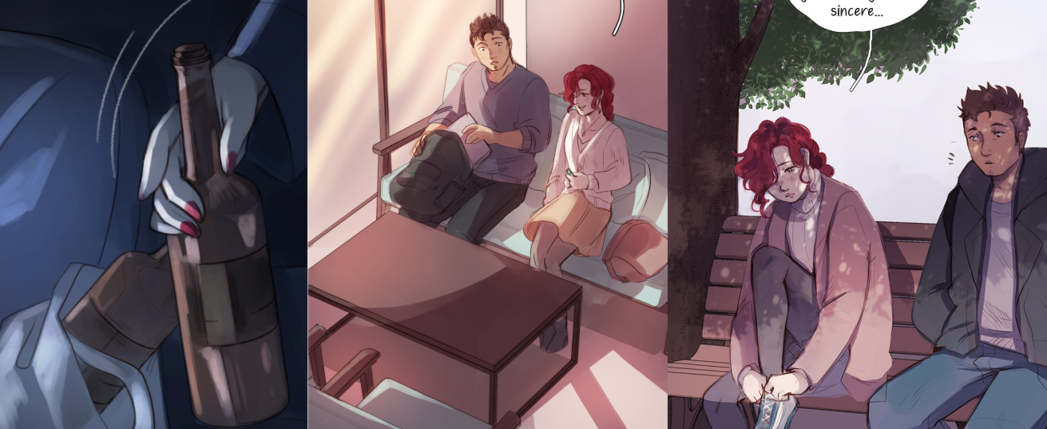
In clip studio I use the LT conversion and make 3D objects lineart and with the lighting/shadows it doesn't stand out too much, examples: the alcohol bottles -- The furniture -- The bench
the biggest time saver I do is that I don't do lineart. That is to say, I just clean up a sketch as lineart. There are times where I do an under sketch for a complicated pose or angle, but otherwise, everything you see is just a sketch where i erased the sketch lines. It's probably the biggest timesaver I do, because it cuts my drawing work in half.
1) Usage of 3-D pose models and 3-D renders for backgrounds. If anyone tells you it's cheating, they are dead wrong; it helps cut back on a lot of trial & error/extra unnecessary drawing.
2) Have a done script- dont create(write) a new episode every week off the top of your head; know what you are planning to do way ahead in the comic's story.
3) I loosely do pencils- doing most of my detail during my inking stage. If I put too much energy into my pencil work, I then lack the energy once I reach inks. Because I skimp with pencils I'm able to put a lot of energy into my inks
4) For panels that I don't do backgrounds to- I use a combination of gradients and a texture brush that creates a nice look.
1 month later
There are already some good tips on here, honestly.
One of my biggest issues was figuring out how to color digitally. I essentially taught myself how to draw digitally aside from what I unconsciously absorbed from some videos, and I know I'm still figuring things out. For people, I create a layer of a single color below the line art that can only be modified where I've already drawn (this works differently depending on the program so I won't get too specific), and then color accordingly so I don't have to worry about stray marks. Also, always have a color palette to work from (if you use color), even if it's just another page of your comic open in the background instead of a dedicated color sheet. And the fill tool. Use it.
Other than that, I'm more comfortable with drawing on paper than digitally, so doing complicated scenes (especially fight scenes) on paper and translating those sketches into a digital program for the cleaner line art/coloring is incredibly useful.
My short cut is .... to avoid unnecessary characters in a scene ... as the more characters the more variable colours needed to be used ....
I'll often color backgrounds in digitally while everything else is hand drawn. Not really to cut time or a corner, but it is to cut ink usage because copic ink is e x p e n s i v e.
For cutting time, I'll sometimes reuse panels if its just of a character talking and their expression can be the same.