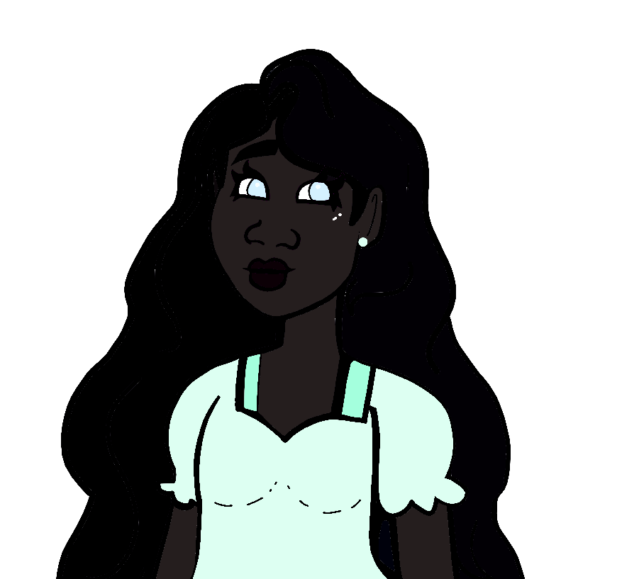
There's a lot of good advice in this thread, but I don't think anyone's addressed the most obvious issue: I'm sorry, but that skin color is just too dark for its context. =/ There's no way around it.
Like everything else in art, color is a representation of a concept. Never have I ever seen someone with such dark skin that their facial features are indistinguishable...so by giving a character a skin color that's so dark you can barely see their face, you are not actually representing anyone. On the contrary, it looks lazy; like your only concept of dark skin is that it should be "dark"...meanwhile, making sure that it still looks like skin and not just a void doesn't factor into your thinking.
Now in a different context, like a different art style with a greater level of detail, that color might work. For example, in the Houseki no Kuni manga, there is a (non-human) character whose skin is straight-up black, and they still look beautiful and have readable expressions, thanks to the artist's skillful use of white highlights and linework.
But if you're not using highlights, or shading, or color grading, or any kind of detailed technique that will bring life to an extremely/unrealistically dark color-- and it seems like you aren't-- the unfortunate truth is that you simply cannot get away with it. It's gonna look confusing at best and like an offensive caricature at worst; you need to use a different color.
The new color you should pick depends on the skintone aspect that you want to emphasize for the character. For example, if the darkness of the skin is the most important aspect, you want a very dark and desaturated brown-- notice how I said dark AND desaturated, not just dark.
Taking saturation away will help the skintone "feel" darker while still being readable, and in my experience it's more realistic anyway. Never have I ever seen a real person with that eye-blindingly saturated "deep brown" that a lot of amateur artists come up with when they color POC for the first time. To me that's the equivalent of giving a white character neon pink skin-- it doesn't look natural, it looks abstracted.
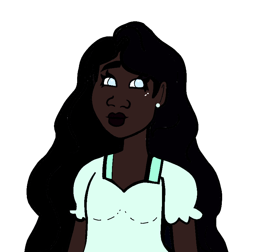
Anyway, here's an example of a 'dark' correction (Lightness +8).

In Paint.NET, 'Lightness' tends to add value while decreasing saturation, making it an easy fix for this. You just need to be careful not to go crazy with it and give the character gray skin (another pet peeve of mine...); red hue should dominate in whatever color you end up with.
Now if saturation is the aspect of the skintone that you want to emphasize; you want a brown with middling saturation and a slightly higher dose of green hue. Red should still dominate, but the green will make the brown feel 'warm' and lifelike as you carefully climb that saturation ladder.
This is a harder type of skintone to get right, so let me just show you the example first:

Yes, although this is much lighter and brighter than the 'dark' correction, this is still a very dark skintone. One of the things you have to recognize as you learn this is that skin colors are not a numbers game (which is why relying on 'set-it-and-forget-it' blending modes often sets artists up for eventual embarrassment); the perceptual saturation of melanin is more of an S-curve than a straight-line trend. This is why you will learn more through reference than by trying to just guess.
Anyway, what I like to do when creating skin tones like this is to first pull up the saturation a lot to make sure I have the 'color tone' I want (in this case, a slightly-reddish brown based on what I saw in the original image) then lower saturation and raise value until I get a 'calmer' brown that looks more like a skin tone.
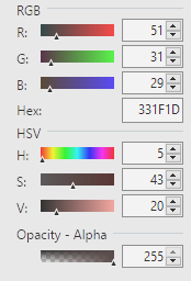
If comparing numbers helps, here's the data on this 'saturated' correction. The numbers on the color you use don't have to match, but its RGB and Saturation/Value ratios should look something like this:

To conclude, I think anyone trying to get better at depicting dark skin should remember two things:
1) Always keep YOUR artstyle in mind. If you are drawing cartoons, do not reference from painters/photos, especially if you're a novice and you don't yet understand how lighting affects dark skin. Simplifying the complexity of a skin tone to a single flat color is a SKILL, and if you haven't learned it yet it's okay to just let other artists do it for you. Cartoons with characters of color exist; study their character sheets! And tons of artists of color have made up palettes you can pick from, find one that matches the palette of your comic and just use it.
2) Your POC viewers will not care that you picked the dramatically darkest skin tone you could imagine, they will care that the character looks good. Don't try to impress people, don't try to prove a point; just learn how to color a character's skin believably. It's art, not a contest; effective communication of the concept is the most important thing.