In hindsight I will say that my comment about desaturating nighttime scenes could probably be taken out of context; I agree that making dark skin look gray is probably not the right choice. I just meant that there are techniques to making colors look darker without having to make it invisible on certain screens.
The references from @theyrebothakilogram's post are a great example. All of them read as very dark, but I can still see them on my monitor, because the artists were able to utilize techniques that make the colors look darker without using a shade at 7% brightness.
But I'm white as a sheet with not as much experience drawing darker skintones, so that's about as much as I can say on the topic, lol.
This post was flagged by the community and is temporarily hidden.
which is totally fair and why i'd hoped to add some more artists i know of who also accomplish this with their styles
like one of my absolute faves recently has been rockybloo especially their comics beanstalked and glitter an guilt since you can see darker skin tones used not just in standalone illustrations but full comic scenes and they still look great and read well
This is true, and I think most people agree with you, they're just trying to say is that it doesn't read the way you're meaning it too
most of these characters read very well as dark skinned characters like you're going for, but you see their color choice is very different from yours, and you can see something similar when you color pick from real people too I included the unedited and edited photos of nyakim gatwech. and I think I see your vision (let me know if I'm wrong) the skin tone you selected it very similar to the color on Nyakim Gatwech's cheekbone
the only problem with this is that it's from the part of her face thats in shadow, for a style like yours I recommend selecting a color from the nose/forehead region because they tend to have less highlights/lowlights. you can see the same thing on white people where you don't want to select the shadow region because it will read very differently
heres what you character would look like if you sample one of the references color palates (I also desaturated to teal a little to make it easier to see)
and here's what your character would look like if we sample Nyakim Gatwetch's color palette
I hope this helps, we're not telling you to change your characters complexion, just trying to find a better color to represent the skin tone you're going for if that makes any sense. Do you have a picture or reference of the look you're going for?
...I never said they were... ._.
I said the fact that their face is almost invisible will make them LOOK like a caricature, or at least feel like one. The average viewer isn't going to know that you just had poorly-executed good intentions...the fact remains that it's kind of a wacky-looking mistake that a lot of people might give the side-eye.
If you've seen how black people have historically been portrayed in cartoons and anime, you shouldn't be surprised by this...and again, I wasn't trying to accuse you of anything; I was just illustrating the degree of the error. =T Some people DO need to be told/warned; I had no way of knowing whether you were aware or not.
Yeah, this was my goal. And also, thank you for all your help and tips, it makes a lot of sense.
My goal is definitely to improve so the characters can be represented the best way possible. I think I just have a tendency to be hyper-sensitive, since it's very important to me that dark-skinned girls get their chance to shine
A good thing to practice as an artist is to view an image on your phone vs how it might look on a desktop. It might also be worth going into setting on your computer and making sure you are using a proper color balance.
I edited the image on the left to show how it appears on my phone and why some people might be a bit shocked about why her skin is so dark.
The image on the right is me using your photo reference to pick a skin color for her.
I use shadows and lighting, just as I do with light skinned people. Black people are not "black", any more than white people are actually "white". Black people are brown, and even when they're really dark brown light reflects off them.
I probably make my colouring way more complicated than I need to, but what I do is get my final ink layer finished, then make a copy of that layer. Paste it underneath the main ink layer, make the original layer invisible, and then colour the new layer with little regard to "staying in the lines". Often while shading I will create several other layers just for the shading and textures so that I can trim them down to "within the lines", then merge the colour layers. After I'm done I make the first ink layer visible again.
Here is Leander (black), Owen (white) and their son Evander (mixed). You can see the use of light instead of dark to bring out the features of Leander's skin and clothes:
It's visible, but still can be a bit hard to see (if the phone is really dim).
I have a similar issue with this, but I feel the scenario and the character's qualities won't be changed, so I played with the shading as a way to sculpt his face for it to be more defined/visible.
When the time comes for us to see your comic, we can see how visible she is within her environments.
Proud of you! :^)
Her whole face is visible, but still pretty hard to see - though my monitors are never at full light/bright settings, so all the darks start to blend together the dimmer it gets.
Perhaps a more contrasting color in the lines or highlights, since they look very similar at first glance. This can be either:
- lighter or darker colors
- brighter or muted colors
- warm or cool colors
I did a test drawing playing around with brighter colors for the skin (same dark as your drawing) and lighter highlights for example. The eyebrows are still hard to see. . .
It's an improvement, but I still find it hard to see. The overall values of your color palette are still too close to ech other I feel.
All of your colors exist in this bottom space of value scale which makes them all blend together.
The red in the dress is the biggest outler, but it helps that it is contrasted againt the blues. But it too is really really dark.
As an example, the color palette I use in my work has this range on the value scale
Additionally I want to show some quick edits. All I did was change the contrast on your drawings (ironically I had to lower the contrast, because the colors are just that close to each other.)
Both characters became instantly more readable, without losing that deep dark skin aspect of them.
Now in both examples you'd probably wanna tweak the saturation somewhat so it blends more harmoniously with the rest of the colors.
If you actually wanna start practicing shading and rendering as a whole, I would definitely advice to use lighter colors as your base, otherwise your shadows will drown out what little contrast you have.
Did a very quick and dirty render. Fun little detail about this one, the shadows on my edit are your original colors.
Ok Here are my big tips no 1. contrast, I think that because she's always in a white void is whats making her skin tone blend with her hair. her incredibly bright white clothing also contributes to this, so consider putting her in a grey void and switching up the colour scheme. no. 2 because the hair is the main thing thats conflicting with her skintone, consider hairstyles where it wont intersect with a lot of her body. I like her long flowy hair but it does make it difficult to see her arms and neck
as part of my switching up the colour scheme, i did darken her eyes. I assume that she either has magic abilities, or cataracts/another visual shorthand for blindness. given the magic, just use a darker blue. given the blindness, she can have another vision imparing condition that doesn't effect how her eyes actually look. most blind people don't "look" blind, I'd advise giving her a cane or a seeing eye dog, as it still serves as a shorthand but doesn't mess with the contrast. (plus doggie!)
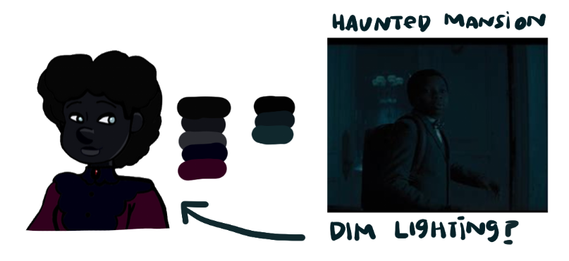
I wouldn't say there's a strict rule to how much contrast you should go for. It's kinda dependent on what the situation requires. I think a basic rule of thumb to follow is the bigger the contrast the more readable your design.
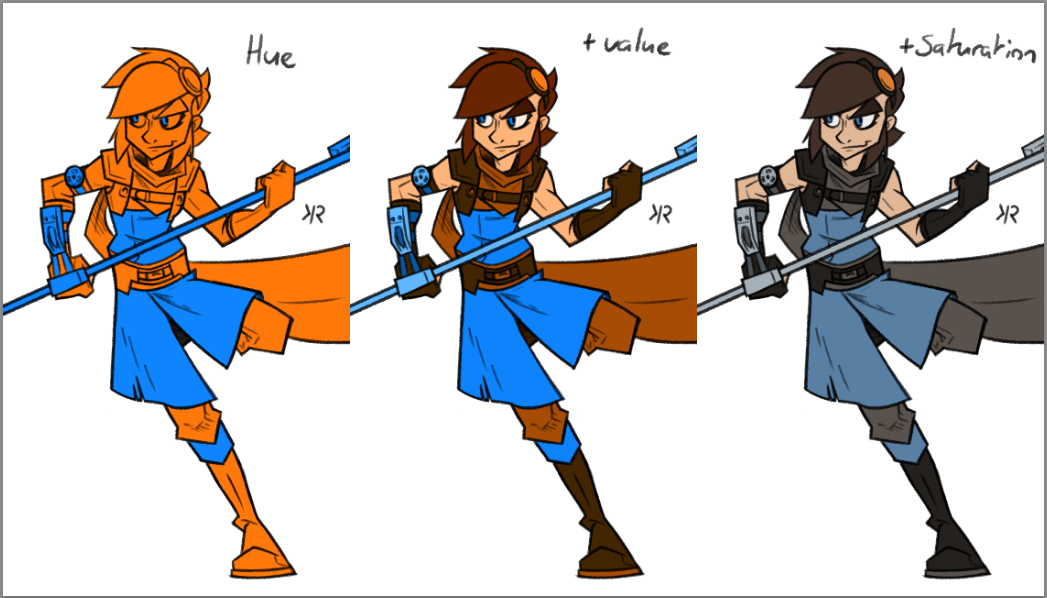
But I would add to that, that there are 3 dimension withing color you can play around with to create interesting contrasts.
You've got Hue:
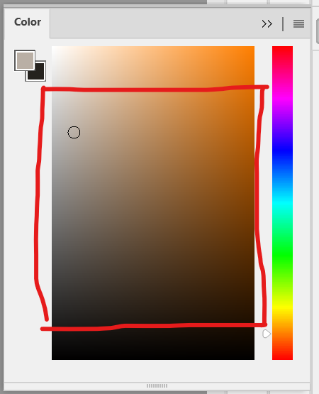
You've got saturation:
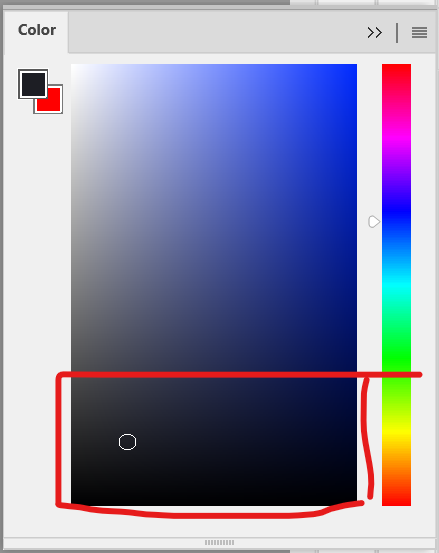
And you've got value:
You can use the contrasts of all three of thee individual dimensions to create a dynamic and readable design.
Edit:
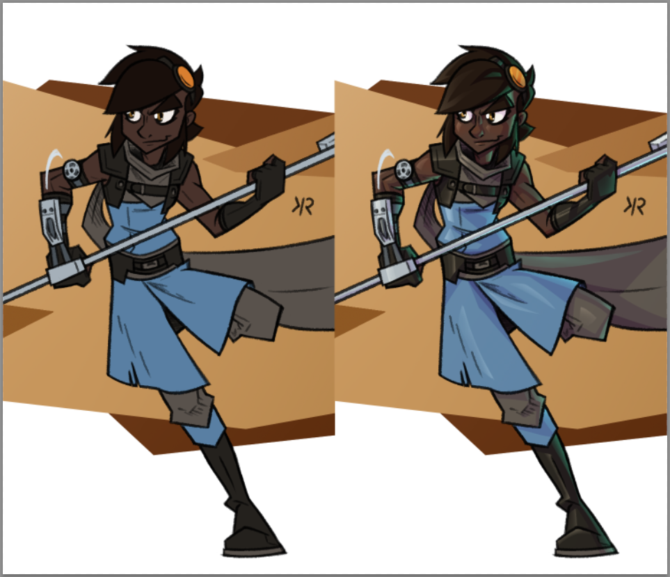
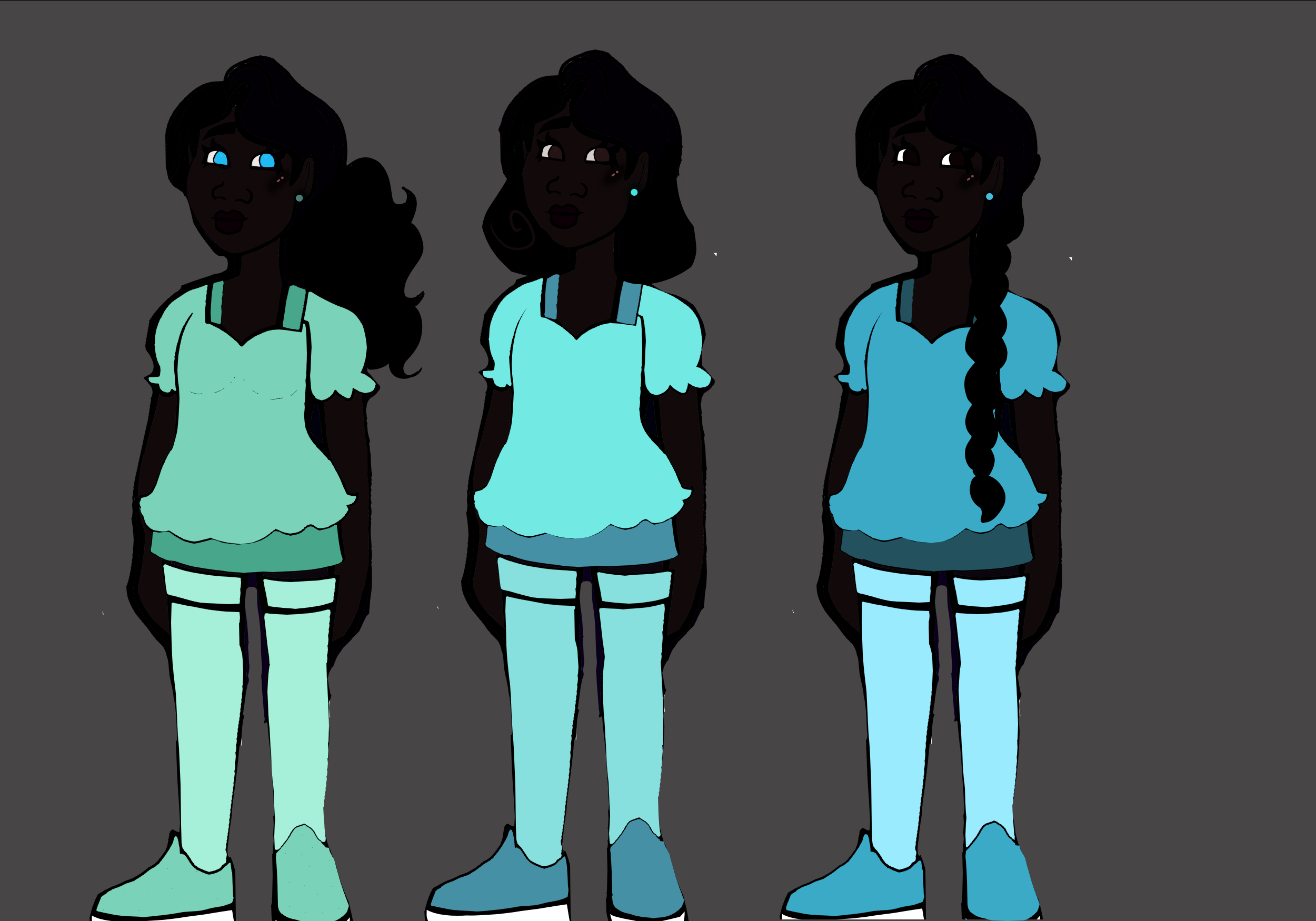
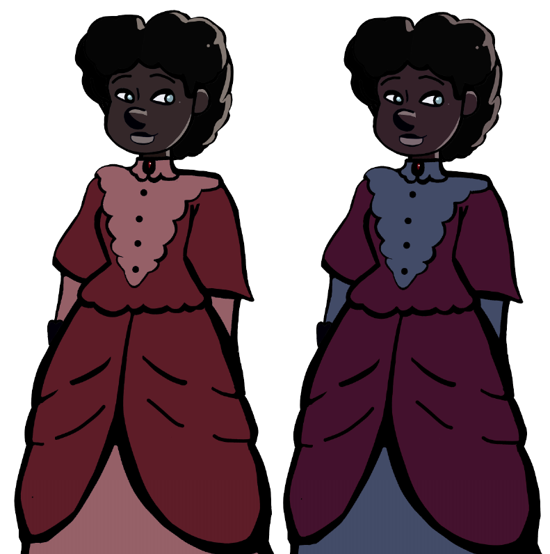
I wanted to add a practical example of my own work. Here's Kyara, each time adding 1 of the 3 dimensions, starting with hue. She's basically just 2 colors, blue and orange.
2nd Edit:
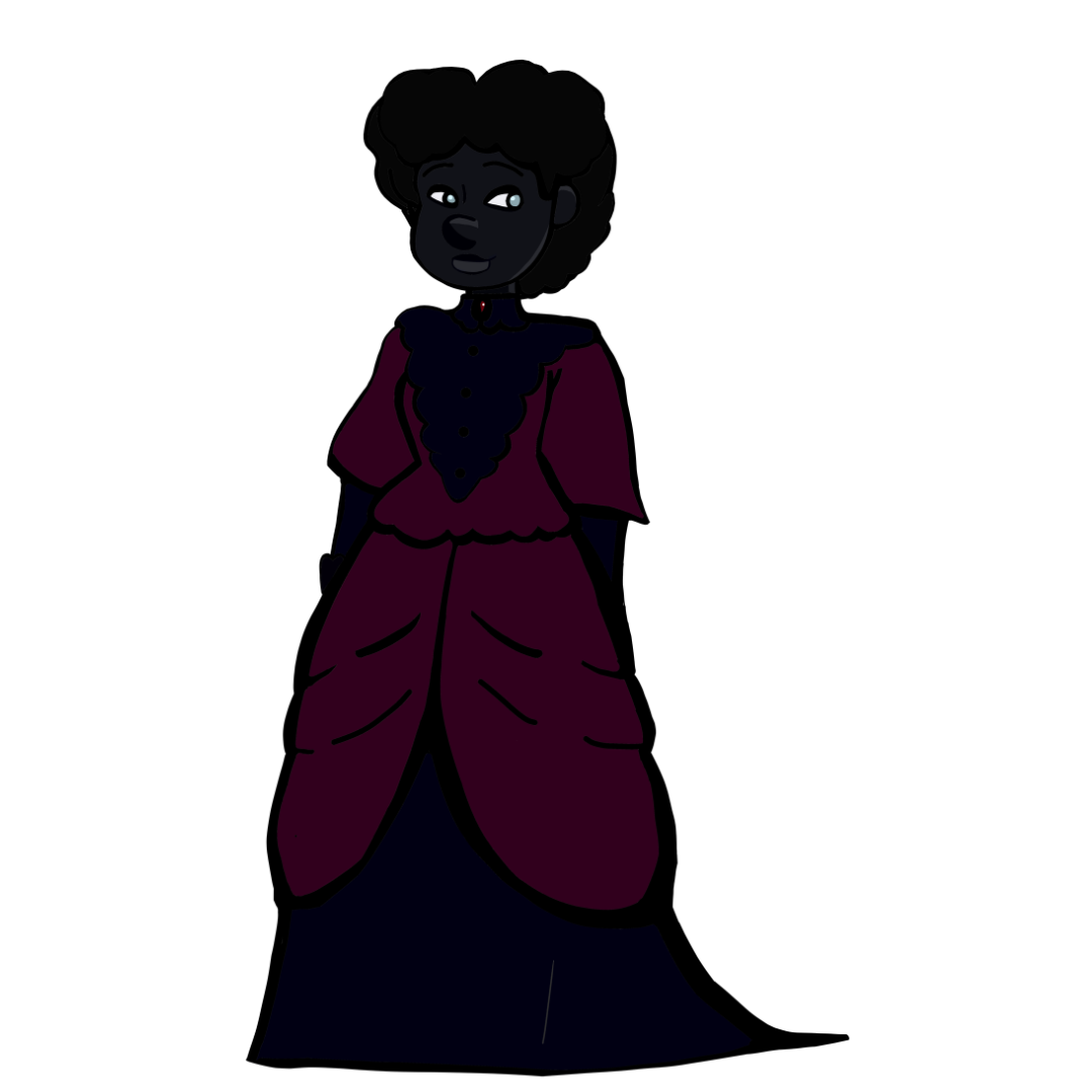
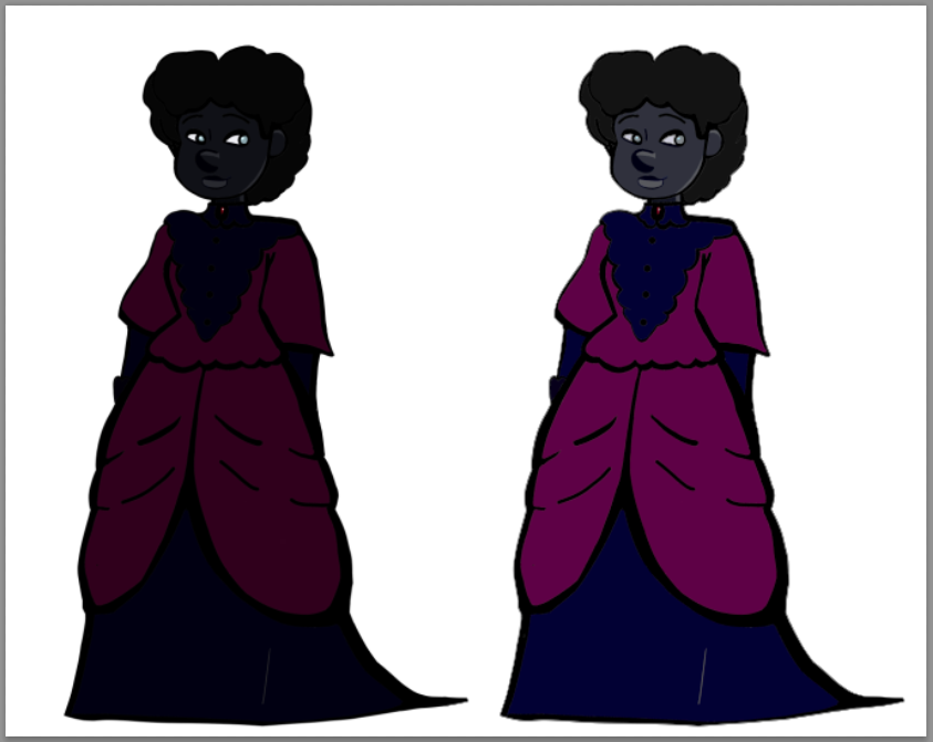
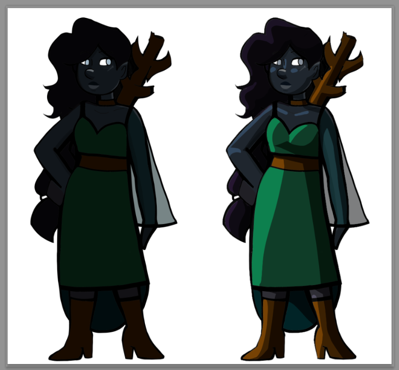
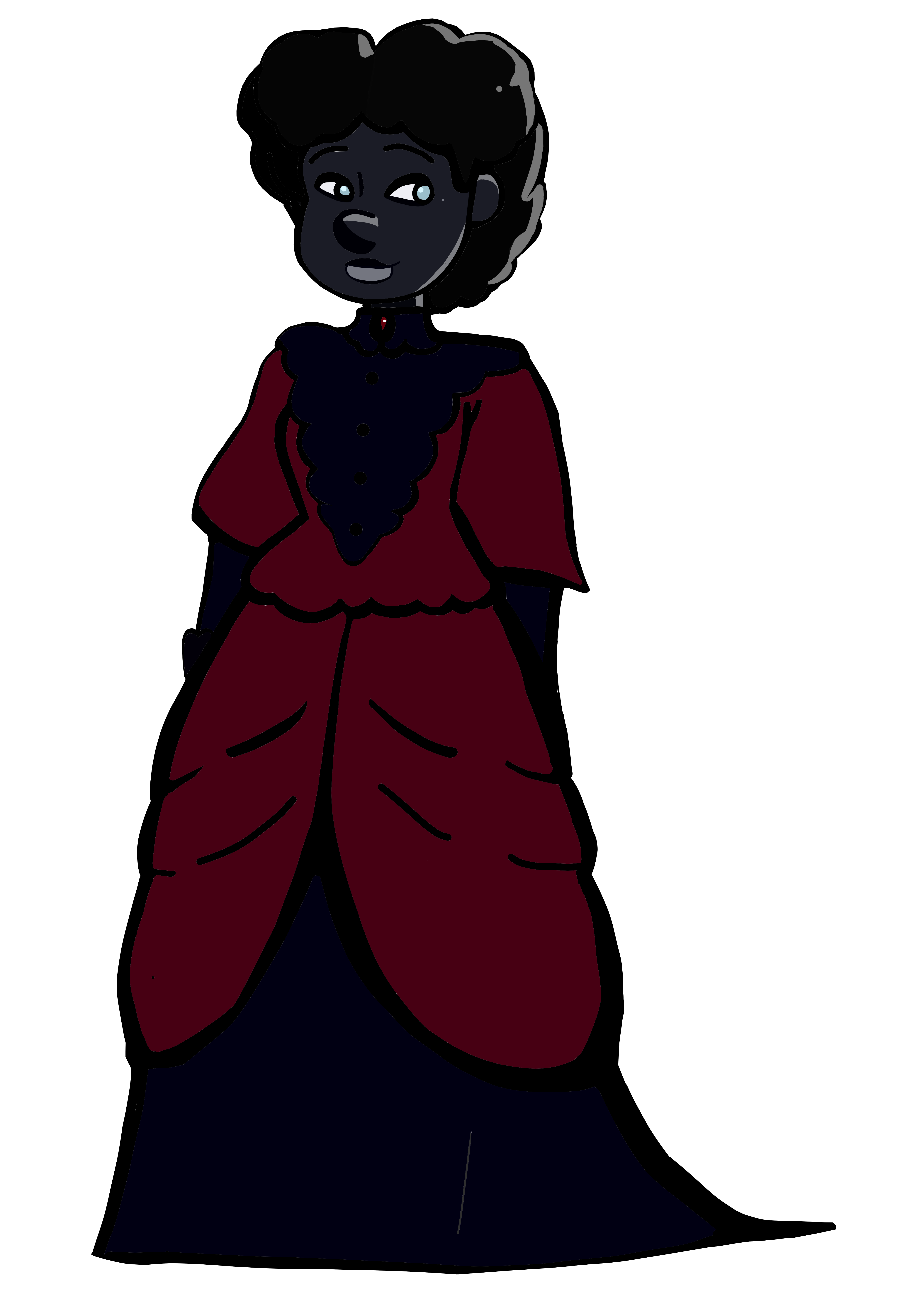
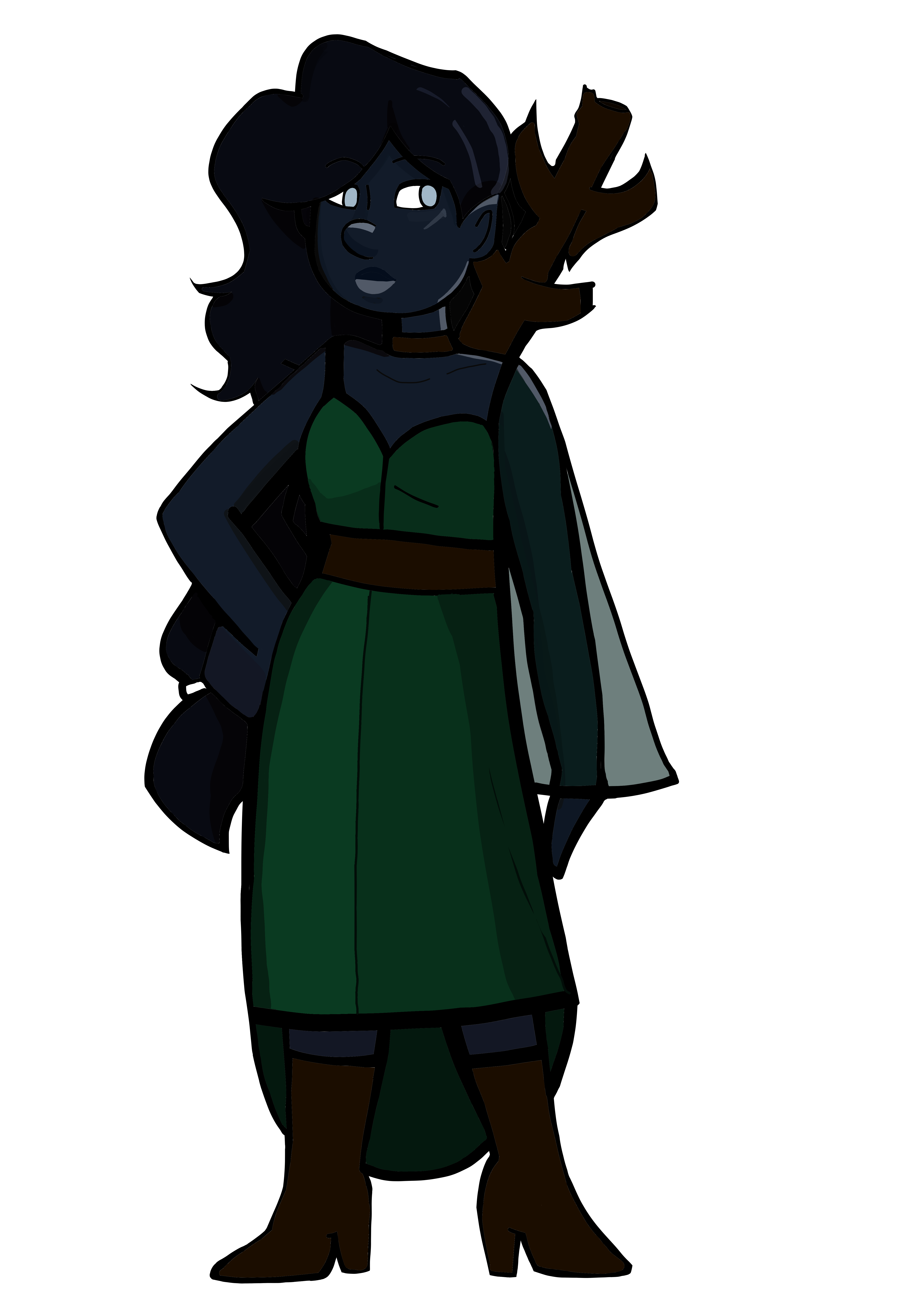
Because we're on the topic of dark skin, I wanted to showcase how I solved it in my own color palette. Since I think that works better for me than trying to do edits. I used the same Kyara drawing and only changed the skin and hair tones. Here's a flat and a rendered version, to show that you don;t need to rely solely on renders to make a readable design.
You can always check how things work in the real world, no matter how dark a skin is, it must reflect light, it can still preserve its dark tone, but be fully glowsome (and not washed out).
1
The darker the skin, the more bright the glows must be.
Without light, even a peson with white skin will appear fully black
Light is the key, follow the light \o/
Dark skin is all about highlights and undertones essentially. I know I mostly write on here but I do art and had a comic previously with a cast of all POC characters. The key is really the highlights and undertones (warm, cool, neutral etc). All skin reflects light and in darker skin tones that reflection can be more apparent. Highlighting on the nose, the cheekbones, the high points of the face and body adds dimension.
Watching makeup tutorials is also a good study. Where they place highlight on the face, where the contour is, it's kind of helpful for an artist when you're looking for the high and low points of the face to figure out where that might typically be.
Ah. . . I did not learn color theory in any formal matter, so I do not know.
I just keep messing around, messing up until I find color combos I like looking at.
If it is difficult to see things color-wise, you can try checking contrast with a little paint pallet like I been adding to the test drawing. It might help (or it might do nothing)
* If you can easily see all the colors are comfortably different -- bee's knees!
* If some colors are blending in or just look bad together, you can change them until you see a combo you like.
With my characters with darker fantasy skin colors, I found that Grey 80% was the darkest I could do it before losing detail. And if you want to have it appear darker, have the base be 80% and add your shadows on top of that.
With your characters, my previous advice still applies that her clothes should be a lighter color.
@NickRowler The angel in your pic looks like the complexion I'm going for actually. is that 80% darkness?
And generally her clothes are lighter, though i'd like to figure out how I can still make darker clothes doable if I ever want to draw her that way, though she usually wears more pastel colors canonically.
alright, an updating, using @NickRowler 's suggestion, this shade of black is about 76% opacity I believe. If anyone could give me some feedback about how the features appear on their individual devices, I would really appreciate it, since I know every device registers color differently