1 / 19
Jan 2018

The thing I love most about making comics is how much it pushes us over time to try things outside of our comfort zones - things that really challenge us. So, what has been the most difficult page for you to create to this date? Why?

For our comic Prince of Spades ( https://tapas.io/series/Prince-of-Spades3 ), the exterior shots have been a particular challenge for me for several reasons - one, because hard architecture/inorganic environment has always been an issue for me, though working on the comic has definitely made me get better. The second reason is because in our comic we're trying to work with a very limited pallet (mostly just primaries) - and boy is it difficult to paint without accidentally mixing colors.

It took several tries but I was pretty happy with the result! So, what pages were your most challenging?

  • created

    Jan '18
  • last reply

    Jan '18
  • 18

    replies

  • 2.0k

    views

  • 19

    users

  • 21

    likes

  • 16

    links

The first page of my second chapter took a couple days to nail down because I decided to try doing my backgrounds differently. It took a while to ink, color and shade it all out but I think the end result was worth it. The page looks colorful and more interesting (I think) than if I had stuck to my old method of creating backgrounds.

For me, aside from just the first half of the first chapter, it would have to be page 6-7 of chapter 1 in particular.

This was my first ever attempt at a two page spread, so it was a real challenge taping the two pages together and trying to keep the shading consistent to show no gap. The perspective, and setting where also very new, so I struggled a lot with the city look. If I were to draw this now it'd be way easier, having more experience with multi-page spreads, perspective, and city landscapes. But at the time it was the hardest thing I've ever done drawing wise.

I would have to say that this was the hardest for me.

I most have redone this page a billion times.

The line art was traumatizing, the coloring (at first) didn't satisfy me at all, and I must have changed the panels countless times.

In the end, I was satisfied with the result, but this page almost, ALMOST, made me rage quit.

Those Called Wolf

For me it was this one

It just because It was so unplanned for

It was a pain but thank God people understood what was happening without a problem

Every page is a challenge and I love it but I did suffer a bit from that one

This is amazing and I love the pallet!

I won't post a page, because I'm keeping my current work close to the chest until I release it, but: I find that any outdoor setting for me challenging. I recently did a detailed forest scene from a bird's eye view. It nearly killed me for the level of depth and the amount of colour. I still struggle with choosing good pallets, so your [OP's] page is quite inspiring. I find it hard to choose non-native colour sometimes, which is such a bother.

Honestly, I'm having trouble thinking of a particular thing that was really hard to draw so much as like, more of the extrinsic stuff? Like the pages where I had last minute script issues that I had to correct, or the complex pages that I had to rush in order to keep with the schedule. So like, a page with a busy background might not be all that technically difficult, but the fact that I have to rush it out for update day makes it difficult.

That said, any time I have to draw a vehicle I die a little bit on the inside.

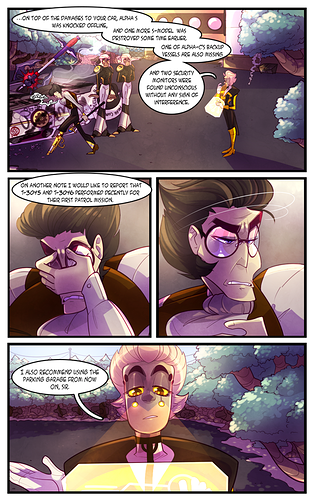
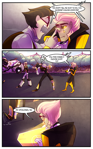
The most difficult pages I have to work on are any panels, pages and certainly splash pages that involve drawing a lot of distinctive background characters. It's fine if I have to draw the main cast or people with actual impact on the story. But there's a tedious aspect to drawing random background characters. Usually I'll just try to cheap my way out with basic outlines and stuff but sometimes you got to actually draw something.

And this means working with character designs that I don't care about because other than this one page, they will never appear again. They have absolutely no impact whatsoever so there's no enjoyment or closeness to these background characters. I want to focus on drawing what actually matters and I don't want to put any distinction into them when that same distinction could go into more impacting characters.

It's boring and tedious because to me, it slows down the creative process. It's basically taking the same time and effort it would to draw a page but with none of the enjoyment that usually comes from it. I want to get to drawing the actual good stuff but sometimes, you just got to have something on the page to give it life.

PrinceofSpades - the page looks sO nice!! I love the way it turned out oh gosh

For me, backgrounds are definitely the hardest! I've been trying to work on my coloring style/color palettes, as well as perspective, but I'm really never satisfied with my backgrounds. uGH this one looks so bad, but i'm working on it!!

This Page from my comic All Broken Gods1:

I made the top panel months before I actually made the full page and it was a nightmare to get right. It looked too cluttered half of the time and whenever I tried adding shading it looked even worse. It didn't help everyone I showed it to said it would look better with detailed shading which I could not find any way to add it without making your eye go everywhere. Finally added minimal shades but I'm still not too sure about it :confused:

That's a good question. I have never thought about it. Once I am drawing I get, not tunnel vision but rather tunnel thinking. (If that makes any sense). I sort of go in a weird trance and space out. I write poetry comic and 90% of my artwork is abstract because, well, poetry is abstract. Contrary to what some people believe, abstract art is not easy. Especially if it has to embody your poetry.

If I have to choose, I would probably say Amore: In Love.

This was the last episode of Amore subseries and the stanza was the same as the 1st episode Amore: attraction.

So basically the artwork had to show the change in the concept of amore from the starting of the poem to the end.

To top it off, the artwork itself was complicated. I wanted the idea of drowning but the vibrancy of the experience to come through.

@indagold I love your artwork. Very unique.

Crow's Worth - Chapter 6 pages 20 and 24.

Because of that goddamn kitchen and table and trying to make it look decent. And even then, I'm still a bit upset because their apartment has no windows.

For me it would have had to be Chapter 1, Page 25 of my newest story "Haven". Buildings and interior architecture is one of my weak points and take me more time than anything to draw.


And from my first and most recently finished comic "First Contact", I would be Update 88 FLORIN, last page and everything that followed. Not only because of the giant striped man but also because I know this story was coming to an end.

I have two pages of https://tapas.io/series/TheMachinist I would describe as my most difficult ones yet. Both have to do with the backgrounds.

First one is Page 15:

The details of that page where just ... too much. :smiley: It is obvious, that I didn't have perspective down there yet, but I still kind of like the outcome if only for the time I put into it.

Second would be Page 76:

The linework already was a handful, but coloring that with watercolor was ... not easy. I work on a small scale (A4), so you can imagine my trouble.

But oh well, if we don't challenge ourselves, we won't get any better, right?

well I think I have to say this page1 was the most difficult to draw mainly because of how much time it took to finish.
3

Crowd scenes are really hard for me I like to not just draw black blobs but sometimes I get lazy and do it.