
Would be cool to hear your opinion about this little passion project of mine!
Awesome I've been looking for critique ever since I finished chapter 2. My comic is an ongoing story, fantasy/adventure type thing.
Check out "The Chronicler" on Tapas
Destiny Awaits! I remember you from like, back in 2015. your art's really improved!
and alright, ill bite, heres my comic: There was a War2 if youre focusing on the art, skip to chapter 4 bc most other feedbackll be outta date. if youre focusing on story then ¯_(ツ)_/¯
Hey there!
If you're interested here's my longform comic and I'm always curious what others think:
tapastic.com/series/electricity-is-her-element
Hi! I'd love it if you reviewed my series ABDUCTED. It follows 13 year old Asher on his journey home to Earth after getting abducted by aliens. https://tapas.io/series/abducted
While your comic hasn't yet hit the meat of the plot yet, it seemed interesting and the jokes were funny -3- and the demon girl was cute, so I subscribed~
Pros:
-The art is really good! .3. The characters are expressive, their designs are unique, and proportion-wise everything's good.
-The pacing is quite nice. Both the main characters were introduced within a few pages, and you can already tell a lot about their personalities. I even think what is part of the main conflict was mentioned? (The Mananangal) Very clever story-telling how it was mentioned by passing background characters.
-The backgrounds! Simply the fact that they are there is pretty impressive for a first comic lol -3- But they're also really good! The shops, the houses, and even the debris is all really well done and doesn't stand out too much.
Cons:
-Sometimes the color (well, "color", its grey-scale lol) bleeds outside of their lines. That's not necessarily a bad thing as it works with the style, but just something I noticed.
-This is kind of a nit-picky thing, but it's about the fight scenes. The action is good, if not a bit simple. BUT the positioning in some of the panels were a bit off. Like how between episode 1.4 and 1.5, Ri attacks and jumps out the way, but is still positioned in the same place by the end of that sequence.
Other:
-I like how the characters sometimes exist partially outside the borders. Especially the monster. It's like it's so big/powerful, that not even the borders can contain him~
It's short, so I don't have a lot to say~ But it's great so far! Keep up the fabulous work .3. I really love your style
Thanks so much for doing this for the community! As mentioned privately, we'd love to hear your thoughts!
Here's a link: https://tapas.io/series/FACTION
Alright, so I tried to read things from January and from February (which I assume are seasons 1 to 3), and then I skipped to season 4 and read most of that.
Pros:
-You've definitely made improvements in your art~ The character designs are unique and stand out from each other. The colors you use work nice with each other.
-I really like the line-less backgrounds you use. They give a minimalist feel and look really nice with the characters, as they don't pull too much attention.
Cons:
-The proportions of body's are consistently off. The necks are too wide, the torsos too long, and the tops of heads are too flat. The last one is especially noticeable on the female characters.
-The attempts at making "fast" movements (such as the hand wave in "Take a Layer" or the head turns in "Undercover") are a bit too much. A tip for those kind of movements is to only draw 2 or 3 positions, and if you can try to make the moving part lighter or faded. You should also use a lot less movement lines. You only need a few to get the movement across. You can also use sound effects to kind of "cheat" by saying things like "wave" or "turn"
-Your lines are quite wobbly. It's not as bad in the character-art, but it's especially prominent in the backgrounds.
Other:
-The sheer detail in some of the backgrounds are really nice. How in the bedroom scene you can see all the figurines and other furniture. Or in the kitchen scene in "All You Can Handle".
Well that was an interesting read .3. a lot of black and white comics today. Though I'm not enitrely sure what the comics about, time will probably tell.
Pros:
-Your art is very good! The proportions are well done and your characters are very expressive. However, the eyes are a bit too big, even for an anime style .3.
-Your use of paneling in the mobile-format is really good. You use it well to express the characters emotions and control the pacing of the scenes.
Cons:
-Your speech bubbles could use some work. The spacing is inconsistent and the edges of the bubbles are too close to the text. The positioning is kinda off too. Here's a tutorial that should help: https://forums.tapas.io/t/comic-tip-leading-reader-through-speech-bubbles/13463
-The episodes are riddled with spelling mistakes  You should look through your pages and make sure those are corrected.
Other:
-I think you should make your episodes shorter .3. It's hard to tell exactly how long each episode is, as you use the mobile/webtoons paneling format amazingly, but there was a lot of scrolling. A too long episode makes things glitch/crash on mobile. Plus, splitting them up means more updates, which means you show up on the "Fresh" tab more
Thank you. I will check out that tutorial because I really have trouble with text, then when I go back to correct it everything goes wrong. So thank you for taking the time to give me a link so I can work on that.
For spelling someone else pointed that out to me and I am currently begging my girlfriend to read over stuff for me, so I no suck so much, lol.
I didn't know that long episode could glitch!! But I started with such long episodes I thought it would be disappointing if i suddenly cut it to shorter ones...
Thank you so very much for your feedback and help!!
thank you for the time. Still trying to nail that proportion  . Never thought about line movements I appreciate that note.
hey wolfe, thanks for taking the time and do this reviews,
it's very helpful.
I would love to hear what you have to say on my comic, just getting started (18 pages) but updating daily, so maybe I get more pages when you get to read it.
hope you like it! , thanks!
Wooow, your art is beautiful~! So pretty that I subscribed .3. Though there's not a lot of story yet, so this'll be focused more on the technical aspect of things.
Pros:
-Did I mentioned the art?? The effort put into the coloring, the backgrounds, and the linework is just amazing. I can really feel the emotion/work put into this comic. The characters are so expressive, and the Prologue especially was very well done. On like my third read through, I noticed that the sky was slowly going from a yellow-ish sunrise lighting to a full, sunny day throughout the panels! That's so cool! Such attention to detail!
-Your speech bubble placement is actually very well done. The words aren't all squished together, and that font you chose meshes well with your style~ That tends to be something people forget about.
- I love your character designs tbh. Your design for death was unique, as well as the design for the (what I believe is) the human/deity she tried to bring back to life. 
Cons:
-Your panels are really squished together .3. It makes the scenes feel very fast paced, which is odd in moments that aren't necessarily moving very quickly. And, because things are so close together, it can even stop up the flow. For example, on page 3, after the speech bubble "or a hundred crew, finny boy", the next set of panels is way too close to the previous set. As the reader looks at it, they run into the "nonsense" speech bubble before Finny's suggestion. (i tried to draw it out for you, looky)
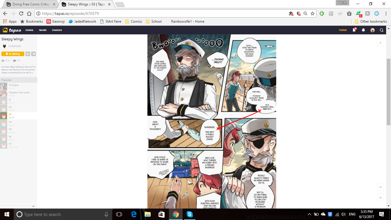
The reader would run into the wrong speech bubble first. Technically, the best way to fix it would be to lower that speech bubble, but the page is so tightly packed, you're unable to do that
-Sometimes character positioning is unclear. An example of this pages 2 and 3, where Thomas is hit with a fish. It's clear that the old man threw it at him, but it's unclear from where the fish is thrown. Or even where the old man comes from, since he just kind of ends up in front of Thomas.
This happens again on Page 4 when the girl boards the ship, and goes to look at the things they caught but those things seemingly did not exist before that panel. If it was somewhere "off screen" then it implies she walked rather far after climbing onto the ship, and then walked to an unknown area of said ship.
Other:
-I don't have anything to put here really, but I think you shouldn't be afraid of slowing things down. In some cases this may mean drawing additional panels (which sucks, i know lol) OR you could make wider gutters (the space between panels). Since this website really favors the webtoons format, I would suggest putting wider vertical gutters where you can. And maybe less panels that are within other panels (an example of this would be on Page 6, when the girl grabs Thomas).
Sure, I'll bite! <3 Here's my comic!
It's called Whose World! ^_^
Thanks for doing this! Your reviews seem really succinct and helpful. If you still have room, I'd love you you to take a look at mine!
I'm currently in the process of converting all of my book-formatted pages into webtoons format, so the page layouts switch around a little bit. Hopefully it won't be too distracting, but if you do have any thoughts on the format those are welcome! Thanks again.
If you're still lookin' for things to review then I'd love to get some feedback on my high-fantasy action adventure comic, Legends of Kayal. Only have around 24 pages so far so it wouldn't take long 
Ohh! I'm amazed to find your insight very helpful! Most of it are spot on to the issues I've been doubting myself  I've had more headache in putting and selecting which scenes to put in a page and I guess that really shows haha ///
I read your other reviews from others and I found it quite helpful also, you have good eyes on comics.
Thanks for sharing your thoughts! > <
Tbh that wasn't particularly interesting to read, but it definitely had a good-sounding premise. But it's the third chapter and the adventure hasn't really started, and the way it's paced makes it very confusing.
Pros:
-The characters themselves are very expressive, and maintain interesting body language
-The premise, at least, sounds very interesting. It seems like a lot of thought went into this world, it just isn't shown particularly well.
Cons:
-There was honestly way too much narration within the first 2 chapters alone. For a comic, it was very wordy and relied a bit too much on the narration/speaking than on the "depiction" part of the art. I would personally say there are too many speech bubbles per page for a web-styled comic. I think more panels should be dedicated to showing the characters reactions to the things happening, or even just scenery. Wider gutters would slow the pacing down (which it desperately needs).
-Your speech bubbles, in terms of content, are way too big. This is especially noticeable in Chapter 3, where even more exposition gets dumped on the reader through walls of text for most of the chapter.
Others:
-Overall, the pacing is a bit all over the place. It kind of looked like it was set in medieval times with queens and courts, but then the third chapter has a bunch of teens at a beach party... but they're still royalty maybe? I guess there was a timeskip. I'm not sure.