
hey wolfe, thanks for taking the time and do this reviews,
it's very helpful.
I would love to hear what you have to say on my comic, just getting started (18 pages) but updating daily, so maybe I get more pages when you get to read it.
hope you like it! , thanks!
Wooow, your art is beautiful~! So pretty that I subscribed .3. Though there's not a lot of story yet, so this'll be focused more on the technical aspect of things.
Pros:
-Did I mentioned the art?? The effort put into the coloring, the backgrounds, and the linework is just amazing. I can really feel the emotion/work put into this comic. The characters are so expressive, and the Prologue especially was very well done. On like my third read through, I noticed that the sky was slowly going from a yellow-ish sunrise lighting to a full, sunny day throughout the panels! That's so cool! Such attention to detail!
-Your speech bubble placement is actually very well done. The words aren't all squished together, and that font you chose meshes well with your style~ That tends to be something people forget about.
- I love your character designs tbh. Your design for death was unique, as well as the design for the (what I believe is) the human/deity she tried to bring back to life. 
Cons:
-Your panels are really squished together .3. It makes the scenes feel very fast paced, which is odd in moments that aren't necessarily moving very quickly. And, because things are so close together, it can even stop up the flow. For example, on page 3, after the speech bubble "or a hundred crew, finny boy", the next set of panels is way too close to the previous set. As the reader looks at it, they run into the "nonsense" speech bubble before Finny's suggestion. (i tried to draw it out for you, looky)
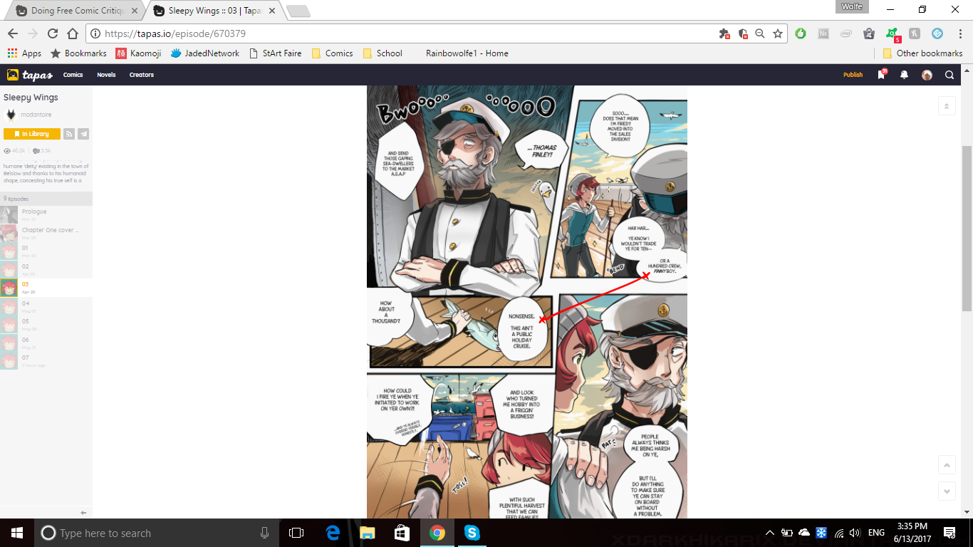
The reader would run into the wrong speech bubble first. Technically, the best way to fix it would be to lower that speech bubble, but the page is so tightly packed, you're unable to do that
-Sometimes character positioning is unclear. An example of this pages 2 and 3, where Thomas is hit with a fish. It's clear that the old man threw it at him, but it's unclear from where the fish is thrown. Or even where the old man comes from, since he just kind of ends up in front of Thomas.
This happens again on Page 4 when the girl boards the ship, and goes to look at the things they caught but those things seemingly did not exist before that panel. If it was somewhere "off screen" then it implies she walked rather far after climbing onto the ship, and then walked to an unknown area of said ship.
Other:
-I don't have anything to put here really, but I think you shouldn't be afraid of slowing things down. In some cases this may mean drawing additional panels (which sucks, i know lol) OR you could make wider gutters (the space between panels). Since this website really favors the webtoons format, I would suggest putting wider vertical gutters where you can. And maybe less panels that are within other panels (an example of this would be on Page 6, when the girl grabs Thomas).
Sure, I'll bite! <3 Here's my comic!
It's called Whose World! ^_^
Thanks for doing this! Your reviews seem really succinct and helpful. If you still have room, I'd love you you to take a look at mine!
I'm currently in the process of converting all of my book-formatted pages into webtoons format, so the page layouts switch around a little bit. Hopefully it won't be too distracting, but if you do have any thoughts on the format those are welcome! Thanks again.
If you're still lookin' for things to review then I'd love to get some feedback on my high-fantasy action adventure comic, Legends of Kayal. Only have around 24 pages so far so it wouldn't take long 
Ohh! I'm amazed to find your insight very helpful! Most of it are spot on to the issues I've been doubting myself  I've had more headache in putting and selecting which scenes to put in a page and I guess that really shows haha ///
I read your other reviews from others and I found it quite helpful also, you have good eyes on comics.
Thanks for sharing your thoughts! > <
Tbh that wasn't particularly interesting to read, but it definitely had a good-sounding premise. But it's the third chapter and the adventure hasn't really started, and the way it's paced makes it very confusing.
Pros:
-The characters themselves are very expressive, and maintain interesting body language
-The premise, at least, sounds very interesting. It seems like a lot of thought went into this world, it just isn't shown particularly well.
Cons:
-There was honestly way too much narration within the first 2 chapters alone. For a comic, it was very wordy and relied a bit too much on the narration/speaking than on the "depiction" part of the art. I would personally say there are too many speech bubbles per page for a web-styled comic. I think more panels should be dedicated to showing the characters reactions to the things happening, or even just scenery. Wider gutters would slow the pacing down (which it desperately needs).
-Your speech bubbles, in terms of content, are way too big. This is especially noticeable in Chapter 3, where even more exposition gets dumped on the reader through walls of text for most of the chapter.
Others:
-Overall, the pacing is a bit all over the place. It kind of looked like it was set in medieval times with queens and courts, but then the third chapter has a bunch of teens at a beach party... but they're still royalty maybe? I guess there was a timeskip. I'm not sure.
uwu I usually don't like sports but that was fun to read. I really like your art style, it's very much like... newspaper comics!
Pros:
-The character designs! Even though they're all wearing the same uniform, all the characters had their own unique look to them and a well-defined personality. I thought Marsilio was an adorable addition to the team as well. Their relationships with each other were clear and even changed, only within 52 pages. It was nice watching them interact.
-The story was short but sweet! An underdog story about a baseball team that isn't all that good. I'm glad it didn't end in a cliche way with them somehow winning, cause sometimes the small victories are better than the big ones (like how Bruno was finally able to hit a ball).
Cons:
-Some of the "action" scenes could've been better. It's hard to explain it exactly, but it's kind of like the "camera" of the scenes never moved. I think moments when characters are batting or scrambling to catch the ball could be done with more dynamic camera angles. (maybe like a top down view, or a tilted angle) as the use of camera angles can do wonders for getting across the mood of a character or scene.
-My second read through, I noticed that there weren't really any interior backgrounds. An example would be page 44 and 45 of Gang of Atomics, where they seem to be inside during this scene, but it's just a green background the entire time.
Others:
-There were some grammar mistakes sprinkled here and there throughout the comic, but it never made it too hard to understand what was happening .3. so i won't put it under cons. Just something to keep in mind though
-I know I commented on the lack of interior backrounds in Gang of Atomics, but it seems in The Perfect Season you've been more valiant with backgrounds .3. They look good.
Hiya!! It seems like you have a lot of requests already, but it'd be really cool if you could take a look at my comic, Betwixt. I only have about a chapter posted, so I'm not sure if there's a ton to go off of yet.
Anyway, thanks a bunch!!
-HM
Thank you very much for the review! It's a proof that someone else read my comic! 
About the "action" scenes you're right! I myself felt the need to better represent action moments. I do not only need different camera angles, I also need to represent an action moment with more panels, in order to let the reader to well understand what's going on.
And the backgrounds? I also felt the same. Page 44 and 45 are green because they are inside a big green tent, but if I inserted some small detail in the back, like a piece of a window, or some ropes and corners, could be a lot better.
As you noticed, however, I put more effort in the second season, about backgrounds.
About the grammar mistakes, I'm italian and my english is scholar-level so ... sorry for them!
Thank you again!
Ahh, what a cute story ^3^ I like how each episode title is a "How To". I wasn't able to read all of it, but I read most of it (plus the most recent pages).
Pros:
-The cast of characters is really unique and memorable! I love all of their designs, as well as the variety of skin tones and body types
-Positioning and sense of space was really good too! The lighting/shadows were consistent, and it never seemed like characters were just appearing out of nowhere
Cons:
-Your backgrounds seem kinda blurry? Like, that may be a technique thing, but still. It was especially noticeable inside the library from episode 60.1. Especially when the girl comes around the corner, and it's just the bookshelf and blank space as the background
Others:
-I honestly don't have a lot to say about your comic~ It's definitely good, and there's no huge problems with it. Great job~!
Thank you so much for your critique I really appriciate it!
I've always had an issue with backgrounds mainly because I upload a lot of panels per week so I my focus is just never on it, although the bookshelf in that panel was particularly rushed and last minute. I'll try to make them more clear though, thanks!
3 months later
What a read that was XD Definitely an interesting concept, with the ghost dad and apparently demonic grandma. There was even a whole nother episode when I finally came to review~
Pros: The character designs are great and memorable, and actually work very well with your style. The characters are expressive and full of life, as they always seem like they're in motion. The backgrounds are also very good, and give a consistent space for the characters to be in. The use of pink/purple lighting on page 12 of Episode 2 was very well done uwu
Cons: Each episode seems very rushed, story-wise. Almost every panel has text in it, and it never really takes a moment to breath. I would definitely recommend adding more panels with no text, and maybe just a reaction from the character or a background showing the setting off. Instead of one coherent story, each episode seems more like a oneshot that happens to happen in the same universe (if that makes sense). Every major problem for the episode is brought up, and often solved a few pages later, which makes it seem rushed.
Other: There were a few grammar mistakes here and there, but they didn't take away from understanding the comic so I won't count it as a con .3. From episodes 1 to 3, there's definitely been a lot of improvement in art! However, the story tends to follow the same formula each time, but hey! Maybe you'll switch things up in this 3rd episode.
lol it's always interesting to see how people label their chapters uwu Some people call them episodes, some people call them parts, but you're the first person I've seen to call them acts. I love it
Pros: The art's actually really cute, and works well for the story. It's almost game-like. I can see you put a lot of effort into the backgrounds and the like. The characters are very expressive, and the brief fight scene was done very effectively!
Cons: The lines on the art are a bit jagged .3. They're especially noticeable in character close-ups. I don't actually have much to say in terms of cons since it's so short, but it definitely looks interesting. I hope to see you update again
Other: I think you should better take advantage of the webtoons style Tapas pushes! o3o Instead of putting the same panel just to add more dialogue, I would definitely recommend using the white space in between panels to insert additional dialogue if you don't plan on changing the camera view. And also, don't be afraid to have more than one person talking in the same panel! Phantom Paradise does this well: https://tapas.io/series/phantomparadise
lol I've actually been reading Magnolia Online for awhile. It's really come a long way~
Pros: The characters are cute and relatable, and their designs are honestly so great~ The way they interact with each other and the world around them really gives them life. The story ended up being really interesting too. The additional conflict from the bots really grounds this story in reality (as well as mentions about their IRL life) instead of going full blown rpg-escapist fantasy as most would do.
Cons: The panels seem really small for the sheer amount of text being placed in them .3. Aside from that, I don't really have a lot of problems with this comic. The story can be a bit hard to follow at times, especially as everyone was gathering to have a meeting about the bots. It becomes too chaotic, and just ends up being kinda-funny, random nonsense with a sudden resolution at the end.
Other: ~I have no other comments to make~
That was so fun to read o3o You've gotten yourself a new subscriber~ And I came back just in time for updates to start again!
Pros: The art is absolutely amazing uwu You really make the black and white work well. Everything's so detailed, it's honestly kind of shocking. The story was also super interesting too. It did get a bit wordy at some point during chapter 2, but it was necessary exposition so I'll let it slide this time XD
Cons: Action scenes were a bit stiff. It was like, yeah, he's swinging this sword, but he's just using his arm for the action so he's not really swinging it with a passion. Another example would be on Ch2, Page 9 while he's fishing. Sure the fish is there (and fishing was mentioned earlier) so those are signs of what he is doing, but he himself looks very stiff while performing the action.
Other: Why does he have a mouth on his chest, I need to know  Why did creation take such a turn.