
thank u for reviewing my webcomic <3
considering Kao, I really enjoyed the plot as much as the special characters in it. there are some mistakes when it comes to anatomy and composition but dont worry about it, the amazing progress u're having through the comic will soon erase those mistakes .
keep it up 
thank u for subscribing !! and for the the good feedback
really love the colors u put in ur comic as much as the unique artstyle and the composition <3 .
keep up mate , I really love it !!
thank u for submitting <3
so emotional with all the well drawn expressions .really wanna know more about the story .
keep it up pal
thank u for submitting and for reviewing my webcomic <3
I will try my best to post one episode every month cause of the few time I have for drawing .
about "The story of Osram" that's a good readable comic (not stupid at all)
I can see the progress through the chapters so no worries if there are some little struggles when it comes to composition and proportions .
as I said t's a Good comic
keep it up !!
thank u so much for the amazing review and for submitting ur webcomic <3
I really like the colors u're using on ur comic, the OCs and the songs too (they're making it more emotional)
tho u should work more on the backgrounds and it shall be perfect .
but still it's an amazing work, keep it up!!
I will be first to admit my backgrounds are something to be desired, but i will try to work on that for the future. I am a big stickler to color theory because it can help tell the reader about the character without you knowing about them, besides its kind of fun to pick the colors they are going to be wearing. As for the songs, I think music really enhances the mood you should try to listen to a song while reading your comic and see what happens.
I just read through your comic. The story is interesting enough, but I find that your panels are far too large. It takes a really long time to scroll though and there's less fluidity when reading because of it. I'd add more diversity in the size of your panels and if possible, less large gaps between them too.
@mugenotasu I reviewed your comic and left my review your comic's comment page.
@storytimebiondi I love your comic's style. The story is pretty interesting too, I'm looking forward to your upcoming pages.
Here's mine:
thank u for the cool review and for submitting ur comic <3
I like the plot of ur comic and the chosen colors for each character .
but I think u should work a little bit on ur anatomy .
love it
(Sorry for the late reply) Thanks for the review, I'll make the spaces between them smaller. But I still don't know what size to make my panels though.
@shaylafarley5 I have about 0.2 inches of space between panels.
@mugenotasu Thanks for the review. Yeah, anatomy is always a work in progress, but I can see a difference from the beginning to the last chapters, so it's getting better.
14 days later
Your art style is quite beautiful! The story seems very deep and it left off on such a good cliffhanger. I can't really find anything to critique except for a few errors with the text. Maybe you should have someone proof read for spelling or grammar mistakes? For some reason the music wasn't working for me either even though I saw the symbol for it... that might just be me though. I love it overall!
Mine is a dorky little comedy, It's my first ever attempt so it was meant to be a test run while I work on my art skills. Tell me what you think regardless. 
Naldo Comix Here's my webcomic! Please review mine thankss
thank u for submitting ur comic n her and for reviewing mine 
I found ur webcomic fun to read tbh the art stile is fine and mostly it's not disturbing at all
love it <3
keep going
@mugenotasu Your webcomic is beautiful, with suggestive and intriguing imagery! You're doing great work with the colors: there's a twilight quality to the lighting that creates a very special mood. You grab the reader's attention fairly early on with unexplained, brutal occurrences. I don't really know what to criticize. At this stage in the narrative, I think the characters need to be more thoroughly introduced fairly soon, so that readers can get to know them. So far, the reader's interest is kept up by the art and the mystery aspects of the story, but in order to create long-term engagement for a story, I think most readers need to be invested in the characters from an early stage. Everything I've seen so far is great though, in regards to both story and art. Here's my comic, a sci-fi adventure story: https://tapas.io/series/Carlas-Adventures.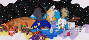
I found your comic a few days ago and I'm absolutely in love with it. Your art is amazing and the story looks really interesting so far, can't wait to read more!
Here's mine if anyone wants to review please do!
Here's mine! I'm probably gonna be adding some tiers here soon, but I wanna keep it relatively basic for right now so it doesn't become a burden:
thank u for submitting here
ur comic is pretty cool I like the unique art-style u do, if only u could work more on the shapes (the character outline)it sometimes looks off like his left shoulder in the second panel. otherwise it's pretty cool
so i’m not a big fantasy person but i enjoyed your comic so far!
art is fantastic, super atmospheric, great coloring
the font put me off a bit, the boxes felt like they were mimicking a manga style which is fine but felt unnecessary here; i believe they’re often vertical in manga because the text is written top to bottom but when you’re writing a comic in english (over translating one) that’s not completely necessary. not sure why the text was also in box format.
the font didn’t compliment th story too well, it felt too bubbly and the changes in size put me off.
last point about the speech is that it’s often spaced in a way that makes the reading difficult. i.e.
“Indeed I’m aware
of it all, so
..
enlighten me”
might work better if it was spaced like so;
“Indeed,
I’m aware of it all
so...
enlighten me”
essentially, work the spaces between the text to fit the pacing of the reading.
overall: great art, intriguing story, maybe look into working with a letterer
wreck me